
2 Data visualizations Tagged "#Transport"
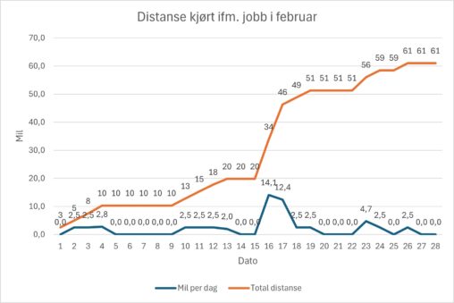
The data visualization show the distance I travelled by car for work-related duties during February. The graph shows distance per day as well as accumulated distance through the…
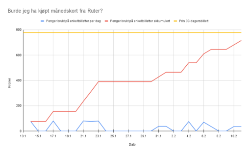
The diagram is showing the amount of money (in kroner) an individual has spent on public transportation over 30 days (Jan 13th to Feb 10th 2025), compared to…