
5 Data visualizations Tagged "#sleep #stress #health"
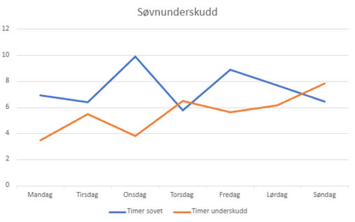
Ringen min sin søvnanalyse, viser at eg har eit søvnbehov på 8t og 30min. Søvnunderskotet mitt blir regulert ut i frå registrert søvn kvar natt.

This visualization shows how many cups of coffee I drink during workdays and how I rate my sleep quality on a scale from 1 to 10. The data…
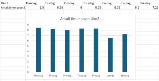
This diagram shows how my sleep varied for the second week of 2025. Note that on Saturday(lørdag) I was out drinking, which heavily affected my sleep in.

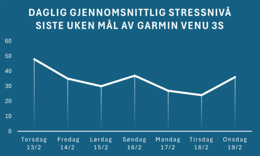
Does good sleep buffer against stress? I looked at one week in June 2024 in the Apple Health and Stress Monitor apps on iPhone and was surprised at…