
25 Data visualizations Tagged "#RICT2425" (page 1 of 2)
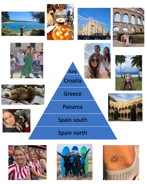
Graphic: Shortest to longest trips in the last 5 years until now… 1. Italy (Milan) – 1 Day for a holiday trip 2. Croatia (Pula, Split) – 1…
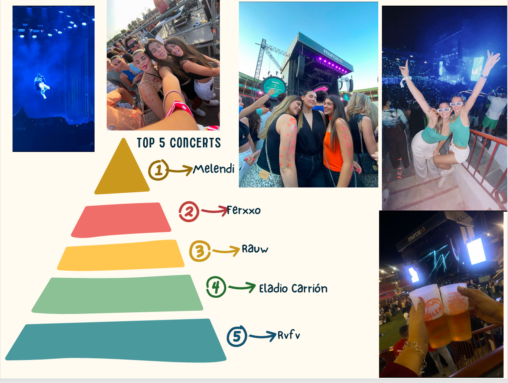
This is my top five concerts of 2024, my top one is Melendi because it was a familiar experience, the top 2 is Ferxxo because it was summer…
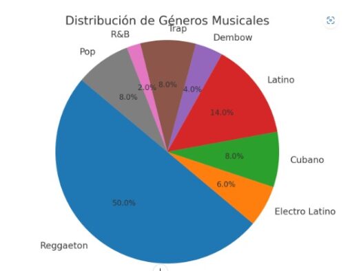
I love music, I spend most of the time listening to it, so I decided to do a diagram about the genres from my daily playlist. We can…
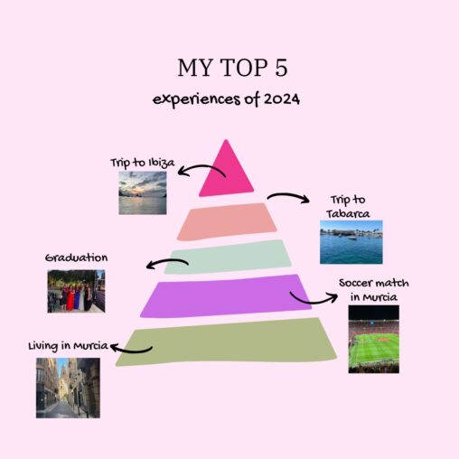
I’ve made this pyramid for making a ranking about my top experiences last year. In the top 5, I put living in Murcia because I am very happy…

In this three graphics I’ve presented myself, as an active, classic and funny person, represented with my steps, my clothes and my leisure.
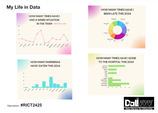
There are 4 graphics that represent: – How many times have I had a weird situation in the tram: these situations can vary from a weird encounter to…

The four diagrams give information about: 1. How much time do I spend on each App in my phone?. 2. How many days do I go or skip…
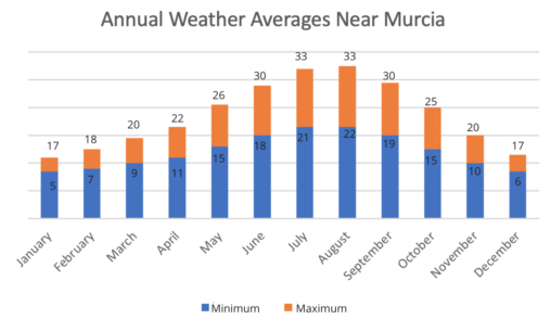
Description: This chart shows the annual weather averages near Murcia. Averages are for Murcia / Alcantarilla, which is 10 kilometers away from Murcia. This chart is based on…
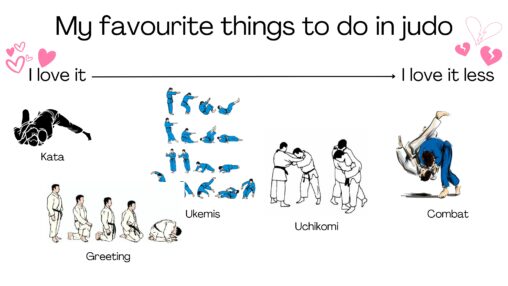
Top 5: combat It is something I enjoy doing sometimes, but since at my club it is taken very seriously and I am not as good as my…
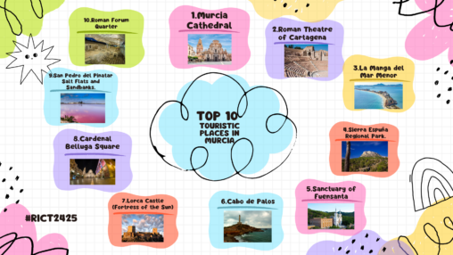
This is the top 10 touristic places in the Region of Murcia according to my personal opinion
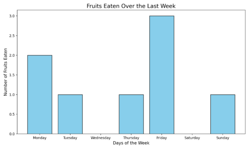
This graphic shows the times I have eaten fruit last week. On monday I ate two pieces of fruit, on tuesday one piece of fruit, on wednesday no…
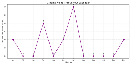
The graphic shows the times I went to the cinema last year. I´ve been one time in jenuary, cero times in february, cero times in march, in april…
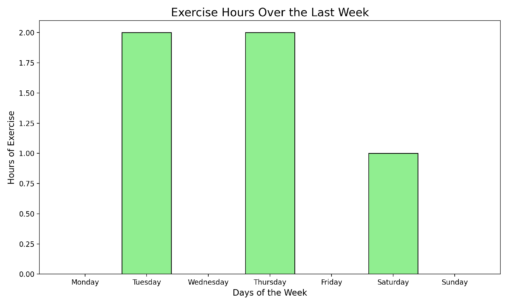
This graphic shows that i didn´t exercise last monday any hours, tuesday two hours, wednesday no hours, thursday two hours, friday 0 hours, saturday 1 hour and sunday…
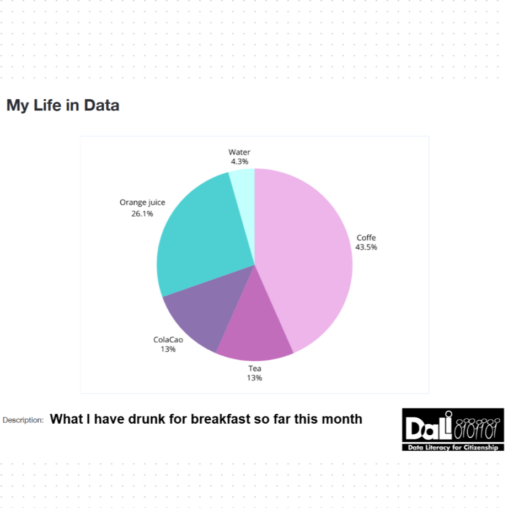
This graphic shows the percentage of how much coffee, tea, ColaCao, orange juice and water I have drunk for breakfast so far this month. This way it visually…
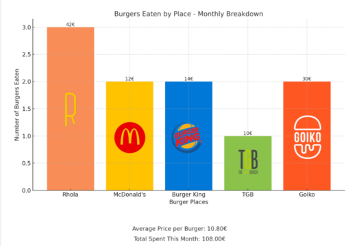
This month’s burger obsession has been fully documented in a glorious graph: the total number of burgers devoured (spoiler: it’s a lot) versus the ultimate favorite of the…
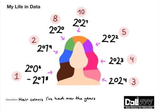
This image reprensents the number of different hair colours throughout my life. Each colour presented in the drawing reprensents the colour that i had for the longest time…
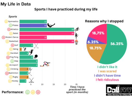
In this image I represent the sports I have practiced during my life using a horizontal bar diagram to show the time I have practiced each sport in…
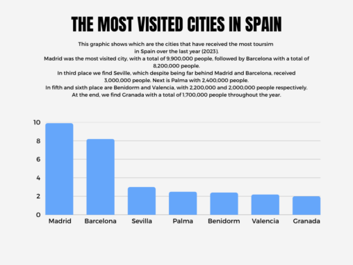
This graphic shows which are the cities that have received the most toursim in Spain over the last year (2023). Madrid was the most visited city, with a…
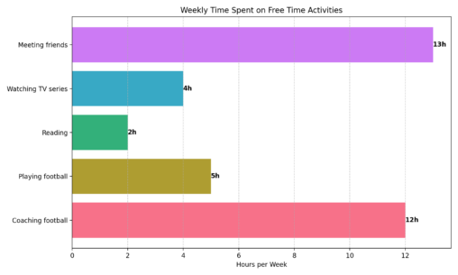
This graphic represents the distribution of how do I spend my free time along the week.
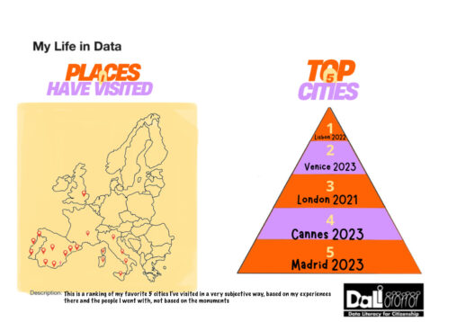
This is my top 5 places I’ve been to. It is based on the experiences I had there and the people I went with, not based on the…