
2 Data visualizations Tagged "personal analytics"
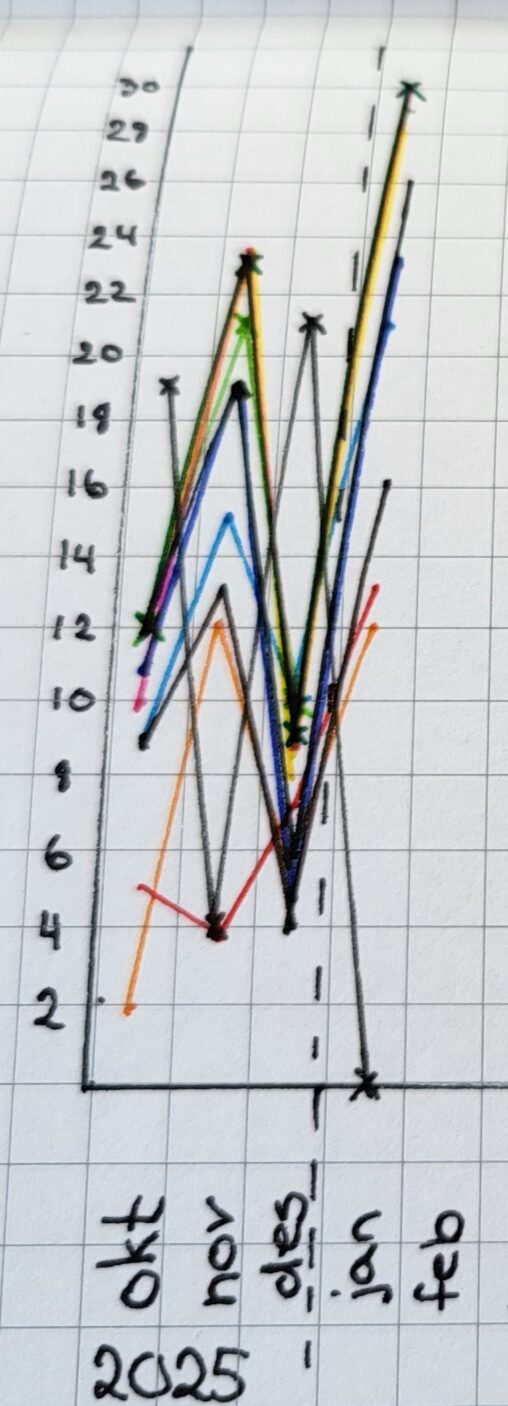
Each color represents one good intention. The graphs visualizes how many days per month I have been successful in completing the different intentions. This data is Public Domain….
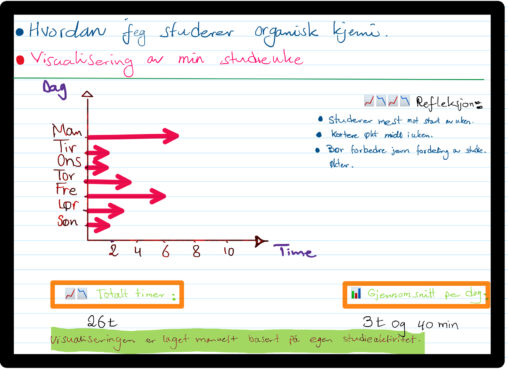
This data visualization shows how many hours I studied organic chemistry during one week. The data represents my personal study activity measured in hours per day from Monday…