
82 Data visualizations Tagged "norway" (page 3 of 5)


The things represented in this picture are items from every member of my family. The owner of the data is myself, chose to be anonymous.

I am representing the time I have spent learning, teaching, correcting, calcualting, helping others with and made videoes about mathematics in week 37 in 2023.

Artist log, colors January 2024 Most used colors in January 2024. Data from the artist log of EWian. The picture shows frequency of colors for January 2024, with…

Mitt private analoge bibliotek 2024 delt opp i seks genre. Lisens: CC BY-SA 4.0 Billedelementer: DALLE-3

The picture is generated with the “text to image” function in Adobe express. The prompt is: A DNA molecule. In the background there is a mountain. A person…

Contrasting the cultural dimensions between France, my country of upbringing, and Norway, the country of my familial roots and present residence. Representing scores for France and Norway on…

The historical electricity prices are gathered from website https://slipper.no/historiske-nordpool-strompriser/. This shows Nordpool’s average electricity prices in øre pr kwh from January 2016 to January 2024.

The chart showes the population density (2024) for norwegian municipalities I have lived for more than 1 year during my life. The orange line showes the share in…


Visualisering av totalt antall fødsler i Norge mellom år 2010 og 2022. Data hentet fra SSB (Statistisk sentralbyrå)

Snøfall dager i løpet av 2023 i Oslo, NO og Bergen, NO.

The numbers are representing what an average Norwegian full time student spend on studying each week compared to Norwegian law students.

The data show how much time per day I spent working out in the morning when I wake up waiting for the coffee. Minutes and days are my…

Copyright Statistisk sentralbyrå. CC BY 4.0.
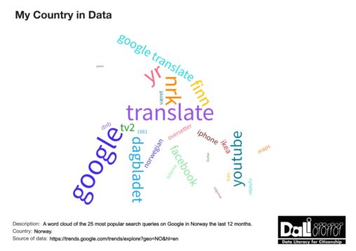
Word cloud of top 25 Google search queries in Norway in the past 12 months. Data downloaded: 18.09.2023. The scoring of the queries is on a relative scale…

This diagram reflects the numbers of newborn babies in Norway, covering the decade from 2012 to 2022. The total amount of newborns are displayed in the orange diagram,…
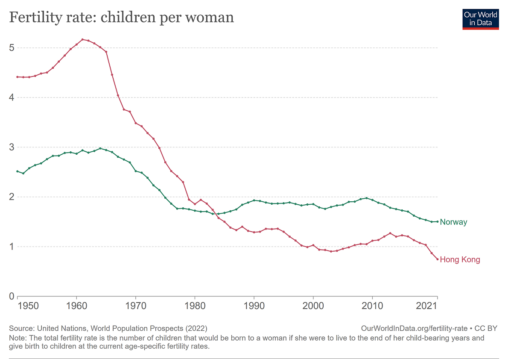
A comparison of fertility rate trend from 1950 to 2021 between Hong Kong and Norway. From 1960, both places started their fast economic growth. The trend is common…
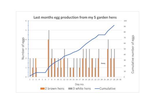
Data showing egg production from my 2 brown hens (> 4 years old) and 3 white hens (> 2 years old) during a month in 2023. Hens of…