
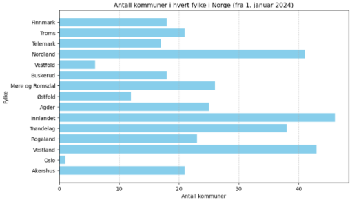
82 Data visualizations Tagged "norway" (page 1 of 5)
This visualization represents the historical price performance of the Cardano ESG Transition Equity Europe fund (ticker: AVEA, ISIN: NL0010579074), listed on Euronext Amsterdam and managed by Cardano Asset…
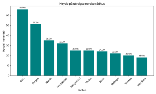
En oversikt over et utvalg norske rådhus, rangert etter høyde. Creative commons license.
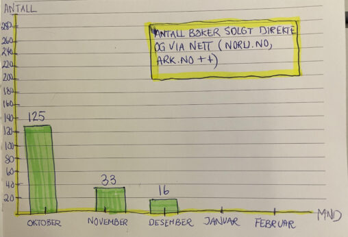
This data visualization presents the number of units sold of a self-published poetry collection per month during the fourth quarter (Q4) of 2025. The time period covered is…
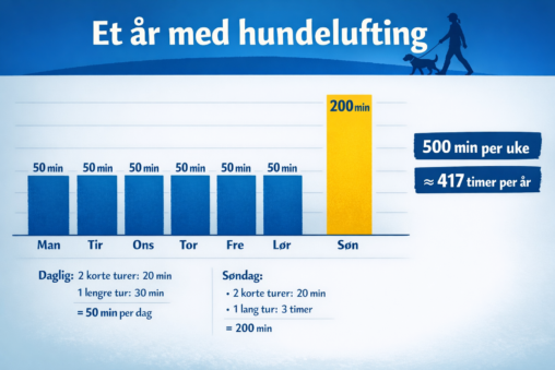
My one year walking the dog, hours anually spent. Put all my data into ChatGPT, promted it to make an visualization
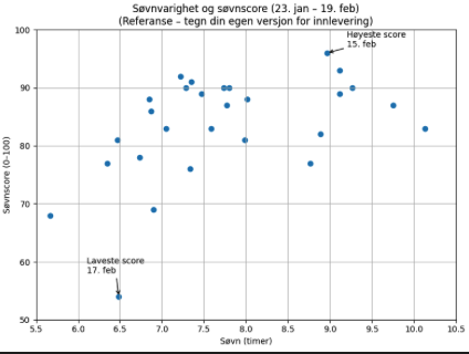
Visualiseringen viser min registrerte søvn i perioden 23. januar–19. februar. Hvert datapunkt representerer én natt og viser forholdet mellom søvnvarighet (timer og minutter omregnet til timer på x-aksen)…
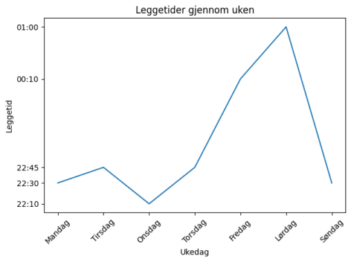
This graph was created in Excel and illustrates my bedtime patterns during the period 09.02–15.02.2026. All times are presented in 24-hour format. Shows a clear visual of late…
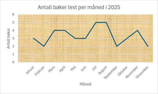
Eget produsert og visualisert data basert på hvor mange bøker jeg har lest i løpet av 2025, fordelt per måned. Målet var å vise utvikling over tid
Jeg har produsert og visualiserte hvor mange bøker jeg har lest i løpet av 2025, fordelt per måned. Målet var å vise utvikling over tid. Produsert av Isabel….
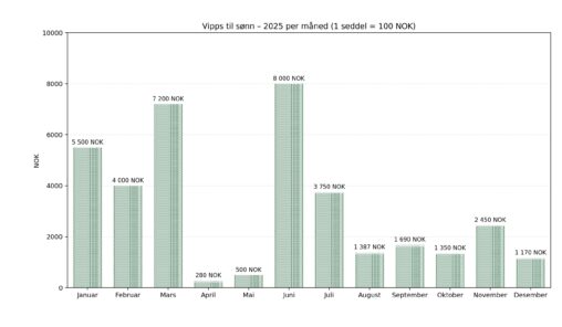
Instant money transfer by Vipps makes it easy to transfer money quickly and on demand in Norway. I wanted to know how much money I have sent to…
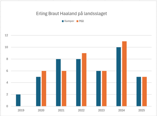
Grafen viser antall kamper og mål Haaland har scoret på landsslaget siden han debuterte på landsslaget i 2019.
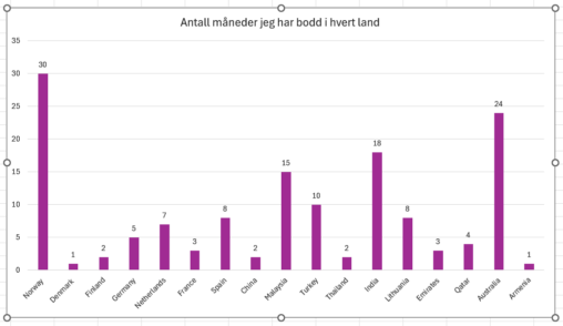
Jeg er eieren. Dataene handler om reisene mine i forskjellige land.
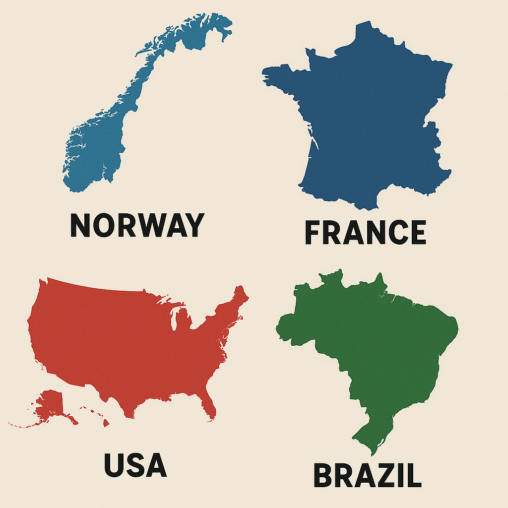
A visualization of the countries where I, previously and current, have worked in.
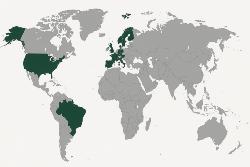
A map of the world visualizing the countries where I, previously and current, have worked in. No data owner.
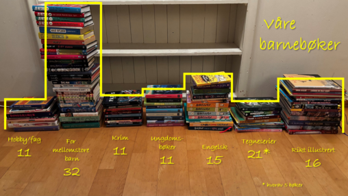
Stacks of children’s books, sorted in different categories. Number of books in each category. (text in Norwegian)
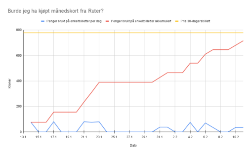
The diagram is showing the amount of money (in kroner) an individual has spent on public transportation over 30 days (Jan 13th to Feb 10th 2025), compared to…
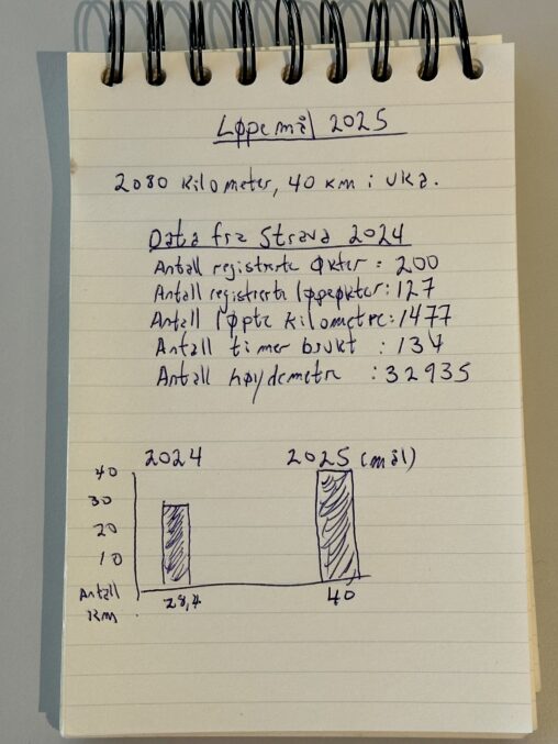
Traing data from my personal Stava account about my training in 2024, and running goals for 2025.