
104 Data visualizations Tagged "#Bergen" (page 3 of 6)
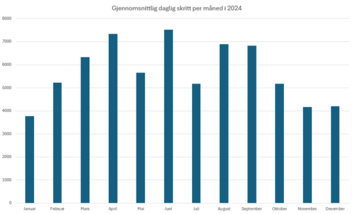
Det gjennomsnittlige antall skritt jeg gikk per dag er representert for hver måned.
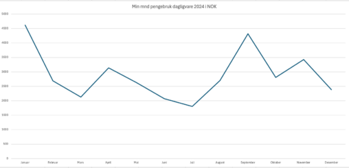
Diagram som viser bruken av NOK per mnd hos diverse daglivarer, så her går alt under samme kam. i 2024 var dette bare for et enslig forbruk.
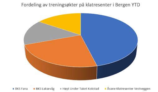
Diagrammet viser en oversikt over hvilke klatresenter jeg har vært på fra starten av året for å buldre.
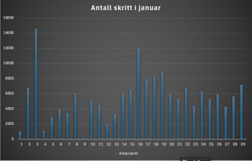
Dette er en visualisering av mine daglige skritt hver dag fra 1.januar til 29.januar.
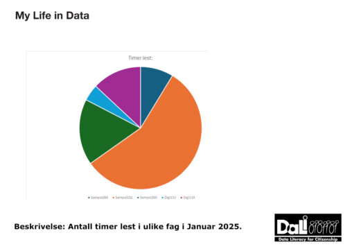
Diagrammet viser antall timer brukt på å lese i fem ulike emner ved UiB i perioden 1. januar til og med 28. januar. Enhetsformen brukt er timer. Diagrammet…
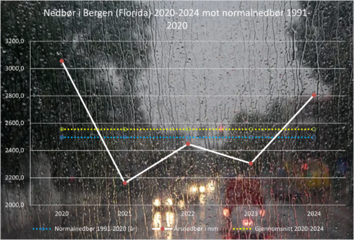
The graph shows precipitation at the weather station in Florida, Bergen, Norway from the year 2020 to 2024 (white) compared to the average percipitation from 1991-2020 (blue) and…
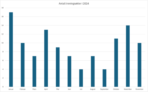
Dette er en visualisering av antall treningsøkter jeg hadde i 2024. Ved å ta en titt på stolpediagrammet, kan man tydelig se at den mest travle treningsmåneden var…
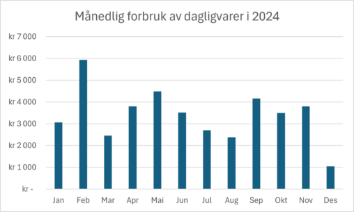
Stolpediagram over mitt månedlige forbruk av dagligvarer i kroner for 2024. Personlig data.

The chart shows how many steps I walked each day of the week from 09.09.2024 to 15.09.2024. Copyright status is Public Domain.

A trout fish in local freshwater outside of Bergen was examined for internal parasites.The trout was found to have approximately 60 capsules of the parasites inside. Dibothriocephalus ditremus…

Visualisering av antall skritt som jeg har gått i løpet av uke 37. 2024. På tirsdag, torsdag og fredag var jeg på jobb, og man kan se at…

Does good sleep buffer against stress? I looked at one week in June 2024 in the Apple Health and Stress Monitor apps on iPhone and was surprised at…

Grafisk fremstilling av en statistikk på bruk av sykkel og bil til jobb i 2023 og 2024

The data is from Bergen kommune (https://www.bergen.kommune.no/omkommunen/fakta-om-bergen/klima/tall-som-beskriver-klima-i-bergen). They have recieved the data from Meteorologisk institutt, Florida målestasjon. The figure shows the difference between rainy days in Bergen in…

This is data from my iPhone. Made me wonder if there is a connection between how many interruptions (notification) in context to weekly use. I will need to…

The things represented in this picture are items from every member of my family. The owner of the data is myself, chose to be anonymous.

Soltimer i Bergen de siste 5 årene fordelt per måned. Dataene er hentet fra Norsk klima service senter.

Chart showing average annual precipitation in mm for my hometown (Bergen, Norway) and that of my closest project colleagues around Europe. Climate data from the public domain.

Artist log, colors January 2024 Most used colors in January 2024. Data from the artist log of EWian. The picture shows frequency of colors for January 2024, with…

Mitt private analoge bibliotek 2024 delt opp i seks genre. Lisens: CC BY-SA 4.0 Billedelementer: DALLE-3