(page 9 of 157)
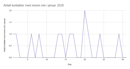
Jeg ville vite hvor ofte jeg ville ringe moren min, som bor i et annet land, i januar 2026.

Jeg ville vite hvor ofte jeg ville ringe moren min, som bor i et annet land, i januar 2026.
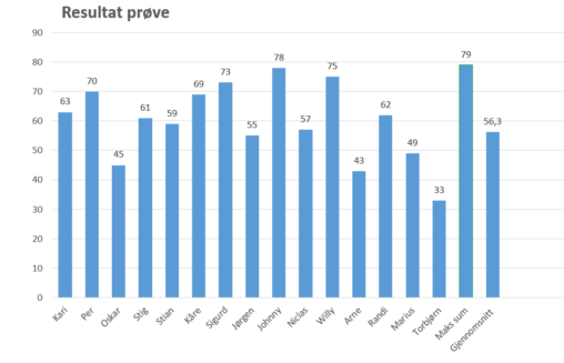
Ved å lage søylediagram er det lettare å sjå resultata fordelt på kvar elev. Ein ser bedre kor mange som er på dei ulike nivåa. Her er eg…
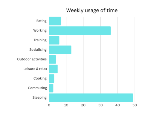
[link url=”https://www.canva.com/design/DAHCEmBUm2Y/q9tI3vXxlZ6gn_qEqbtudw/edit?utm_content=DAHCEmBUm2Y&utm_campaign=designshare&utm_medium=link2&utm_source=sharebutton” text=”Weekly report of time”
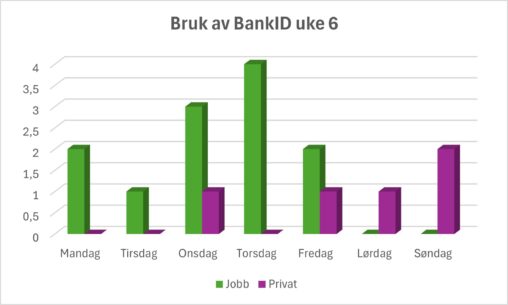
Grafen illustrerer hvor ofte jeg har brukt BankID for å utføre oppgaver i uke 6 i år. Oppgavene er skilt på private gjøremål og jobbrelaterte aktiviteter.
Kvart år tilbake til 2006(ikkje vist i bilete) har min sambuar og eg ført dagbok for det daglege arbeidet i garden som vi driv. Dette er vikitg data…
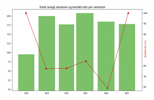
Visualisering av hvor mange som fullførte emnet ‘DIGI110 Fantastiske data’ ved Universitetet i Bergen fra og med høsten 2022 til og med våren 2025, og hvor stor andel…
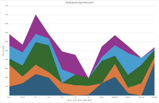
Har samlet data over ferdigstilte strikkeprosjekter i løpet av de siste 5 årene og ville se på om det var perioder i året jeg har strikket mer enn…
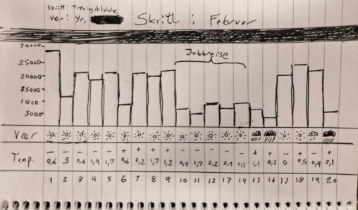
The chart shows my average daily steps in the time period February 1st to 20th, 2026. This is juxtaposed with the average temperature for the given day, as…
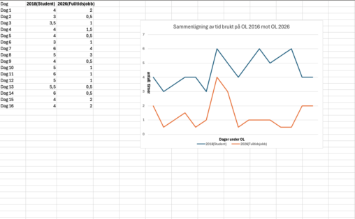
This visualization shows an approximate comparison of the number of hours I spent watching the 2018 and 2026 Olympic Games, measured in hours for each edition of the…
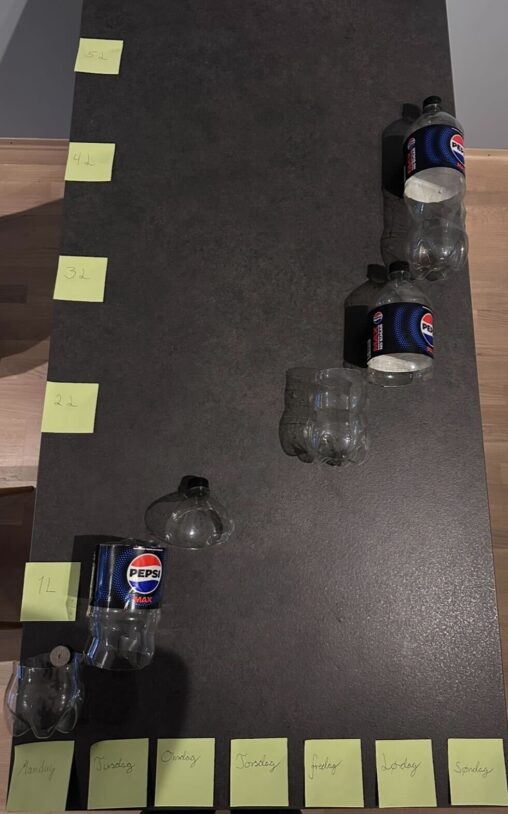
This is an visualisation of Pepsi Max consumption for a week in february 2026. The x-axis shows time (in days), while the y-axis shows consumption (in liters). The…
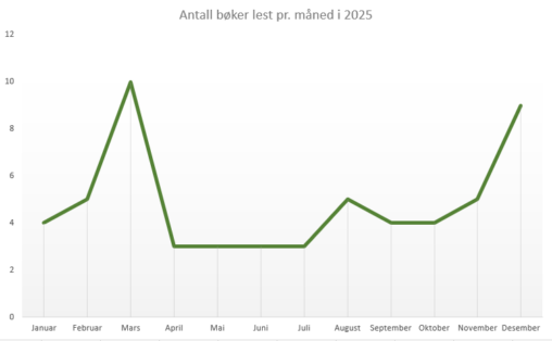
Diagrammet viser antall bøker jeg har lest per måned i 2025. Data er hentet fra min personlige profil hos Goodreads.
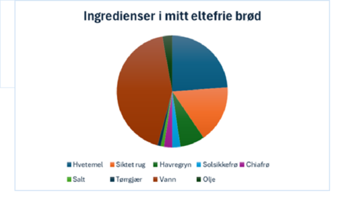
Visualisering av mengdeforhold mellom ingrediensene i brødene jeg baker
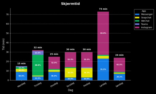
Diagrammet viser data over skjermtid på mobil for ulike apper i løpet av en uke. Tidene er hentet fra mobilen for de respektive dagene og registrert i et…
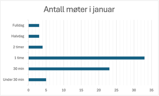
Oversikt over alle møter på jobb i janaur 2026. Data er hentet fra min personlige kalender i Outlook.
Ingredienser til 2 brød
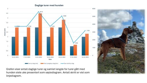
Har samlet data i uke 8 (16-22 februar) på følgende: – antall turer jeg har gjennomført med min hund – antall skritt jeg har gjennomført med min hund…