(page 84 of 154)
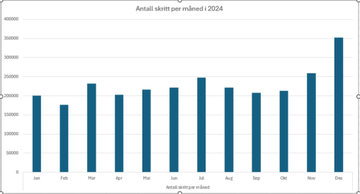
Grafen viser antall skritt jeg har gjennomført i 2024. Antallet er kalkulert ut fra min helse app på telefonen som oppgir gjennomsnittlig skritt per dag per måned. Videre…
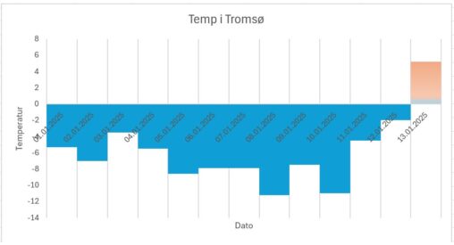
Snitt temperatur i Tromsø i løpet av Januar 2025 i (representert i grader Celsius). Data brukt i illustrasjon kommer fra sida yr.no. Temperatur økt med nesten 15 grader…
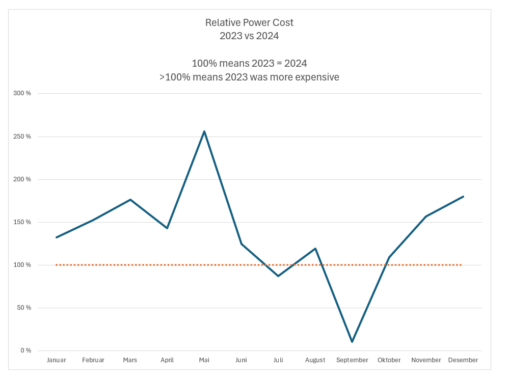
The figure shows the relative cost of power in my house. 2023 prices were historically high, and thus far there are only 2 months that were more expensive…

Dette er oversikt over min uke. hvor mange del av uken tar enkelte oppgavene. Det kan variere litt men dette er gjennomsnitt.
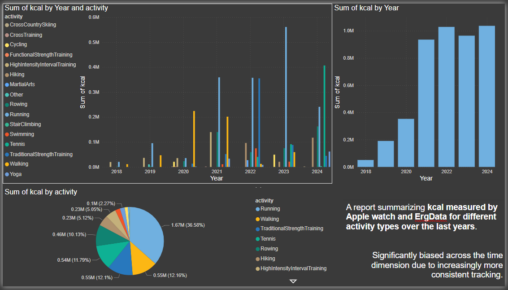
A report summarizing kcal measured by Apple watch and ErgData for different activity types over the last years. Significantly biased across the time dimension due to increasingly more…
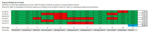
Farge på trafikklys på vei til jobb. Hensikten er å få korrigert oppfattelsen av at man “alltid” får rødt lys i trafikken, og sørge for at stressnivået blir…
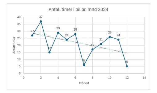
Bildet viser antall timer brukt i bil pr. mnd for 2024. Dataene er hentet fra appen til bilen: My BMW
When you live on the west coast of Norway, you get used to the fact that the summers are often cool. Then it becomes almost kind of a…
ChatGPT has taken many professions by a storm in the past year, and mine is no exception. While I mostly use my work account due to data privacy…
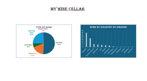
I am collecting wine, and the graphs show data from my cellar. First, it shows the % of different types of wine (red, white, rosé, sparkling, and dessert…
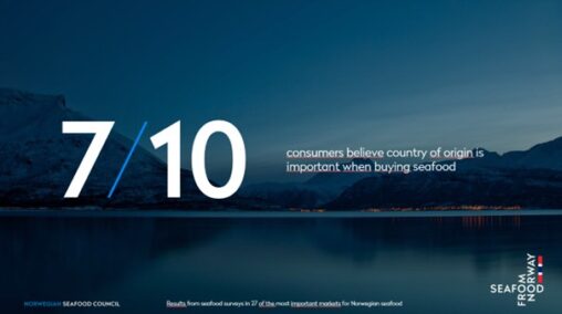
Undersøkelser fra de 27 viktigste markeder for norsk sjømat. Kilde: Norges Sjømatråd.
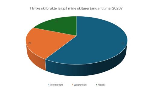
Jeg gikk mye på ski i perioden januar til mai 2023 og her er en oversikt over hvilke type ski jeg benyttet. Totalt var jeg på 90 skiturer…
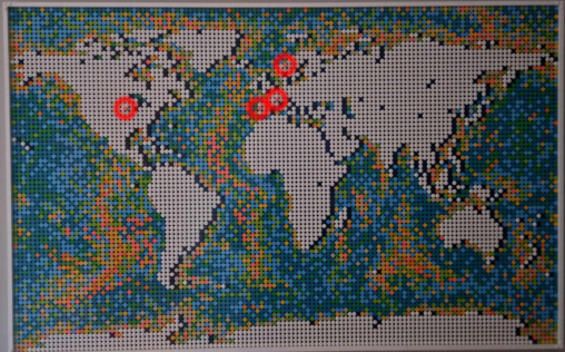
I built a Lego world map over the past year. It took me approximately 16 hours to finish. I have highlighted all the countries where I have lived…

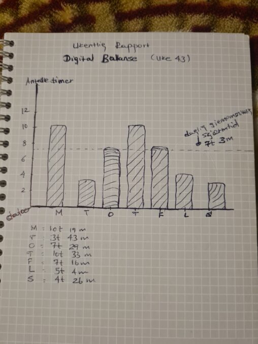
Her viser hvor mye skjermtid har jeg brukt hver enkelte dager i uke 43, og gjennomsnittlig skjærmtiden jeg har brukt.
Her viser hvor mye skjermtid har jeg brukt hver enkelte dager i uke 43, og gjennomsnittlig skjærmtiden jeg har brukt.

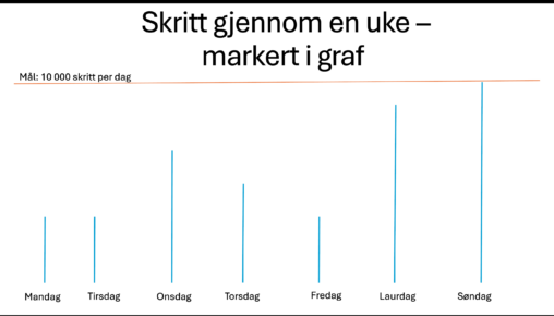
Mine skritt gjennom en uke: mål og realitet