
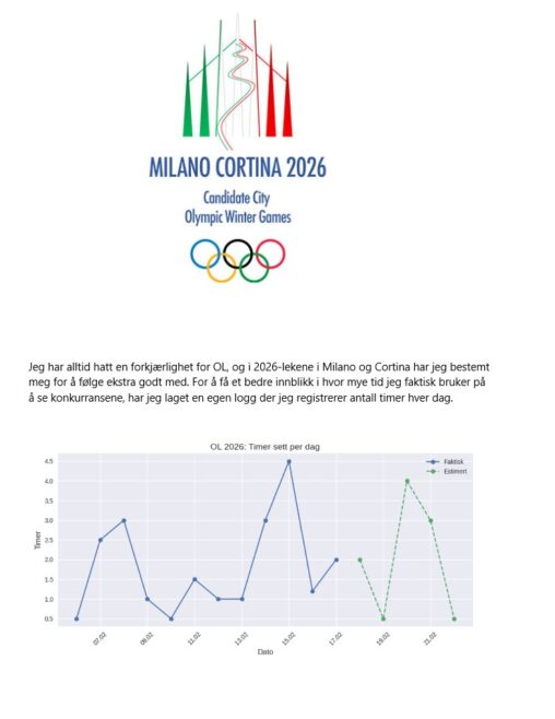
(page 8 of 157)
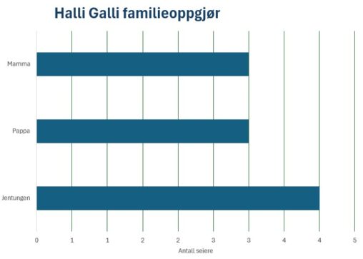
I helgen hadde vi familieoppgjør i spillet Halli Galli. Det er et spill hvor det er om å gjøre å reagere raskest. Vi voksne må øve litt mer…
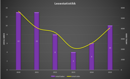
Diagram som viser hvor mange bøker jeg har lest per år over de siste 5 år, samt en representasjon over hvor mange sider dette tilsvarer per år.
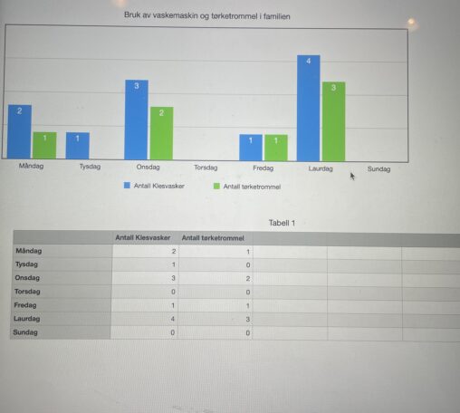
Dette viser kor ofte me bruker vaskemaskin og tørketrommel i veke 8.
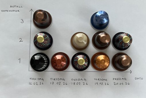
Visualiseringen viser antall kaffekopper konsumert i løpet av en arbeidsuke. Data ble samlet inn fra og med mandag 16.02.26 til og med fredag 20.02.26. Hver Nespressokapsel illustrerer én…
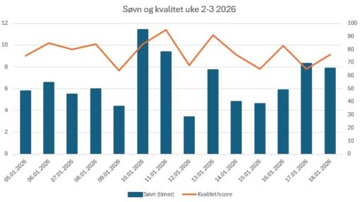
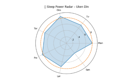
Har hentet ut data fra Apple Watch på søvnmengde per dag, og helse appen gir en rating på søvnscore basert på tre kategorier; varighet – sengetid og avbrudd….

Jeg leste ti bøker i november, ti i desember og syv i januar

I’ve collected data from my Garmin-watch and made a vizualisation of the hours I was awake from 16-22 of February 2026
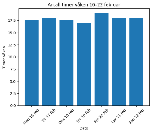
I have vizualied how many hours I was awake from 16-22 february 2026. I used data from my Garmin watch
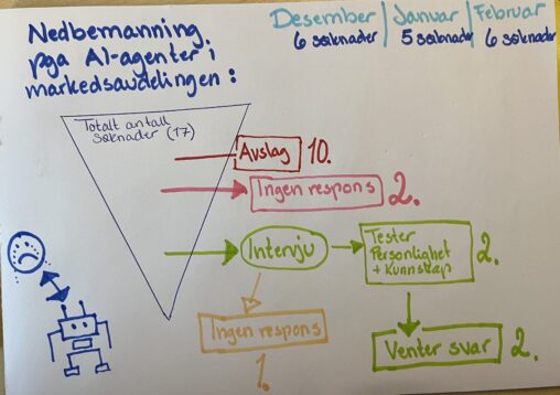
Beskrivelse av visualiseringen Visualiseringen viser min jobbsøkerprosess fra desember 2025 til februar 2026. Bakgrunnen er nedbemanning på grunn av AI-automatisering. Bildet følger 17 prosesser (enheter) fra kilder som…
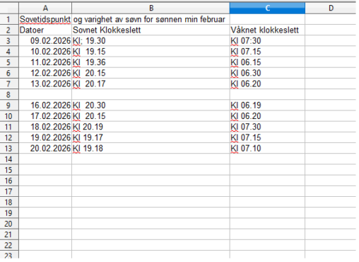
Her ser dere tidspunkter for når min sønn på 4 år sovnet noen dager i februar og når han sto opp. Ville se om han sto litt senere…
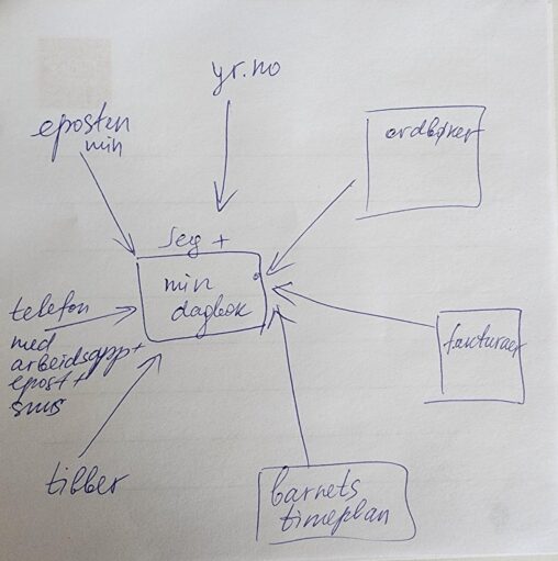
Min dagbok er i sentrum av mitt liv. Alt i mitt liv knyttet til data oppført enten i dagbok eller i telefon. Eller både og.
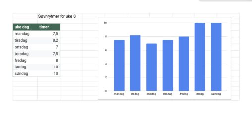
The data are my sleeping hours for week 8. I have gathered the data from my watch.
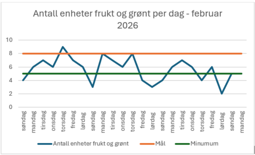
Grafen viser antall enheter frukt og grønt konsumert per dag i februar 2026. Målet er 8 enheter, minimum 5 enheter.
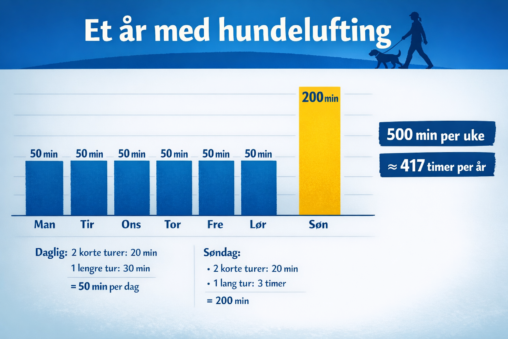
My one year walking the dog, hours anually spent. Put all my data into ChatGPT, promted it to make an visualization
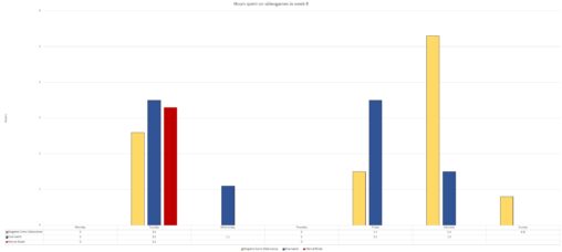
The grahs visualize the hours i have spent on different videogames throughout week 8. The unit of measurement is hours. Every coulured bar represent one of the games…
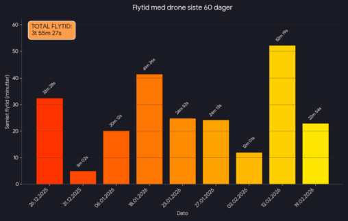
Grafen viser samlet flytid med pr dag i løpet av en 60-dagers periode. Samlet flytid for hele perioden viser også.
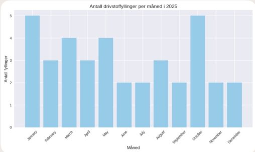
Antall Bensinfyllingar per månad i 2025. Fann data i nettbanken som viser datoane eg har fylt bensin i 2025. Skreiv datoane inn i Copilot og bestilte ei visuell…