
(page 55 of 160)
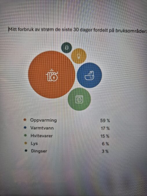
Her er det fremstilt strømforbruk i husholdningen fordelt på bruksområder i løpet av siste 30 dager. Figuren viser at største strømforbruket går til oppvarming av bolig.

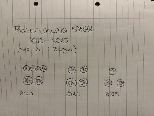
Prisutviklingen for bananer fra Kiwi årene etter jeg flyttet hjemmefra. Talle er hentet ut 21. februar fra enhver.no
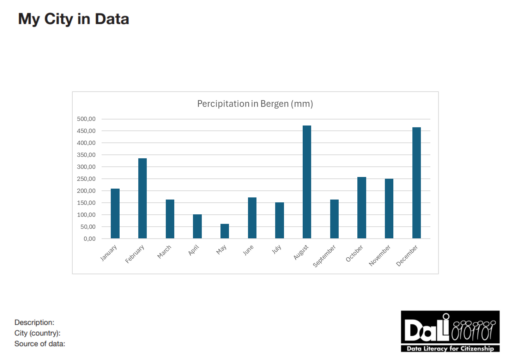
A visualization of the amount of Percipitation in milimeter in Bergen, Vestland, Norway in 2024 by month.
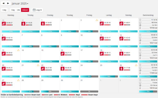
Dataene viser registrerte treningsøkter, treningsform, treningstid og intensitet.
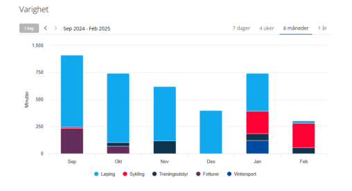
Visualisation of my training activities for the last 6 months. The activities are categorized into type of activity. Showing minutes trained per month.
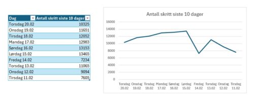
Dataen viser en oversikt over antall skritt jeg har hatt over 10 dager i perioden 11.02.25 – 20.02.25
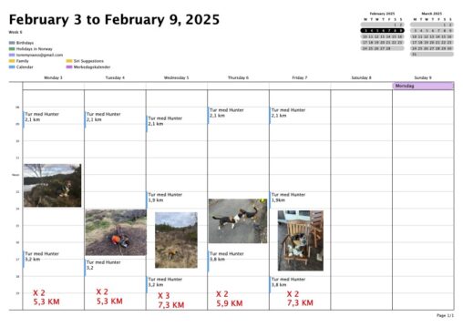
A weekly calendar where I have put down my walks with my dog. Here you find the time of day, the length of the walks, and how many…
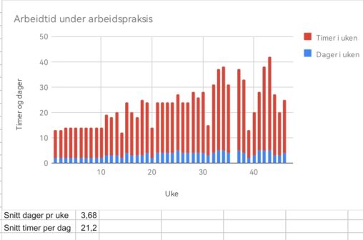
Antall timer i arbeidspraksis i regi av NAV, creative common licence, anonym
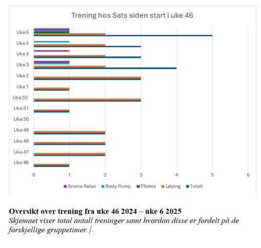
Oversikt over trening hos SATS for å sammenligne hva jeg har gjort mest av siden jeg startet. Oversikten viser også hvor mange ganger jeg har trent per uke.
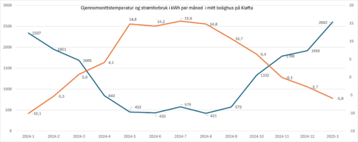
Gjennomsnittstemperatur er representert i Celsius grader pr måned. Strømforbruk representert i kilo Watt timer per måned
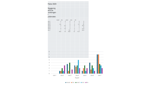
Dataene i tabellen viser antall timer hver dag i en uke som er brukt på møter i arbeidstiden. Deretter er tabellen gjort om til et stolpediagram. Ønsket var…
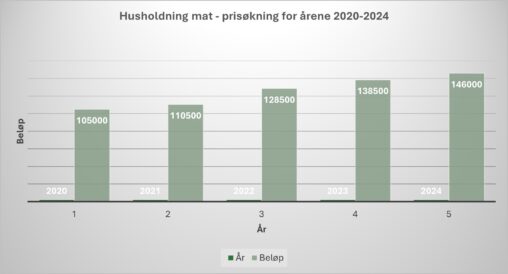
Stolpediagram som viser innkjøp av mat til familie på to og som samtidig til dels viser prisøkningen som har vært på matvarer i årene fra 2020 til 2024….
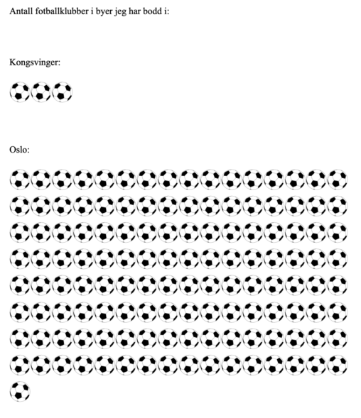
Open Clip Art Library (https://no.wikipedia.org/wiki/Fotball_%28ball%29#/media/Fil:Soccerball.svg)
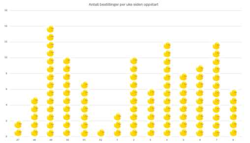
Ny jobb, nye muligheter. Hvor mange bestillinger er gjort på prosjektene mine per uke siden oppstart? Hvorfor må stolpediagrammer være stolper med farger? Why not ducks?
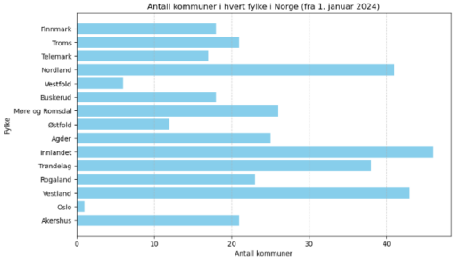
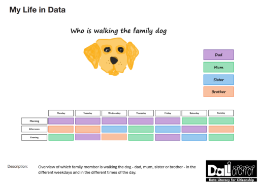
Table overview over who is walking the dog (dad, mum, son or daughter) the different weekdays and different times of the day (morning, afternoon, evening). The table shows…