
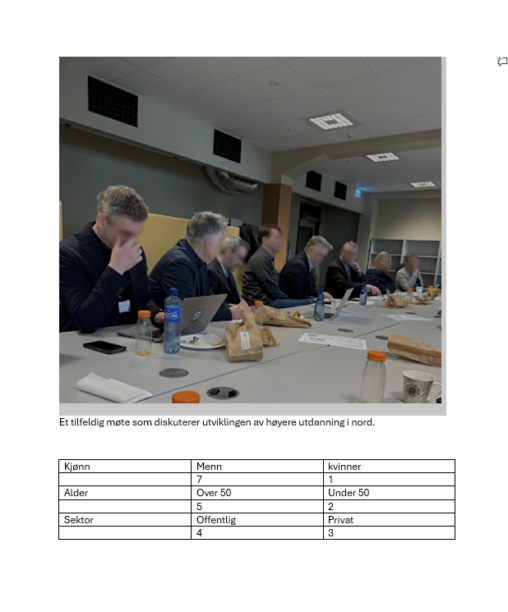
(page 5 of 157)
Enkel selvprodusert statistikk over gjester gjennom 30 år.
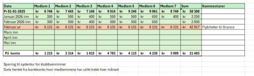
This represents an excerpt of the savings plan for a trip to for me and my friends. This overview is sent regularly to the members of the group…
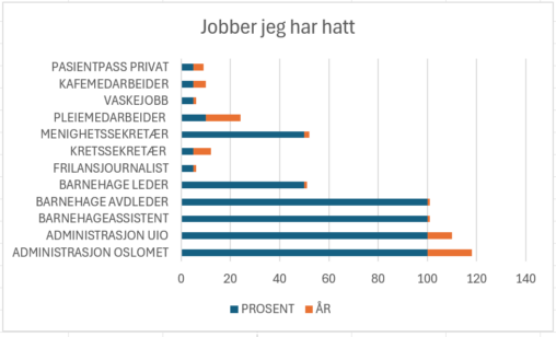
Dette stablede liggende stolpediagrammet viser ulike jobber jeg har hatt, omfang i prosent og lengde på jobbene i antall år.
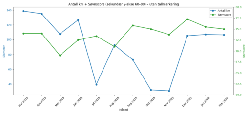
Visualiseringen viser månedlige data for løpte kilometer (km) og søvnscore for perioden mars 2025 til februar 2026. Kilometer er plottet på primær y‑akse, mens søvnscore vises på sekundær…
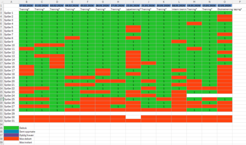
Visualiseringen viser antall treninger som 31 fotballspillere har deltatt på hittil i år. Navnene er fjernet og erstattet med Spiller 1, Spiller 2, osv. Dataene er hentet fra…
Denne visualiseringen representerer min treningsaktivitet i løpet av desember 2026. Dataene viser antall treningsøkter per uke, samt fordeling mellom ulike typer aktivitet (løping, styrketrening og hviledager) med fargelagte…
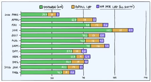
Grafen viser hvordan løpeturene mine har endret seg gjennom ett år. Vår og sommer i fjor var preget av økende mengde og lengre økter, mens høsten stabiliserte distanse…
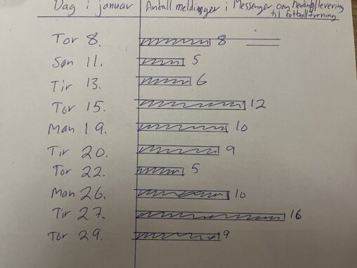
Antall meldinger registrert pr dag i foredregruppe i messenger om kjøring til og fra fotballtrening for barn
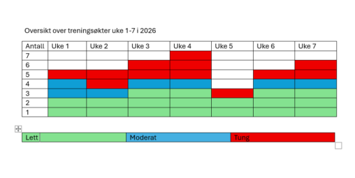
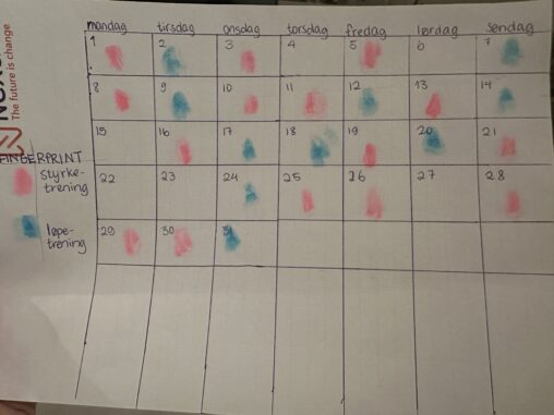
skjemaet viser mine treningsøkter uke 1-7, 2026 og intensiteten av disse. Det er data fra min hverdag som er satt inn i tabellen
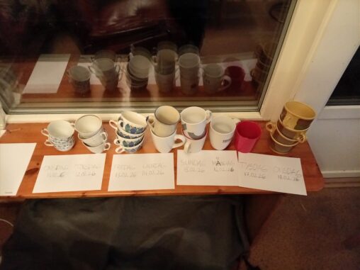
Illustrasjon viser talet på koppar som eg har drukke te i løpet av dagane, kronologisk: Frå onsdag den 11.02. (frå venstre side) til onsdag den 18.02.2026 (høgre side)…
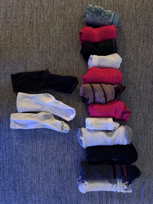
Samlet data fra klesvasken hjemme over en periode på én uke, kun to personer i husholdningen. Alle sokkene ble samlet og sortert etter vask, og registrert hvor mange…
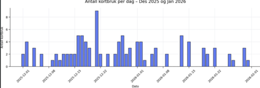
Took my account overview/transactions into a excel sheet, filter out only the transactions that represented physical use of my bank card. Generated a bar chart – most used…
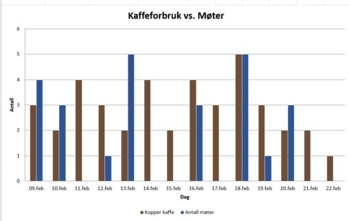
Antall kaffekopper pr. dag og antall møter pr. dag for å se om det drikkes mest kaffe på dager med mange møter, eventuelt motsatt. Antall kopper kaffe er…
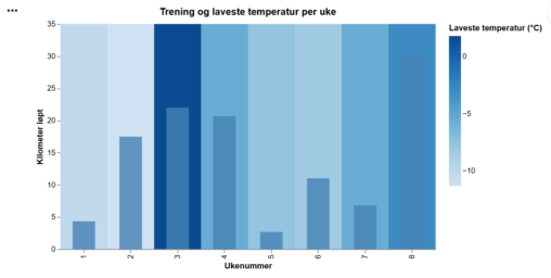
Number of kilometers run per week nr. Lowest temperature of the week in Bergen Norway in celcius visualized as heatmap. Source: Strava and yr.no
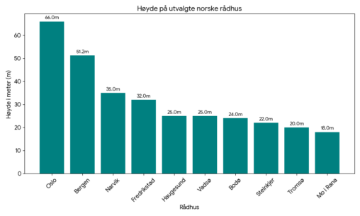
En oversikt over et utvalg norske rådhus, rangert etter høyde. Creative commons license.
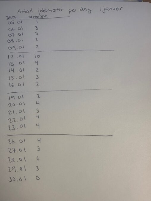
Bildet viser oversikt over alle arbeidsdagene i januar og hvor mange møter som var i kalenderen per dag. Adhocmøter ved kaffemaskinen er ikke inkludert.
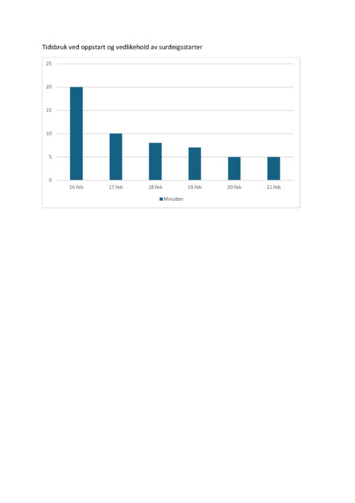
Visualiseringen viser hvor mye tid (i minutter) jeg har brukt på oppstart og stell av en surdeigsstarter over en peiode på seks dager i februar. Hver søyle representerer…