
(page 31 of 157)
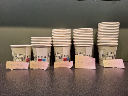
The data is represented through paper cups stacked on top of one another. It visually shows how many paper cups are being used during only one shift at…
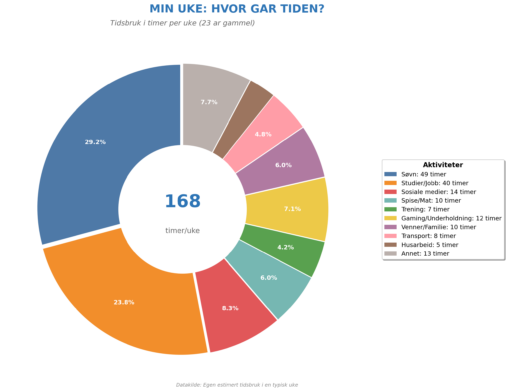
This donut chart visualizes my estimated weekly time distribution as a 23-year-old. The data represents how I spend my 168 hours each week across 10 categories: Sleep (49…
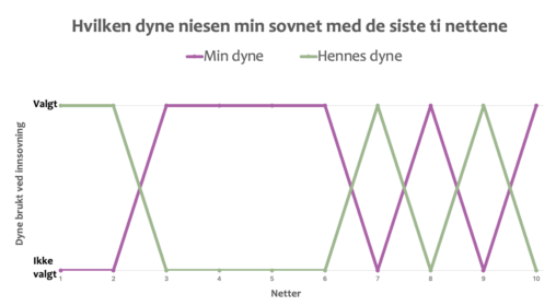
Diagrammet viser hvilken dyne min seksårige niese valgte ved innsovning de siste ti nettene. Valget står mellom hennes egen og min dyne, og visualiseringen viser at min dyne…
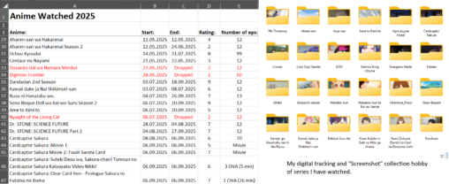
A small representation of how I track different series I have watched in 2025 by adding a start date, end date, rating and number of episodes. I have…
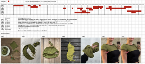
Visualiseringen viser hvilke tidspunkt på døgnet jeg har strikket, og hvor mange timer jeg har strikket i løpet av en dag og totalt i løpet av en uke….
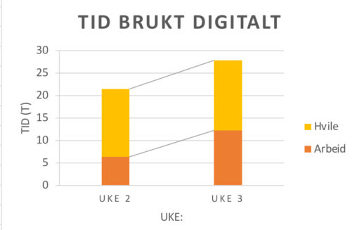
Denne visualiseringen viser hvordan min digitale skjermtid fordeler seg mellom arbeid og hvile over to påfølgende uker. Dataene er manuelt samlet fra ukentlig skjermtidsoversikt på mobil og kategorisert…
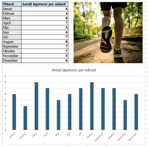
Søylediagrammet viser hvor mange joggeturer jeg hadde per måned i løpet av året 2025. Diagrammet viser dermed hvilke måneder jeg løp mye, og hvilke måneder jeg løp litt…
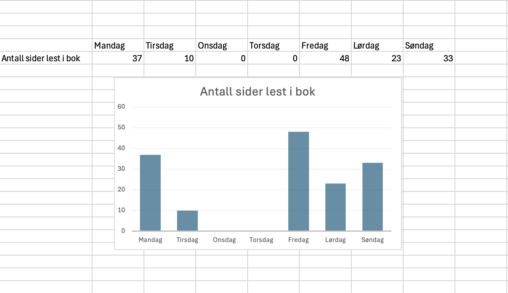
Visualiseringen representerer antall sider jeg har lest i en bok hver dag i løpet av én uke.
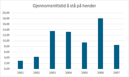
Jeg spurte 7 kvinner fra turnlaget mitt om de ville være med på å teste ut gjennomsnittstiden deres i å stå på hender ved tre forsøk. Jeg fikk…
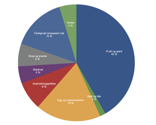
Prosentvis oversikt over hvilke type dagligvarer mitt hushold har handlet i januar 2026.
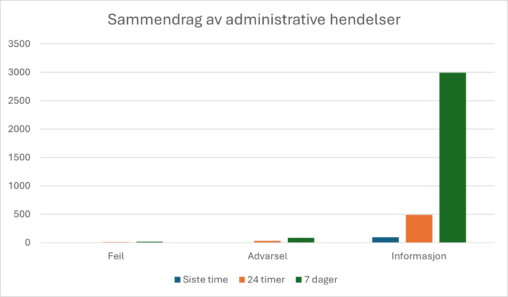
Administrative hendelser er en filtrert oversikt over hendelser hentet fra en rekke logger som datamaskinen holder oversikt over, fra blant annet system, applikasjoner, sikkerhet og oppsett. Den viser…
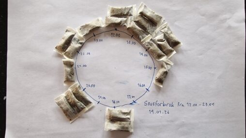
The individual pieces of snus represent the consumption of one snus. The snus are presented in columns for each hour of the day, in a circular pattern to…
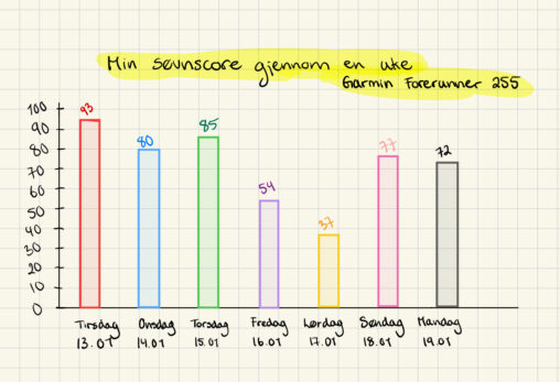
Tracking my sleep score over a week, based on the numbers I got each night from my Garmin Forerunner 255 watch.
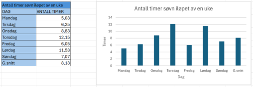
Antall timer søvn målt av en treningsklokke i løpet av en uke (Man-Søn), pluss et gjennomsnitt for uken.
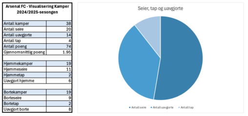
Arsenal FC – Visualisering Kamper 2024/2025-sesongen Antall kamper 38 Antall seire 20 Antall uavgjorte 14 Antall tap 4 Antall poeng 74 Gjennomsnittlig poeng 1.95 Hjemmekamper 19 Hjemmeseire 11…
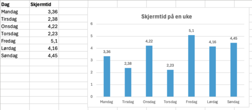
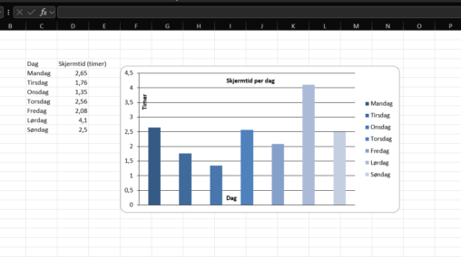
Bildet viser hvor mangen timer jeg brukte på mobilen min forrige uke. Vi kan se en økende trend fra fredag og til søndag, dette kan mye være på…
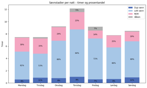
Et søylediagram som beskriver hvordan søvnen for hver natt i en uke er prosentvis fordelt i de ulike søvnstadiene (våken, lett søvn, dyp søvn og REM). Søvnen er…
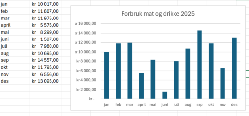
Månedlig forbruk på mat og drikke for året 2025 som student. Norske kroner som valuta.
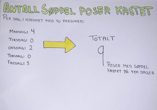
Dataene er samlet gjennom egne registeringer for antall søppel poser kastet per dag i fem dager, med to personer i husstanden. Visualiseringen viser hvor mange poser søppel det…