
(page 24 of 157)
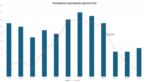
Treningstimer og gjennomsnittstemperatur per mnd. i 2023.
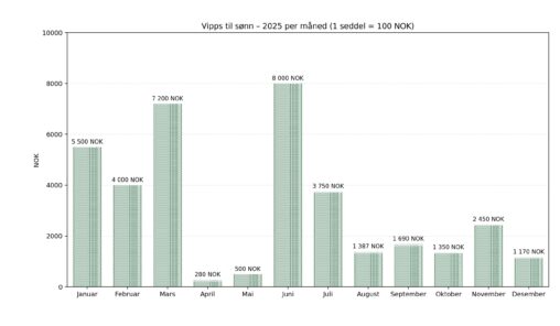
Instant money transfer by Vipps makes it easy to transfer money quickly and on demand in Norway. I wanted to know how much money I have sent to…
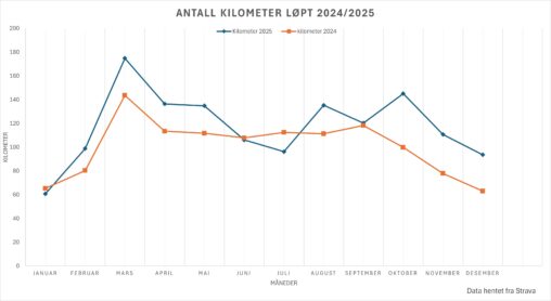
Denne grafen viser månedlig løpedistanse målt i kilometer for 2024 og 2025. Dataen er hentet fra registrerte løpeaktiviteter i Strava. For 2024 dekker tallene perioden fra 1. januar…
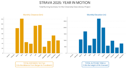
A visual depiction of my running stats for 2025 focused on distance and elevation. Also includes a comparison of relative distance and height comparing my totals to Mt…
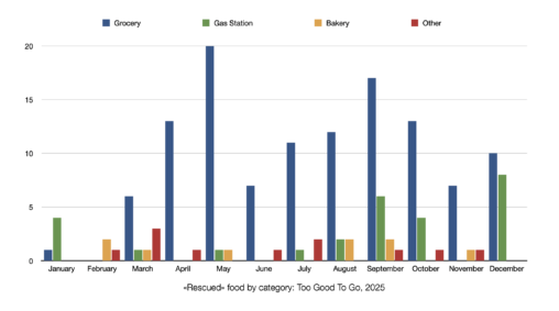
This graph shows the month-by-month journey of food saving in 2025. You can see how much food was ‘rescued’ through the Too Good To Go app, split into…
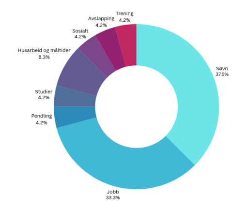
Figuren viser en grafisk representasjon av hvordan jeg disponerer tiden min på en gjennomsnittlig hverdag.
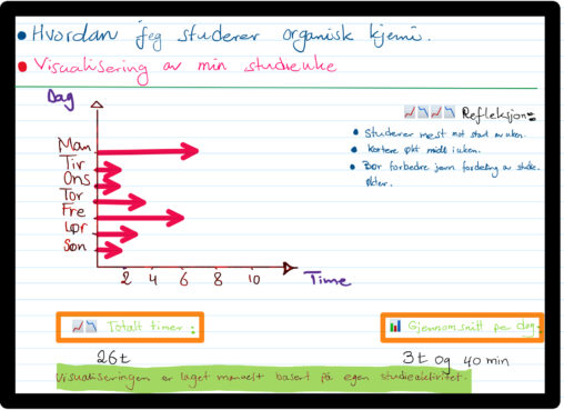
This data visualization shows how many hours I studied organic chemistry during one week. The data represents my personal study activity measured in hours per day from Monday…
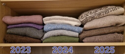
The picture shows my knitting production over the last three years – mainly sweaters for myself.
The drawing visualizes the dates for training outdoors with my neighbors in the period September 2025 to January 2026. I started with my Strava app to see when…
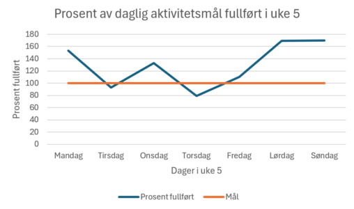
Diagrammet er laget i Excel basert på målinger gjort av ei pulsklokke. Aktivitetsmålet er beregnet av klokken, og aktivitet jeg gjennomfører registreres i løpet av dagen og beregnes…
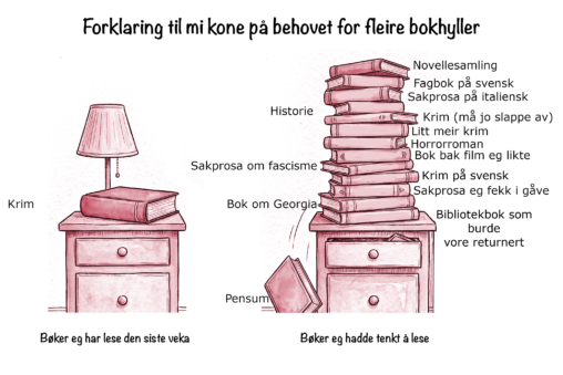
Samla saman bøker eg hadde liggande på og ved nattbordet (og i eit par høve på lesebrett), til saman 15, og bøker eg faktisk har lese den siste…
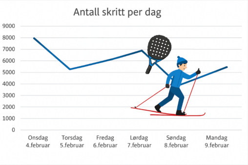
Data om antall skritt hver dag er hentet fra treningsklokken min. Jeg har lagt inn disse dataene Excel og deretter brukt Copilot til å visualisere tabellen med ikoner…
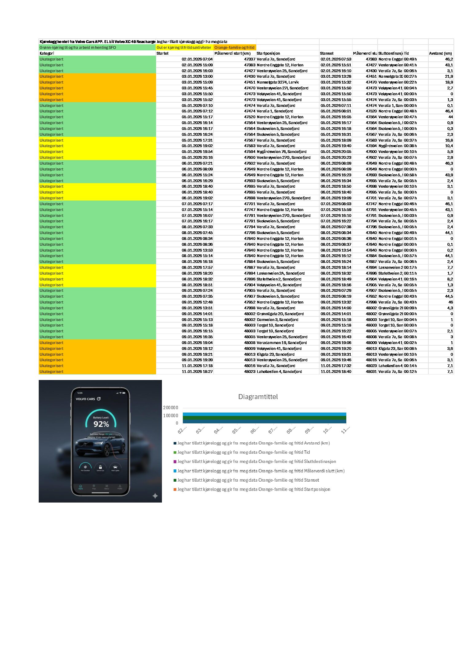


Jeg har tillatt kjørelogg i min Volvo app for mitt elektriske kjøretøy. Eksportert til excel og sortert og fargekodet jobb kjøring, fritidsaktiviteter (sport) og fritid.
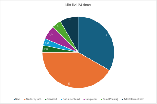
Denne visualiseringen viser hvordan en vanlig hverdag i mitt liv kan representeres gjennom data, fordelt over et døgn på 24 timer. Diagrammet er basert på egen estimering av…
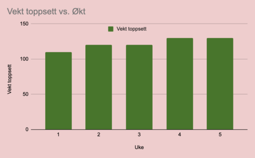
Dette gir et innblikk i hvor mye progresjon som foregår på det tyngste og viktigste i beinprogrammet, slik at man kan få en forventning om hva som kan…
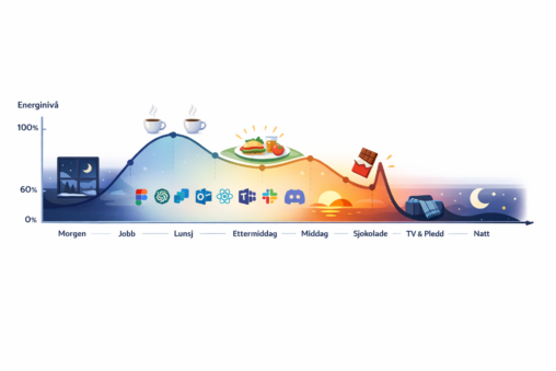
This is a conceptual, slightly humorous data visualization that uses a time-based energy curve and visual markers to communicate patterns and perceived flow, rather than precise measurement. Made…
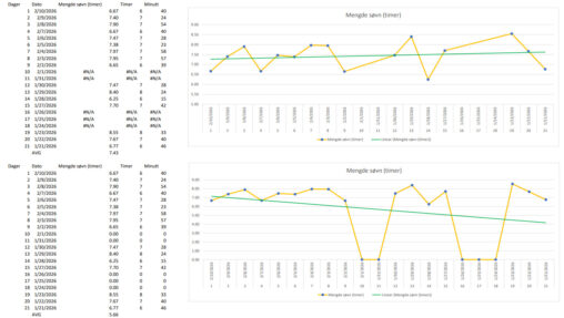
Data collection: table with sleep record for 21 days Data preparation: nights not wearing watch provided 0 hrs and minutes which in return showed false trendline, avg. (average)…