
(page 21 of 157)
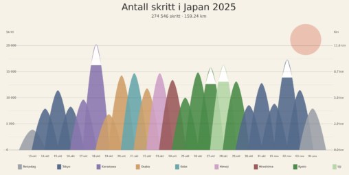
Denne visualiseringen representerer antall skritt registrert i Helse-applikasjonen på min iPhone under ferien min i Japan, fra 13. oktober til 4. november 2025. Dataene ble først samlet og…
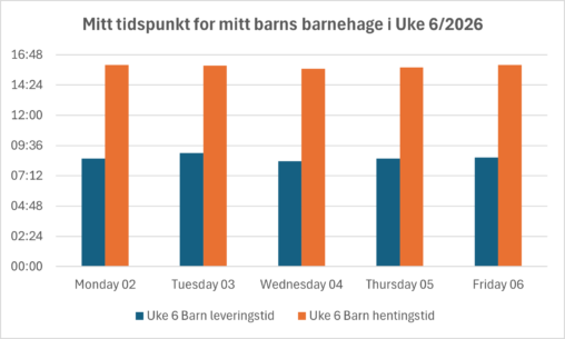
Visualiseringen viser min handlinger som forelder ansvar knyttet til barnet mitt i uke 6 av 2026. Bildet ble utviklet av excel inndre software etter jeg ga den min…
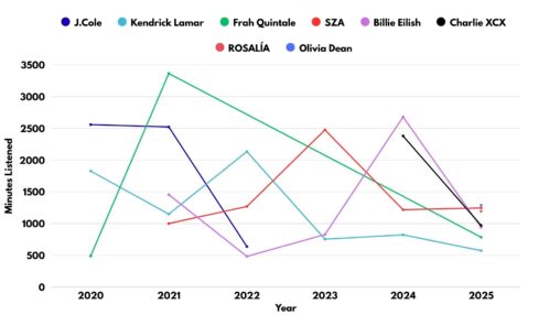
Data from Apple Music’s Replay service allowed me to graph the minutes listed to my favorite artists over the past 5 years.
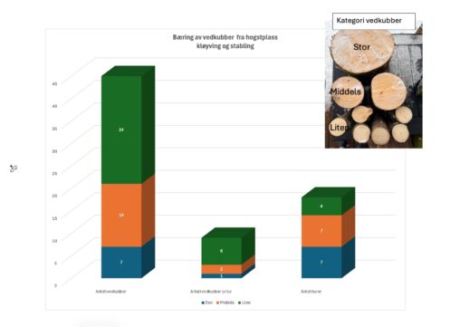
Bildet viser antall turer med bæring av vedkubber fordelt på kategorier av vedkubber. 1 stor vedkubbe = 1 tur 2 mellomstore vedkubber = 1 tur 6 små vedkubber…
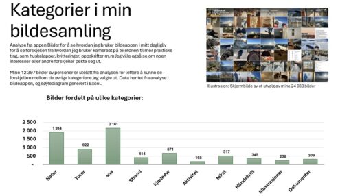
A presentation of the different categories of photos on my Iphone. Data is collected from my photo collection on my Iphone and the datas in the analysis are…

Klæbo skiatlon 20 km VinnerLøp Slutt Tid 46.11.0 Dato 10 Feb OL 2026 Italia
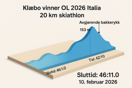
Klæbo skiatlon 20 km VinnerLøp OL 2026 Italia Dato 10 Feb 2026 Italia Slutt Tid 46.11.0
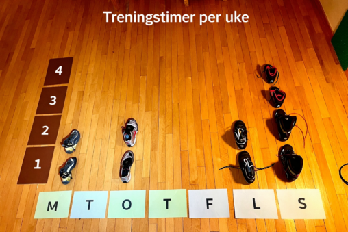
Dette er en visualisering av hvordan en vanlig treningsuke ser ut i vinter. Det er et stolpediagram der x-aksen er ukedager og Y-aksen er antall timer per dag….

Books read by me from january to desember 2025 Iam the owner -14,02,2026
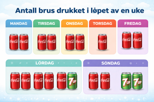
The amount and type of soda consumed by me each day for one week. Used chatGPT to make the image
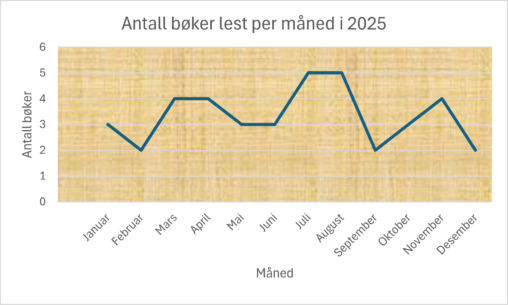
Eget produsert og visualisert data basert på hvor mange bøker jeg har lest i løpet av 2025, fordelt per måned. Målet var å vise utvikling over tid
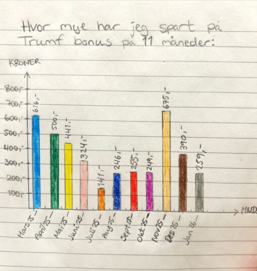
Trumf bonus spart for hver måned fra mars 2025 til januar 2026. Data tilgjengelig gjennom Trumf appen og nettside, og viser hvor mye man spare pr. handel hos…
Jeg har produsert og visualiserte hvor mange bøker jeg har lest i løpet av 2025, fordelt per måned. Målet var å vise utvikling over tid. Produsert av Isabel….
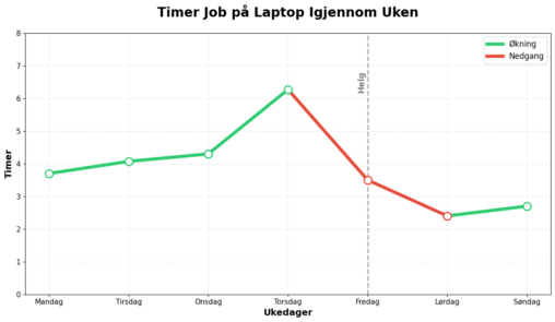
Grafen er en visualisering skjermtiden jeg har hatt på laptopen min den siste uken. Den gir et godt bilde av hvor mye jeg har arbeidet med studier, siden…
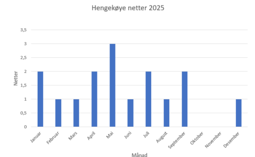
Dette bildet viser en oversikt over hvor mange overnattinger jeg hadde i hengkøye i 2025.
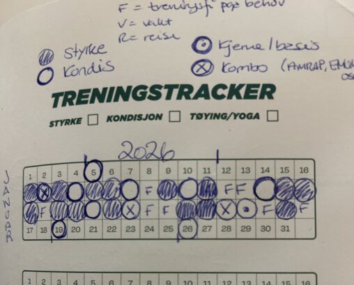
Jeg var ikke fornøyd med mulighet for logg på min pulsklokke, fikk ingen bra oversikt over uke/måned på antall og type økter. Har derfor en analog avkrysning i…
Dette er mitt eget ark som jeg lager når jeg strikker noe for å han kontroll på hvor jeg er i mønsteret. Strikkeoppskrifter som sier øk etter 2…
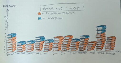
Her er ei oversikt over bøker eg las i 2025, visuelt framstilt i form av bokstablar fordelt på skjønnlitteratur og sakprosa pr. månad. Dei blå bøkene er sakprosa,…