
(page 2 of 157)
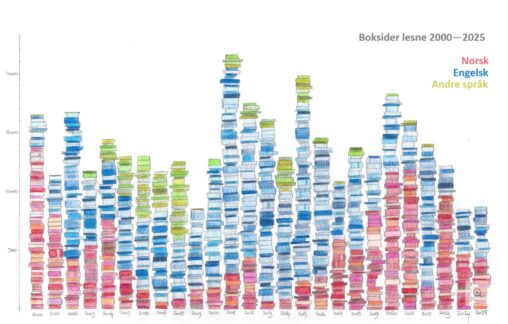
Tal på boksider eg har lese kvart år frå 2000 til 2025 i søylediagram. Tala er henta frå boklista mi. Fargane representerer kva språk sidene var skrivne på.
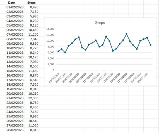
Denne datavisualiseringen viser antall skritt jeg gikk hver dag i løpet av februar 2026. Dataene er målt i antall skritt per dag og representerer daglig fysisk aktivitet over…

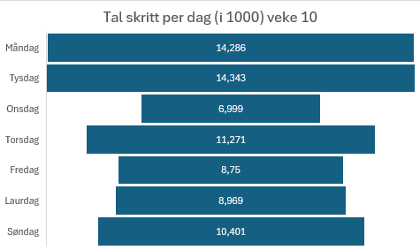
Tal på kor mange steg eg gjekk per dag forrige veke. Henta frå “helse”-appen på min Apple Watch. Eg har valt å presentere tala i 1000.

tid spilt på videospill siden 2026 per uke. datn kommer fra min steam bruker
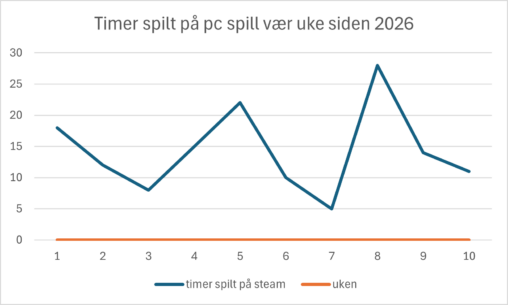
hours spent playing games per week since 2026 the date is for my steam aounct
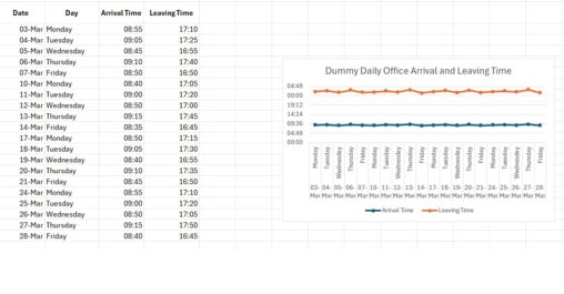
The purpose of this visualization is to illustrate patterns in a normal working routine across one month. Each data point represents a single workday, allowing comparison between arrival…
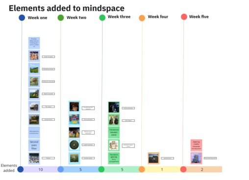
I have been developing a mental landscape with places, characters, and features to assist me in my cognitive functioning. This graph shows the elements I’ve been adding week…
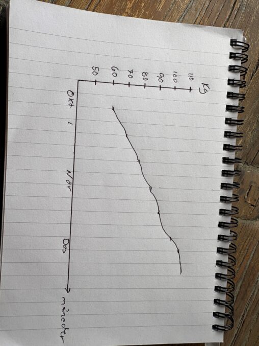
Dette er min vei til å nå over 100KG i benkpress. Startet med å teste på 60kg, men kom ganske raskt opp til 100kg på rundt 3 måneder…
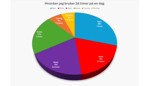
Visualiseringen viser at ila 24 timer, sover jeg mest (skulle gjerne vært 1 time lengre også, menmen), og er ganske sosial. Det verste jeg har på døgnet, er…
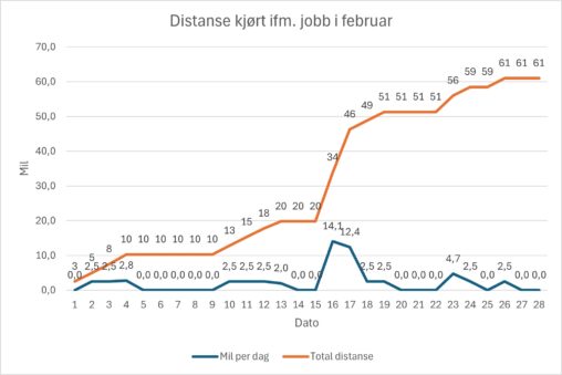
The data visualization show the distance I travelled by car for work-related duties during February. The graph shows distance per day as well as accumulated distance through the…
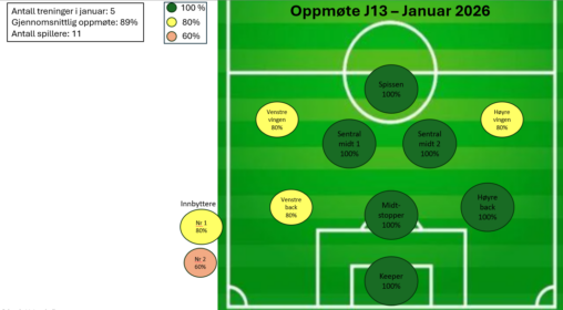
Dataene er samlet inn fra Spond (en app vi bruker for påmelding til kamper og treninger) og dataene er bearbeidet og anonymisert i Excel. Jeg valgte å bruke…
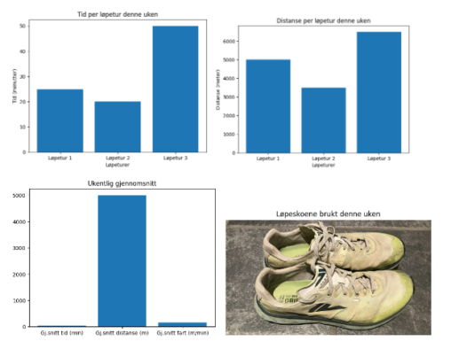
I denne visualiseringen presenterer jeg mine løpeturer for denne uken, hvor lang tid jeg brukte på hver av dem og distansene jeg løp på hver tur, samt gjennomsnitts…
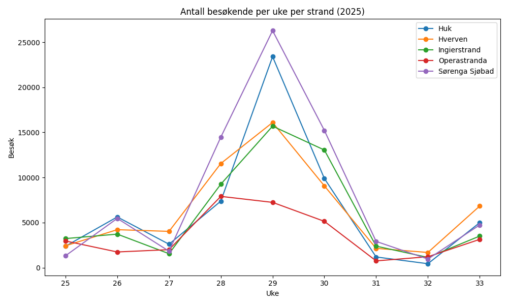
Grafen viser gjennomsnitt antall besøkende badegjester på de fem forskjellige strendene; Sørenga, Opera, Huk, Hverven og Ingierstrand.
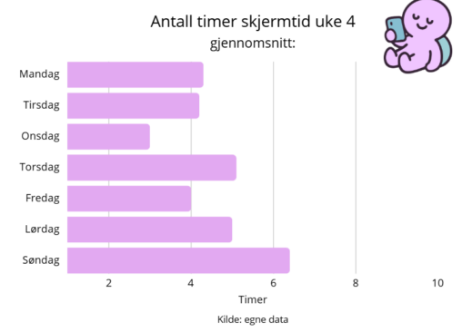
Oversikten viser alle dagene i uken og hvor mye skjermtid jeg hadde de gitte dagene. X-aksen representerer antall timer per dag og y-aksen representerer hvilken dag i uken…
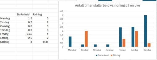
Visualisering av hvor mange timer brukt på stallarbeid i forhold til antall timer til ridning ila en uke.
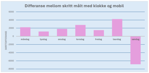
Eg har teke utgangspunkt i skritt-målingane mine for ei veke. Dei fleste dagane viser klokka fleire gåtte skritt enn mobiltelefonen. Søndag gjekk klokka tom for batteri… 🙂 Dagar…
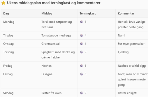
The table shows a typical week of dinners in our family. Over the course of a week, the children in the family have given a dice roll and…
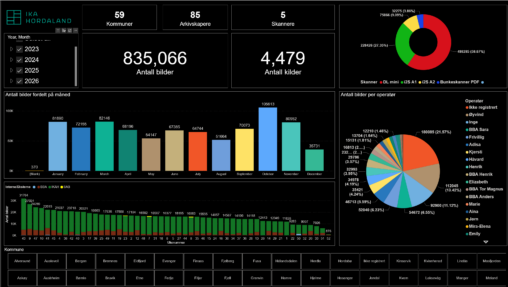
Dette er en visualisering av data over produksjon i kulturarv digitisering gjennom tid. Den gir en oversikt over antall bilder, kilder som er skannet, hvem som er operatør…