
(page 136 of 157)

text=I have made a diagramme to visualize what a student’s life can contain. As you can see, stress and discipline is a big part of it.
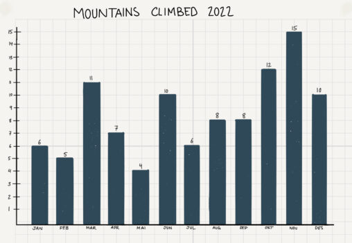
This graph shows how many mountains I climbed each month in 2022, as part of my project to complete 100 hikes in a year.
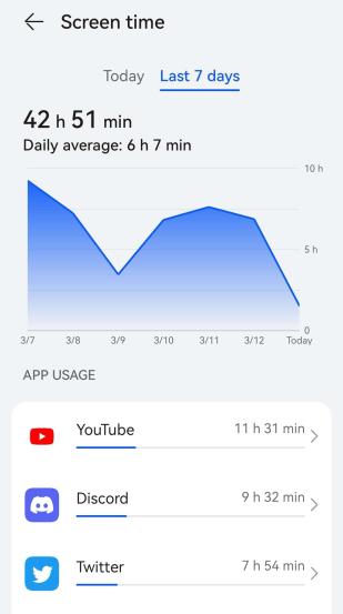
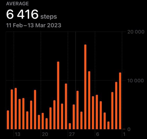
This image shows my screentime from March 7th to March 13th, 2023. The numbers displayed are quite frankly terrifying! I must admit I didn’t know I was this…
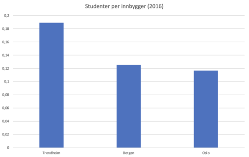
Grafen viser antall studenter per innbygger for, Oslo, Trondheim, og Bergen. Kilde: Statistisk sentralbyråd (2016)
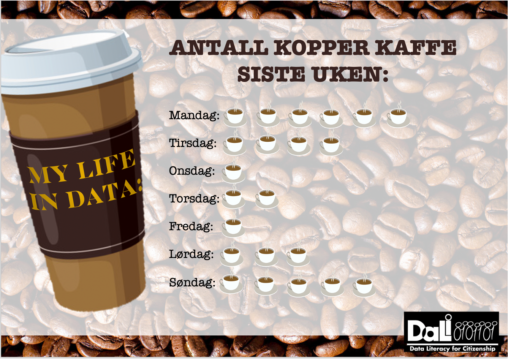
In the image, data from my own life is represented by looking at the number of cups of coffee I have drunk in the last week. This is…

Viser hvordan jeg dag for dag bruker mobilen og hva dette utgjør totalt i løpet av en uke. Man kan se at forbruket fordeler seg jevnt gjennom uken.
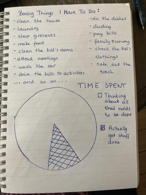
A visual representation of the boring stuff that needs to be done in a family life.
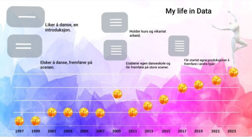
This is a data visualization of what role dance played in my life from year 1997 to start of 2023. The data shows how the role changed throughout…

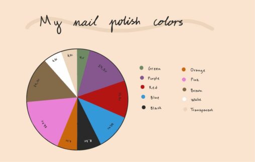
This pie chart shows my nail polish colors by percentage of my total amount of nail polishes.
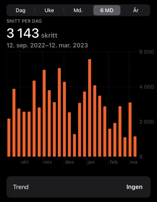
The diagram shows the average number of steps I have taken over the past 6 months. We see in January that more steps were taken than usual. It’s…
Using the health app on the iphone I am able to track the amount of steps I take each day. The bar chart shows the amount of steps…
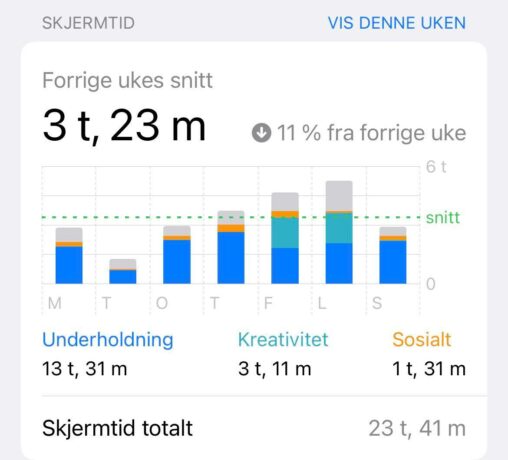
The data shows total time spent on my phone last week (week 10), collected using iphone’s software. The data shows 13 hours and 31 minutes spent on “entertainment”,…


Screen time average over a week representented as a bar chart with every individual day represented and how time was spent each day on various types of apps…
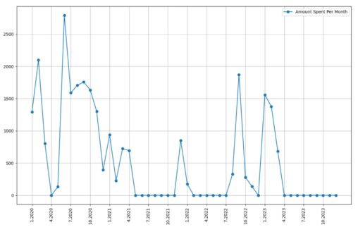
shopping data downloaded from Trumf. Each point represents a month with the Y-axis representing how much I spent in that month. Plotted using python. Funnily, it shows when…

A coarse-grained pie chart depicting a typical day of the week for an anonymous student.
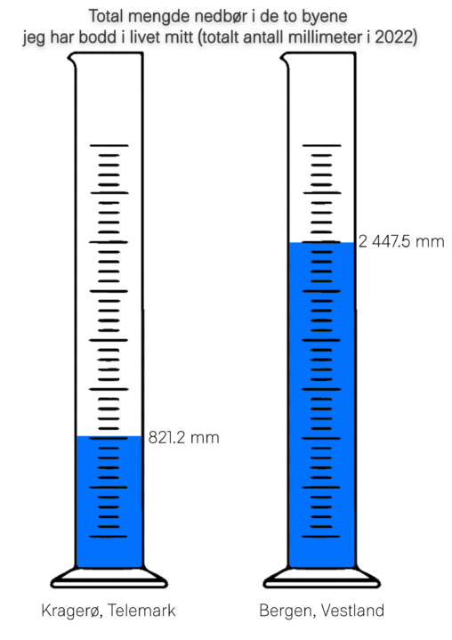
Comparison for the total rainfall in 2022, between the two cities Kragerø and Bergen, the two cities I’ve lived in my life
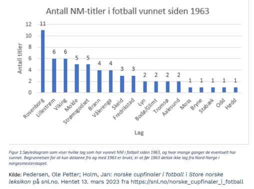
Søylediagram som viser hvilke lag som har vunnet NM i fotball siden 1963, og hvor mange ganger de eventuelt har vunnet. Begrunnelsen for at kun dataene fra og…