
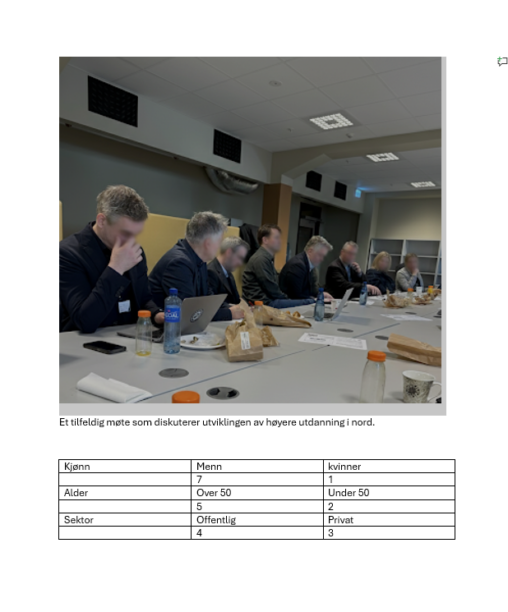
(page 13 of 157)
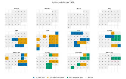
I wanted to find out how much the cabin we bought mid may 2025 was being used all 2025 to check if we got money for value of…
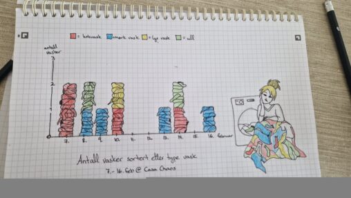
Antall ganger vaskemaskinen ble kjørt i huset vårt i perioden 7.-16. februar 2026, fordelt etter type vask. Håndtegnet.
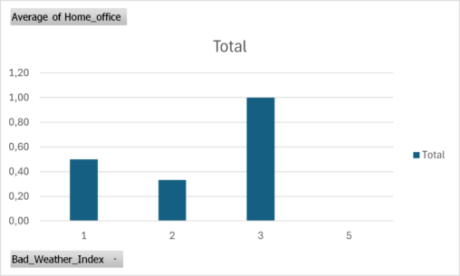
Pivot-table showing the number of home office days compared to a bad weather index that I calculated using data from Yr.no.
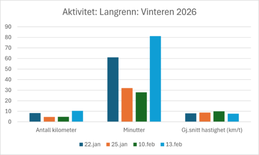
Graf som viser lengde, tidsbruk og gjennomsnittsfart på langrennsturer jeg har hatt hittil i år. Dataene er samlet inn via Garmin-klokke og visualisert i Excel.
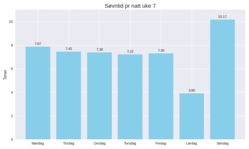
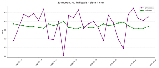
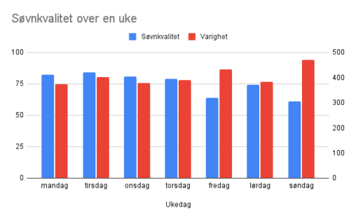
Oversikt over søvnen i uke 7. Data er hentet ut fra Garmin klokke, og deretter laget et diagram med hjelp fra Copilot.
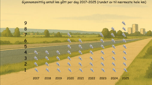
This data visualisation illustrates my average number of kilometres walked per day as registered by the health app on my Apple iPhone from 2017 to 2025. The actual…
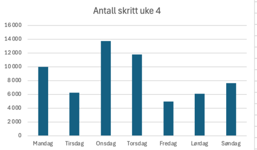
Oversikt over antall skritt jeg har gått per dag i uke 4. Dataene er registrert av en app på telefonen, deretter lagt inn i excel som laget et…
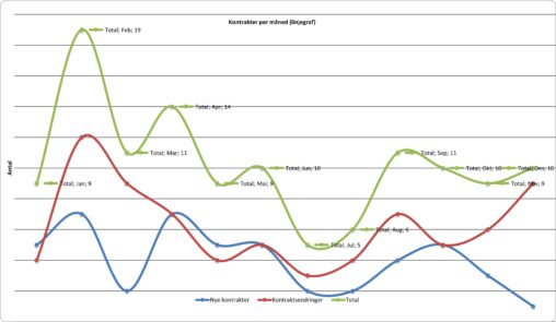
Grafen viser månedlig kontraktsaktivitet fordelt på inngåelse og signering av nye kontrakter, kontraktsendringer og total aktivitet. Totalt volum drives både av nye kontrakter og endringer, som følger et…
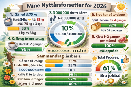
I have set five different New Year’s resolutions for 2026. I have collected data to evaluate my current progress. The illustration presents my goals and statistical percentages showing…
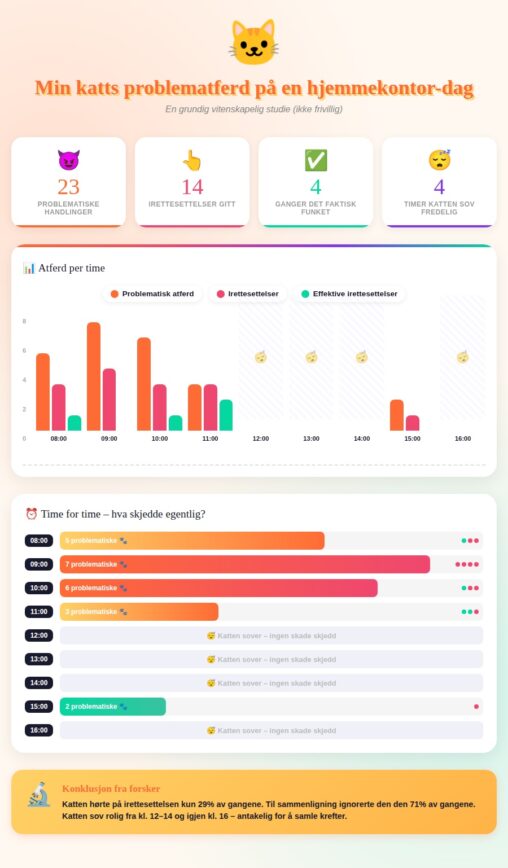
This project visualizes data collected on my cat’s disruptive behavior during a single work-from-home day. It tracks hourly incidents of misbehavior, how often the cat was scolded, and…
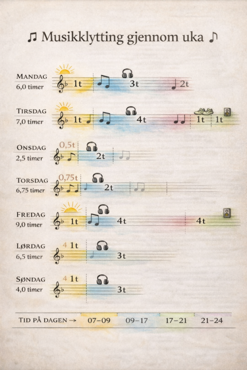
Jeg lytter mye til musikk, både på morgenen, på jobben, mens jeg trener og på ettermiddag og kveld når jeg har fri. Musikk er en stor del av…
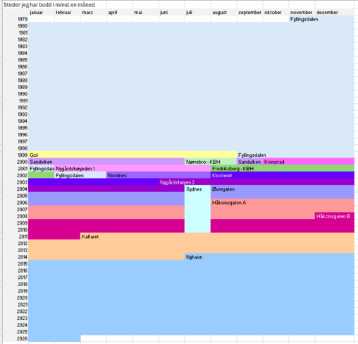
I have created I timeline for places I have lived for at least a month. I have colour coded the different abruptions, and also tried to use a…
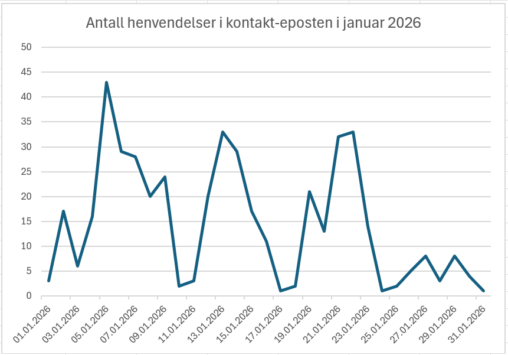
Linjediagram som viser antall henvendelser til en kontakt-innboks ved et universitet i januar. Visualiseringen kan blant annet brukes til å si noe om når det er mest aktivitet…
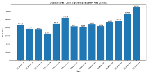
Beskrivelsen er en oversikt over antall skritt jeg har gått i uke 5 og 6 2026. Skrittene er registrert på Min Garmin Venu 4 klokke. Jeg registrerte dette…

Jeg har alltid hatt en forkjærlighet for OL, og i 2026 lekene i Milano og Cortina har jeg bestemt meg for å følge ekstra godt med. For å…
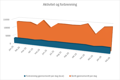
Grafen viser gjennomsnittlig daglig skrittmengde og daglig kaloriforbrenning for perioden januar 2025-februar 2026. Dataene er registrert gjennom smartklokke, hentet ut gjennom Polar Flow, og visualisert i Excel.