(page 126 of 160)
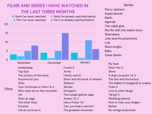
This graph shows how many films and series I have watched in each month from November 2023 to January 2024. It also shows how many of them were…

These are some of the artist I’ve been listening to over the last few weeks, accompained by my favourite discography of each one
These are some of the artists I’ve been listening to over the last few weeks, accompained by my favourite discography of each one.
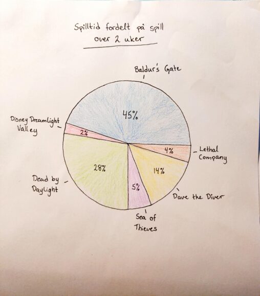
Diagrammet viser min spilltid på steam de sisto to ukene. De ulike spillene er gitt i prosent basert på hvilke spill jeg har brukt mest/minst tid på. Dataene…

The csv data is provided form my garmin fenix 5 sapphire watch by using Garmin Connect and illustrates the increase in average heart rate per km. The graph…


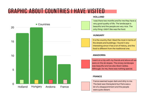
This is a graph about the countries I have visited and the reason for the score #RICT2223
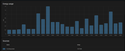
This image shows a bar graph where each bar represents 1 hour of time, and the value that the graph is showing is how much kWh my oven…

Produksjon av straum frå mitt solcelle anlegg. Datavisualiseringen av produksjon er frå ei veke i oktober 2023 og frå heile året 2023.Visualiseringen viser at produksjonen varierar sterkt med…
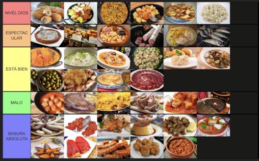
In this graphic there are classified in a subjective way some of the most famous Spanish food

This circular graph shows the hours I spend in my apps in one day. The time I spend on spotify is just listening to music without using the…

In this image you can see a grafic about how much I listen to the 13 songs of the album “Crybaby” by Melanie Martinez.
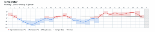
The graph shows the temperatures in Bergen for the last 30 days. Courtesy of yr.no

This graphic shows a ranking based on how much I listen to each Taylor Swift album.
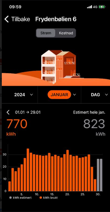
Strømforbruk for januar 2024 oppgitt i kWh. Estimert versus reelt forbruk. Fjordkraft Copyright.