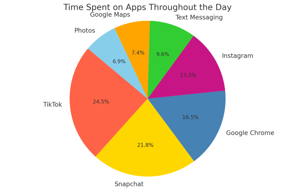
Here’s a pie chart illustrating how time is distributed across different apps during a typical day. Each colored segment represents the minutes spent on a specific app, providing a visual breakdown of app usage. The chart highlights the most used apps, such as TikTok, Snapchat, and Google Chrome, showing how they compare in terms of time investment. This visual representation helps to easily identify which apps consume the most time, offering insights that might inform decisions about digital habits or adjustments for better time management.


