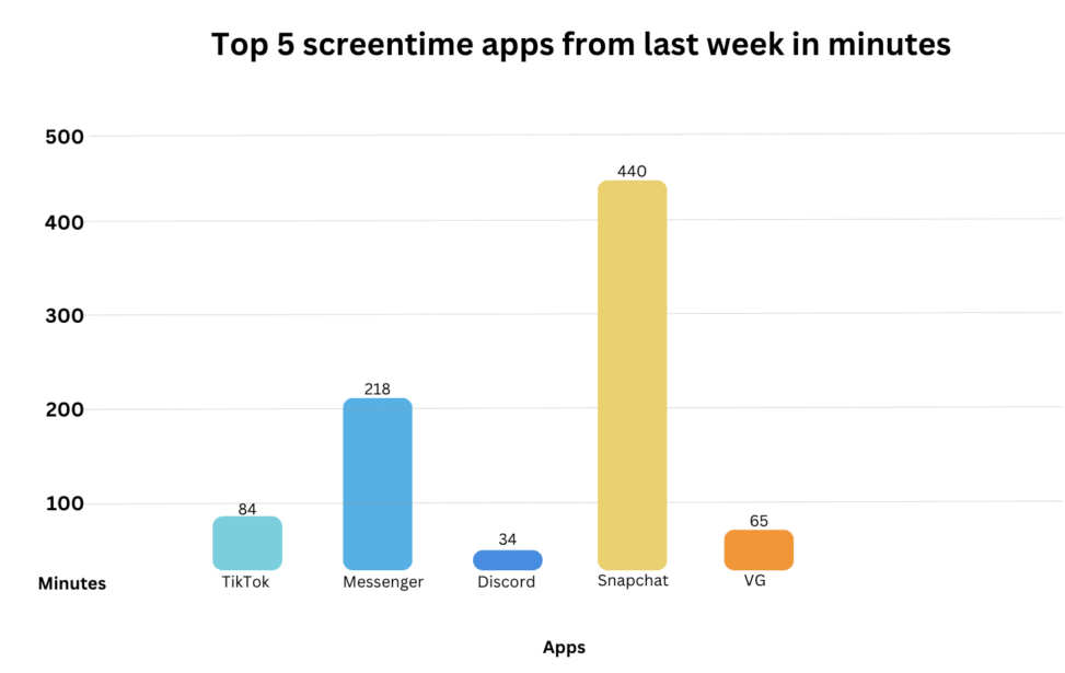
This bar chart shows my top 5 most used apps last week according to the screentime function on my iPhone. The numbers on the Y- axis shows minutes in hundreds while the X- axis has the actual applications. This chart is meant to visualize the big difference in my most used apps and shows the total amount of minutes I spent last week on of the apps.


