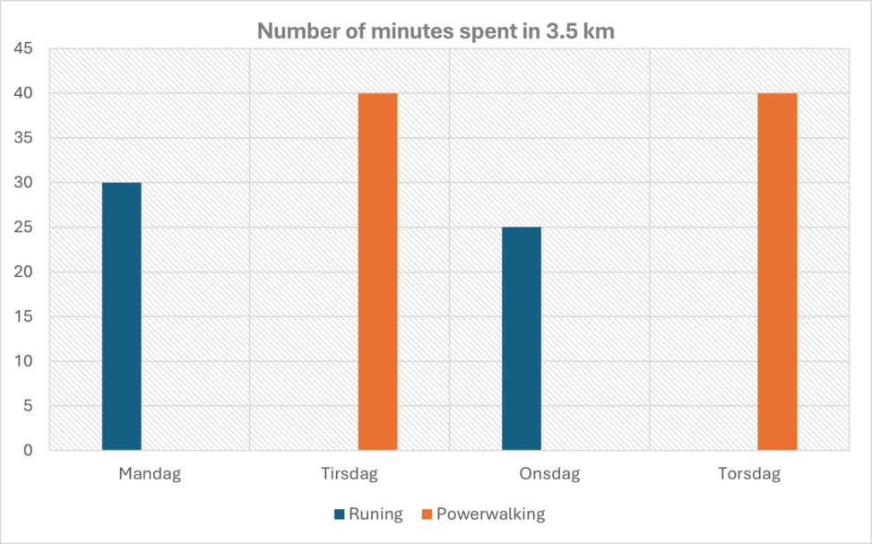
The chart shows the number of minutes I have spent running or power walking 3.5km. This is for a period from 10-13 February 2025. This data has been collected to see if I can achieve the same result by power walking as by jogging when it comes to time. The bar chart is created in Microsoft Word. Data is taken from the stopwatch on my phone.