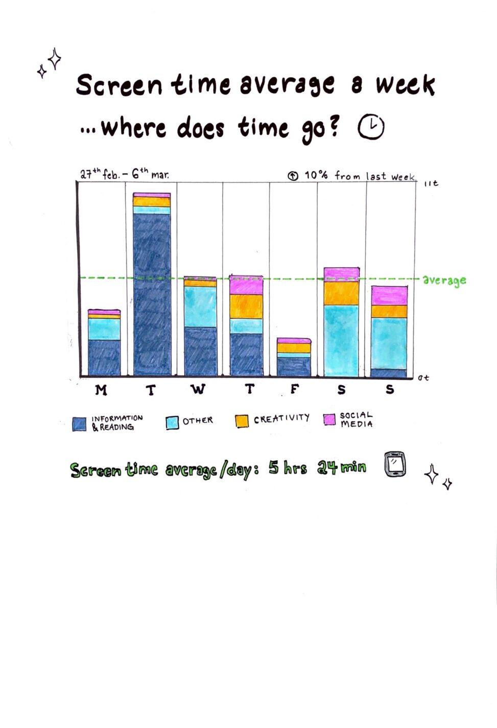
Screen time average over a week representented as a bar chart with every individual day represented and how time was spent each day on various types of apps color coded in to four categories. Average time spent on the phone represented at the bottom. Data gathered from phone, no copyrights as far as I know.

Screen time average/week
- March 13, 2023
- In: 18-29, my life in data
- Tagged: #barchart, #iphone #screentime, averages, screen time

