
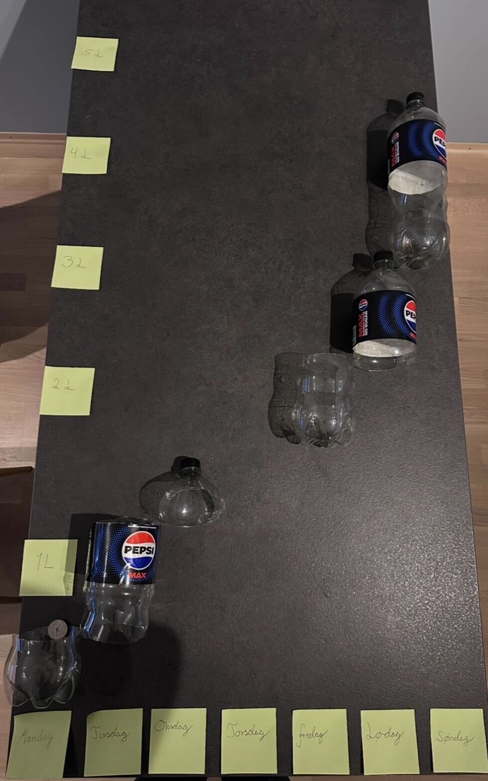
This is an visualisation of Pepsi Max consumption for a week in february 2026.
The x-axis shows time (in days), while the y-axis shows consumption (in liters).
The graph builds on each day, showing the entire consumption on sunday. The bottles visualizes how much was consumed pr. day.