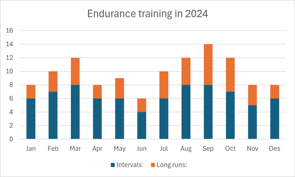
The graph visualizes my personal running journey in the year 2024. It displays the amount and types of runs I went on throughout the year. The blue part of each pilar represents the number of interval workouts completed, while the orange represents the longer and slower runs. Together these two categories make up the total number of runs completed each month.
I am the owner of the raw data and the graph is made by me in Excel. It is therefore under no copyright protection.


