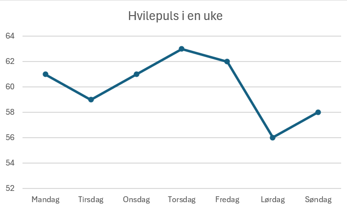
I have used Excel to represent my data. The data is my average resting heart rate in a week, measured from my smart-watch. The horisontal axis represent the days in the week, and the vertical axis represent the average resting heart rate.

A SPLOT on the Web: DALI worlds.
Blame @cogdog for the TRU Collector Theme, based on Fukasawa by Anders Norén.
I have used Excel to represent my data. The data is my average resting heart rate in a week, measured from my smart-watch. The horisontal axis represent the days in the week, and the vertical axis represent the average resting heart rate.