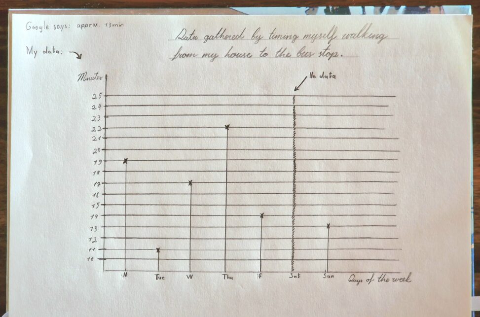
This is a visualization of the data I gathered by timing myself walking from my home to my bus stop and comparing it to the approximate time that was suggested by Google maps. In this visualization I show what my time was from Monday Au. 25 to Sunday Aug 31.