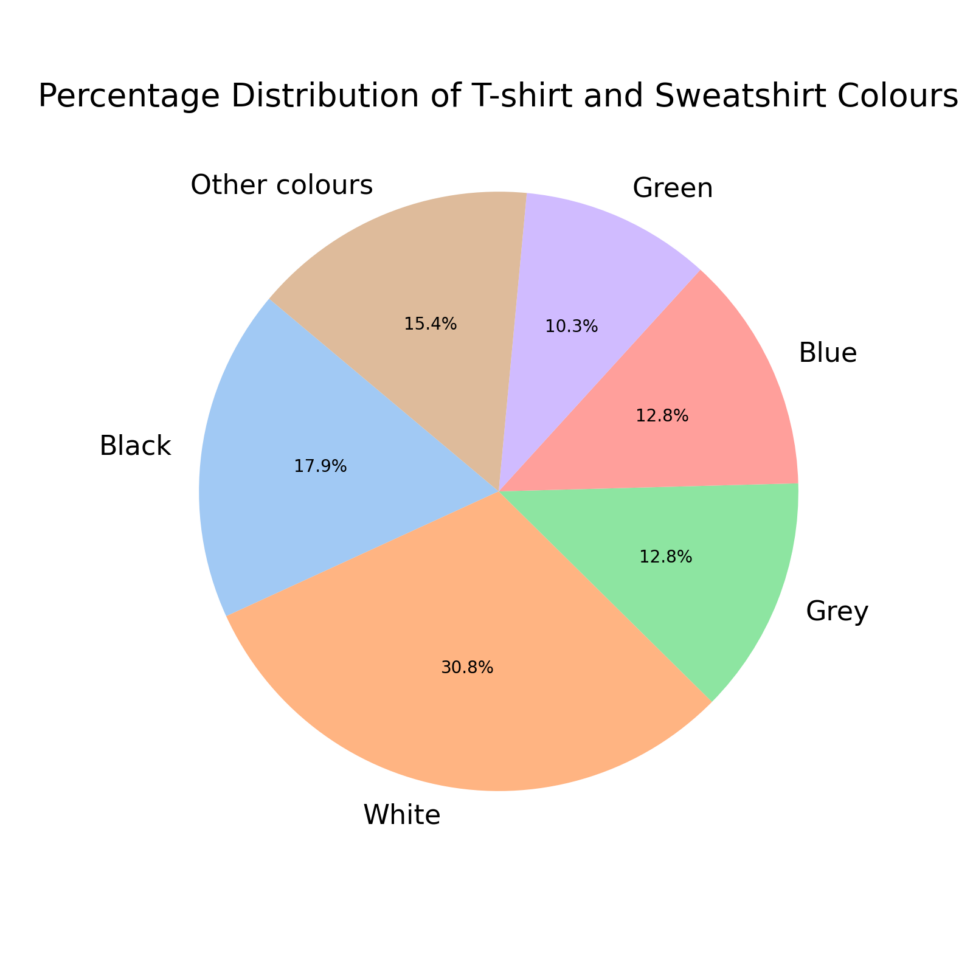
This percentage graph represents the colours of the top garments I have in my wardrobe; the ones with the highest percentage are also the ones I use the most according to my tastes.


This percentage graph represents the colours of the top garments I have in my wardrobe; the ones with the highest percentage are also the ones I use the most according to my tastes.