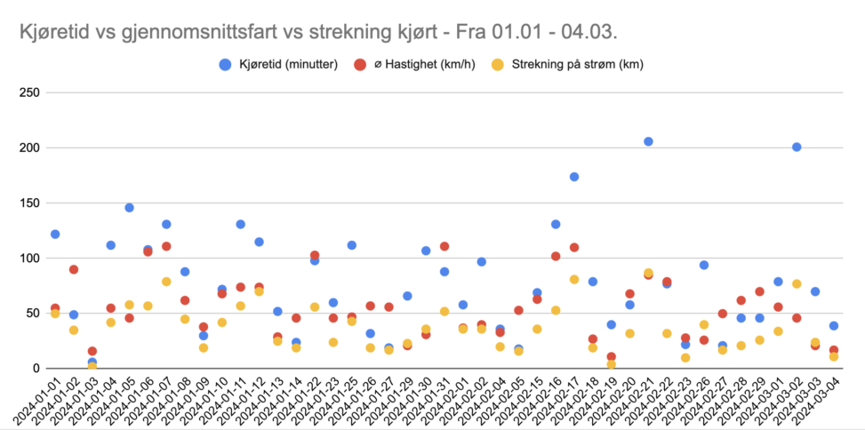
This graph intricately maps out the dynamic interplay between three pivotal dimensions of vehicular movement: the average speed at which a vehicle traverses, the total time spent in motion, and the expansive stretches of distance it covers. Set against the temporal backdrop from January 1st to March 4th, this visualization aims to decode the subtle correlations that might exist amongst these variables.


