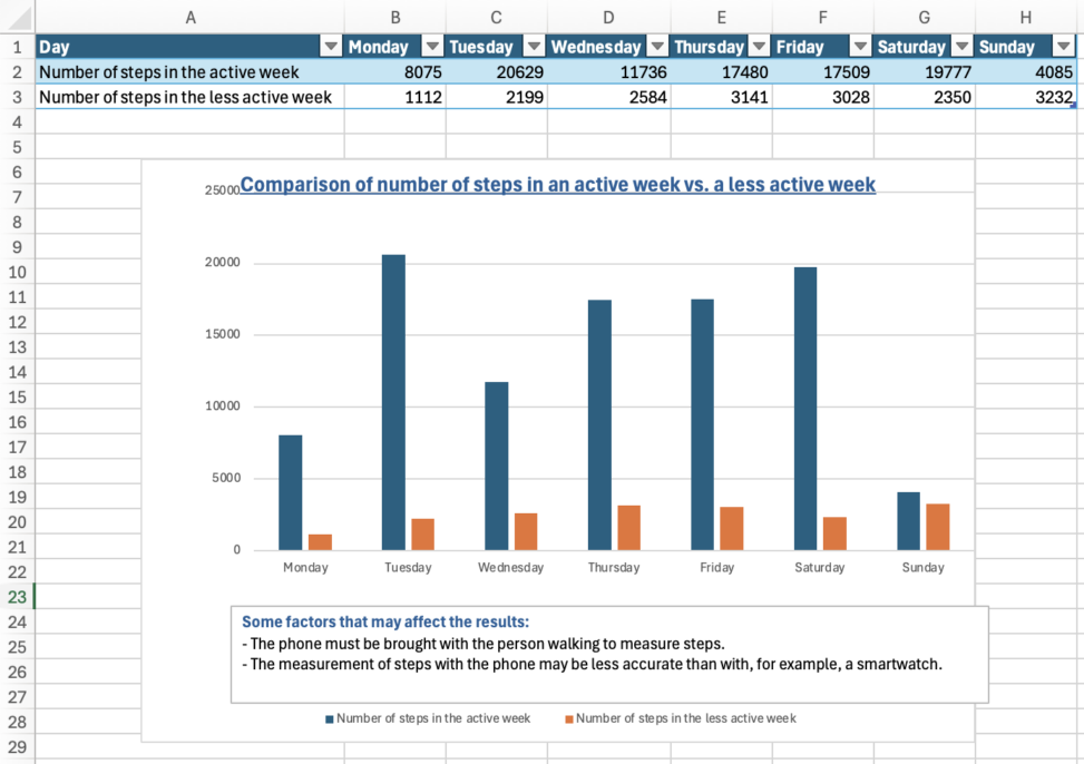
In this diagram I have presented the amount of steps taken in an active week, compared to a less active week. I have collected information from the health-app on my iPhone, and made a table in Excel. By using the table I was able to make a chart and compare the two weeks, and see the general difference in number of steps overall during the weeks. I have also written down a few examples of factors that may affect the accuracy of the measurements, however the chart shows a general stability during each of the weeks, and shows the difference between them.