
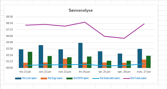
This data visualization represents a sleep analysis for a period of seven days, from January 21 to January 27. The graph displays different sleep phases measured in hours per night, including:
Light Sleep (blue bars)
Deep Sleep (orange bars)
REM Sleep (green bars)
Interrupted Sleep (light blue line)
Total Sleep (purple line)
The y-axis represents the duration of each sleep phase in hours and minutes, while the x-axis indicates the respective date.
The visualization helps analyze sleep patterns, showing variations in total sleep duration, interruptions, and time spent in different sleep stages. Observations indicate that sleep duration fluctuated between 6 and 8.5 hours per night, with January 24 having the highest total sleep (8.5 hours) and January 26 the lowest (6 hours).
Copyright & Ownership
The data presented in this visualization is privately collected sleep tracking data. The copyright status of the data is private and personal use only, unless otherwise specified by the data owner. If the visualization is shared publicly, ensure compliance with applicable data privacy regulations.