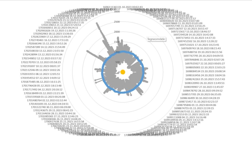
I collected weatherdata from my smart weatherstation for the last three months. The data is exessive but shows temp, humidity, co2 and noise pressure.
When i set it in a visualization i got this shape, it shows that data also can be “artsy” it combines the datafields which is irregular and the structure around for information. i think this is a nice representation on data and the needs for context and structure so that we can utilize it.


