
2079 Data visualizations Categorized "my life in data" (page 83 of 104)
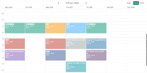
My classes throughout a week, shown through coloured time slots within their respective days. Horizontal is days of the weeks, vertical is time of day. I’m the owner…
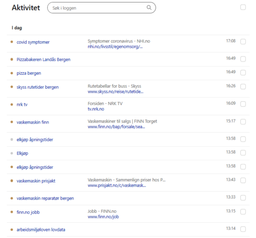
A representation of my Internet search history using Microsoft’s search engine Bing on 25. Jan. 2024.

The visualization shows my own sleep data so far in the current month (jan 2024) as hours per night between the day before to given day of month….
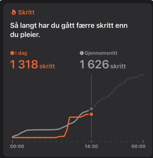
Kan se her mitt vanlige gjennomsnitt for skritt i forhold til hvor mange skritt jeg har gått i dag. Her er det mange ulike faktorer som kan påvirke…

Oversikt over hvilke apper jeg brukte mest på en uke. Her kan man også se tiden jeg brukte på hver app. Appen som ble mest brukt den akutelle…
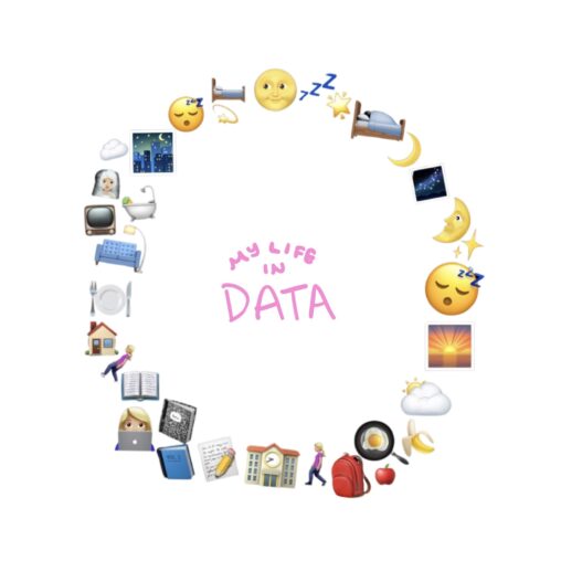
24 hours of my day shown through emojis. The figure can be interpreted as a clock from 00.00-23.59.
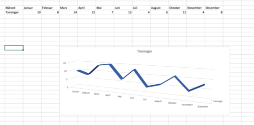
The data shows the amount of training sessions I have had every mounth. Starting with 10 in january, 8 in february, 14 in march, 15 in april, 7…
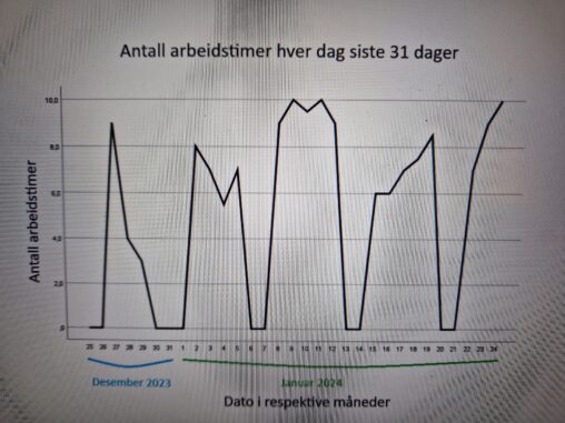
Grafen viser antall arbeidstimer stemplet inn i TIDbank hos min arbeidsgiver. Copyright: open Owner: Kirkeleit
Data visualization of sleep pattern for one week. This includes data on total amount of sleep, time spent in REM sleep, deep sleep and time awake during the…
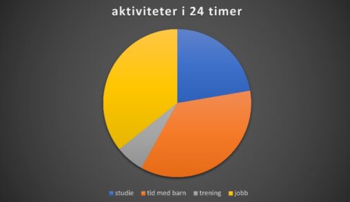
Dette er en data oversikt som tar for seg en uke i mitt liv. Dataen viser hva jeg bruker mest av tiden min på i løpet av en…
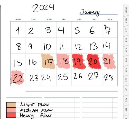
Data self recorded from period tracking app. Entire cycle for January 2024 one of the most important data I have on my phone. The intensity of red shows…


Bildet viser data mobiltelefonen min har fanget opp om min skjermtid i uke 3, illustrert gjennom et søylediagram. Gjennomsnittlig skjermtid for uken er 1 time og 14 minutter….
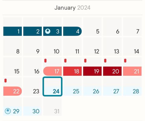
Period tracking app, one of the most important data I have on my phone. The intensity of red shows flow intensity, blue is ovulation. Cycle length 29 days,…
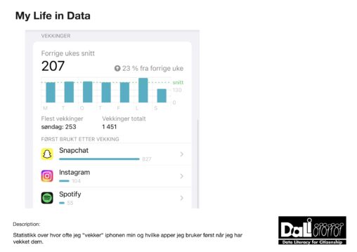
Antall ganger jeg “vekket” telefonen min på en uke var i gjennomsnitt 207 ganger. Det blir også oppgitt at dette er 23% opp fra uken før. Topp tre…

Antall ganger jeg “vekket” telefonen min på en uke var i gjennomsnitt 207 ganger. Det blir også oppgitt at dette er 23% opp fra uken før. Topp tre…
Antall ganger jeg “vekket” telefonen min på en uke var i gjennomsnitt 207 ganger. Det blir også oppgitt at dette er 23% opp fra uken før. Topp tre…
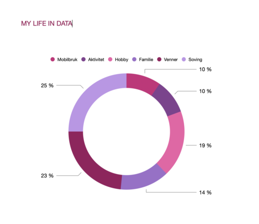
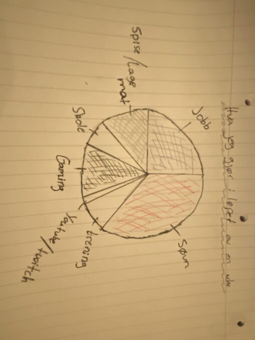
In this picture I show my life divided into a chart diagram, with the most important things in my life represented.