
2077 Data visualizations Categorized "my life in data" (page 77 of 104)

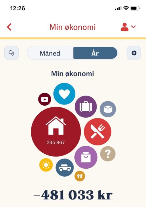
Fordeling av pengeforbruk gjennom et år. I appen er det selvsagt mulig å drille ned i de ulike kategoriene og se data for hver måned. Den største sirkelen…
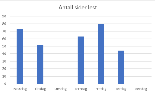
På stolpediagrammet kan man se hvor mange sider jeg har lest i løpet av en uke. Grafen tar ikke med digitale artikler og lignende studiemateriale, men dokumenterer utelukkende…

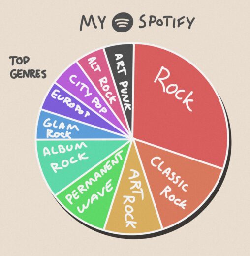
Picture represents my year in music in 2023, percentages are in comparison to last year.

This graph shows how many hours i slept every night, from the 29.01 to the 04.02. The it aslo showed my avrage in the last column. The owner…
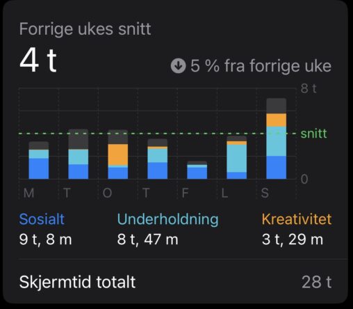
Digital representasjon av hvor mye skjermtid jeg hadde i uke 5. Data blir fordelt i ulike kategorier som; “Sosialt”, “Underholdning” og “Kreativitet”. Grønn strek er utregning av gjennomsnittstiden…
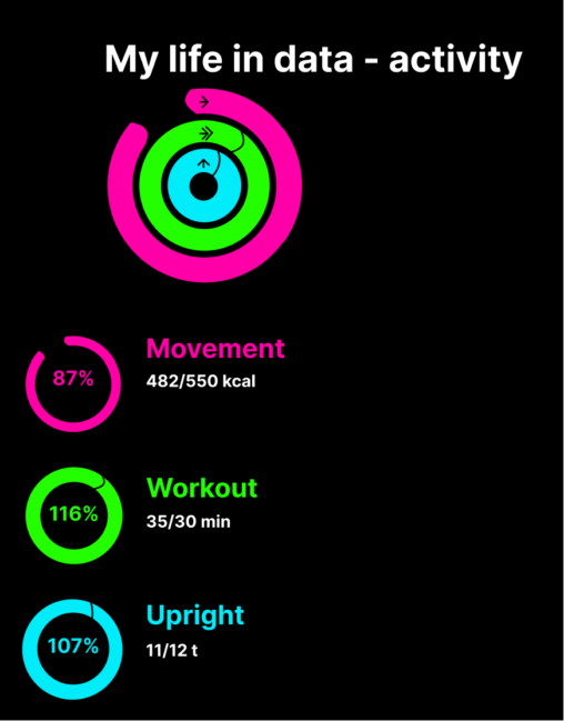
Apple Watch Activity Tracker er en teknologi som sporer din fysisk aktivitet døgnet rundt, fra antall skritt og kaloriforbruk til puls og treningsintensitet.
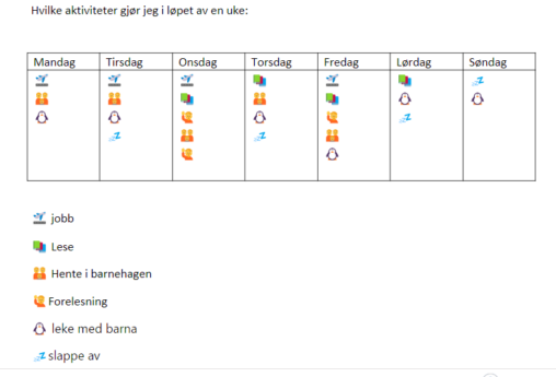
Bildet representerer en gjennomsnittlig uke av livet mitt. Den viser hvilke aktiviteter og oppgaver gjør jeg i en vanlig uke.
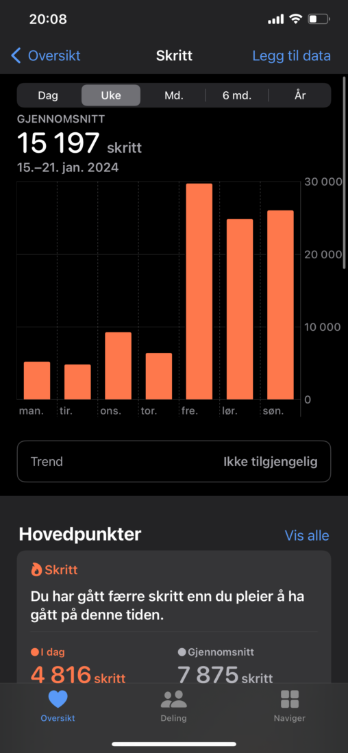
Grafene viser antall skritt gått per dag i en uke. Kurvene er jevne i ukedagene før det er betraktelig økning i skritt i helgen. Dette skyldes at jeg…
This is a water tracker. Which might motivate someone to drink more or atleast keep a knowledge of how much liquid they consume each day. Each waterdrop represents…
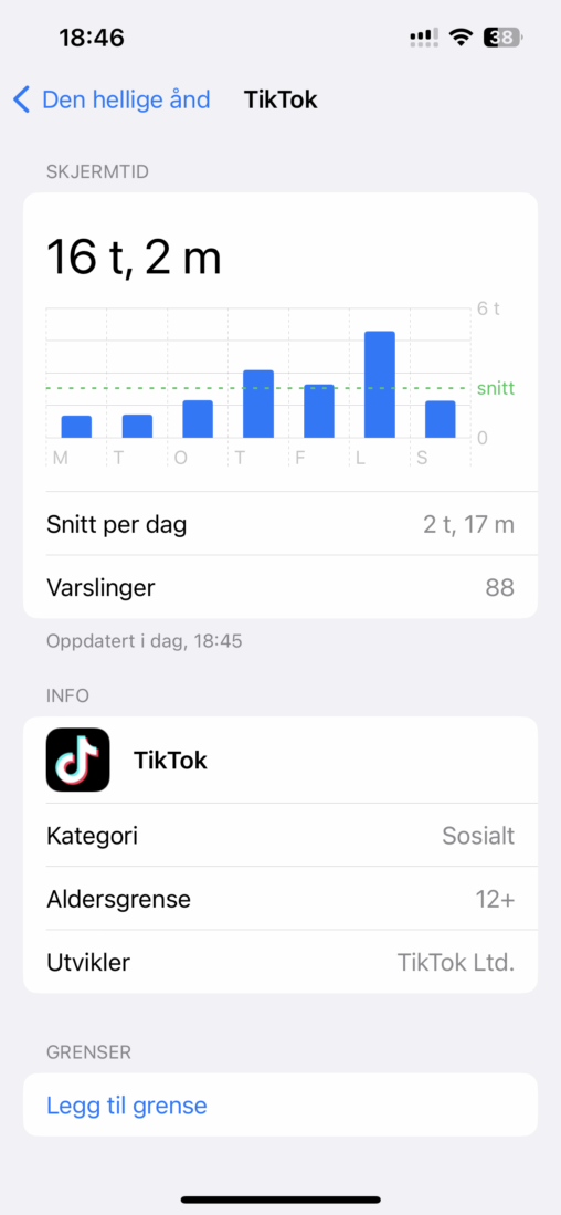
Her er en oversikt over hvor mye tid i uken jeg bruker på å se på tiktok.
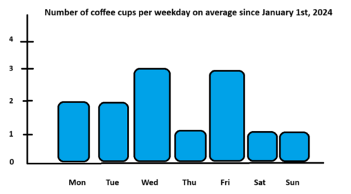
Number of cups of coffee I have had per weekday on average since January 1st, 2024.

Picture showing which metods of transportation. Data includes percentage and total length in km. Made by using data from Google Timeline and the data is my personal contributation.

This graph shows my daily average of steps taken each month of the year 2023. The numbers are represented in averages from up to 10 000 each month…
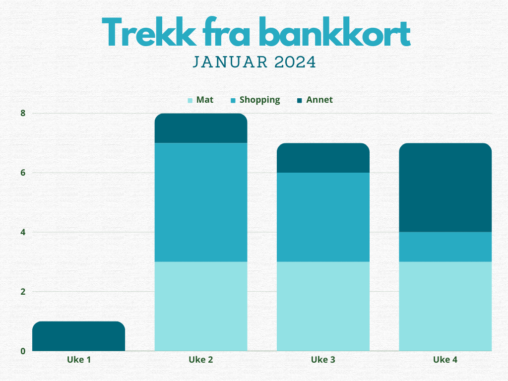
Forbruk fordelt på mat, shopping og annet for personlig bankkort januar 2024.
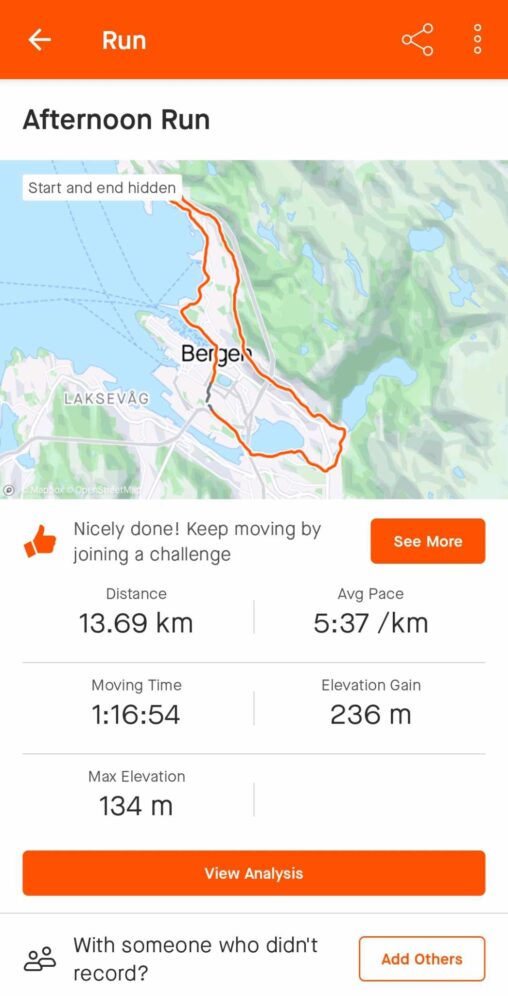
The picture shows the route I run when excercising for the upcomming Bergen City Marathon. Underneath the route there is a summary of my latest sundayworkout, including data…
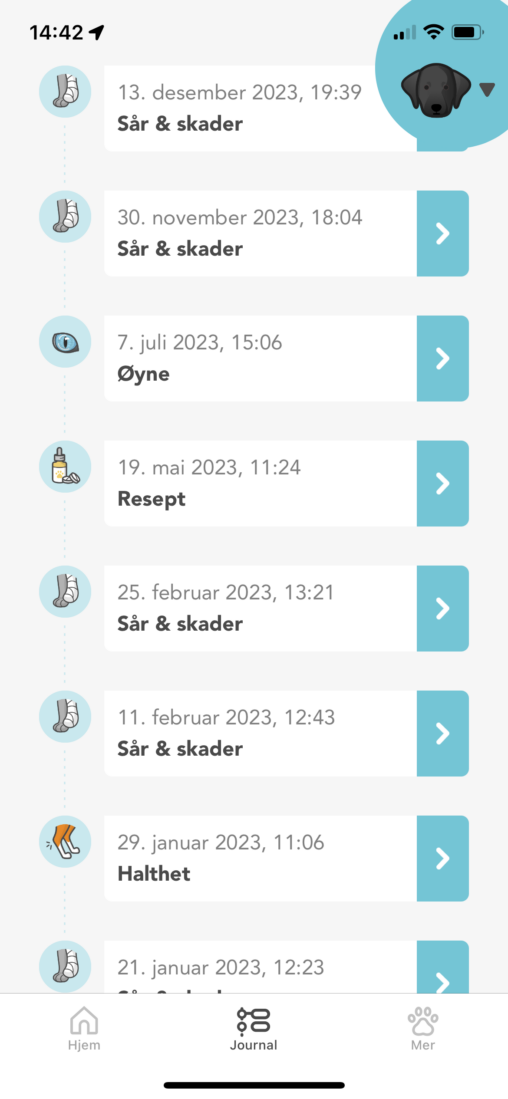
Journalliste med henvendelser, time hos dyrlegen i 2023, samt hva de ulike henvendelsene gjaldt. Hentet fra appen til Anicura.
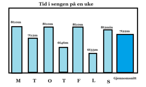
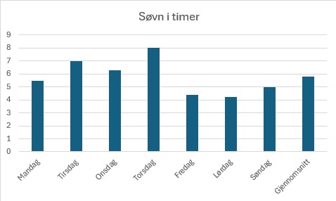
Diagrammet viser antall timer brukt i sengen daglig fra mandag 29. januar til søndag 4. februar.