
2077 Data visualizations Categorized "my life in data" (page 76 of 104)
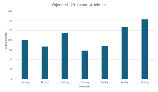
Grafen viser hvor mange minutter skjermtid jeg hadde på mobiltelefonen i perioden 29. januar til 4. februar 2024. Dataene er samlet inn via appen “Digital balanse” av Google…
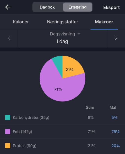
Diagrammet viser målet og faktisk fordeling av karbohydrater, fett og protein som jeg har spist i løpet av dagen.
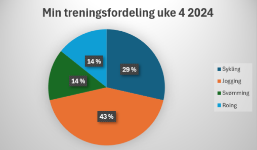
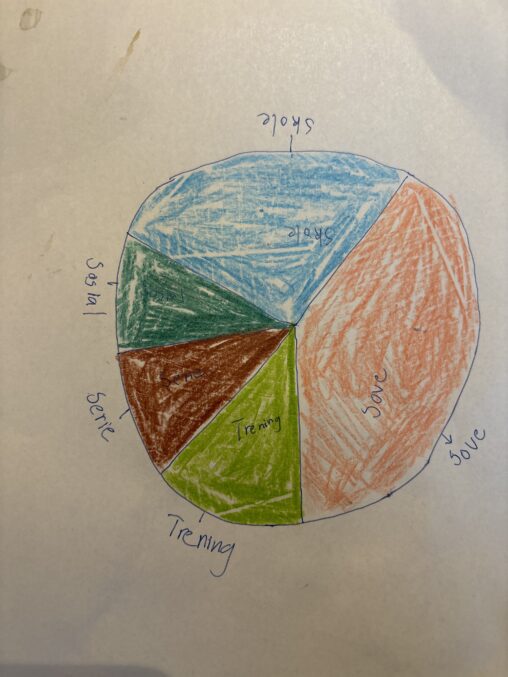
I diagrammet presenteres prosentvis andel av total treningstid benyttet på hver idrett i uke 4 2024.

Books on my nightstand per February 6th, and percentage read of each book. 100% is finished book. I used a calculator to calculate the right percentage of each…
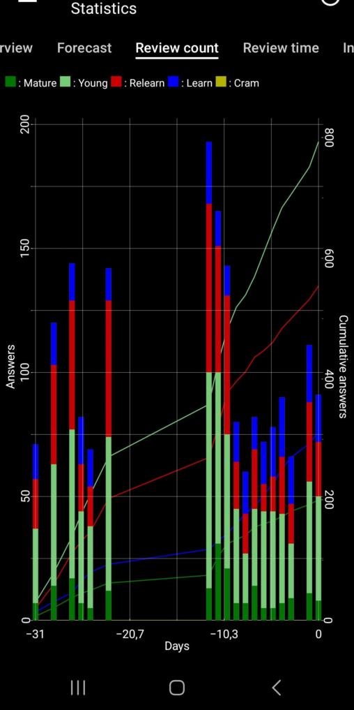
Vocabulary flashcards were studied last month. Distinguished between the number of times I have learned words, relearned/repeated, and relatively new words. Public domain (now), owned by me.
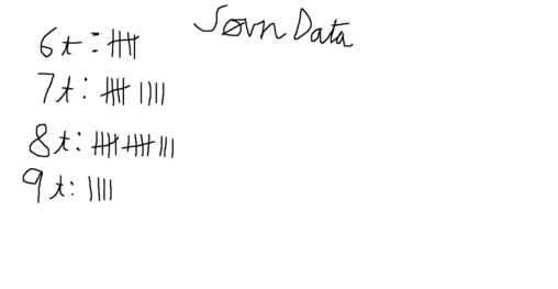
Søvndata samlet gjennom Garmin smartwatch. Dataen er antall dager i januar jeg sov en vis mengde timer, lengden er rundet av. Dagene er fra 1. januar til 31….
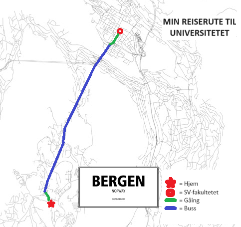
My travel route from my home to the SV-faculty at University of Bergen (EnTur.no, 6. february 2024)
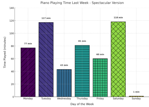
The piano playing time chart for last week. This version includes colorful bars with different patterns for each day, along with annotations displaying the exact time played in…
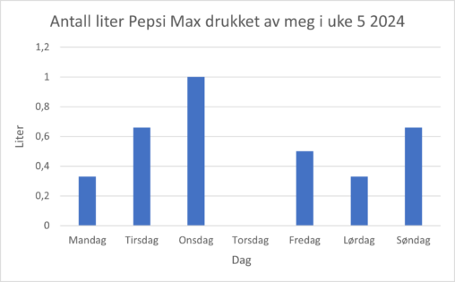
Grafen viser hvor mange liter Pepsi Max jeg drakk per dag i uke 5 2024. X-aksen representerer dager i uken. Y-aksen representerer antall liter. Dataen er samlet inn…
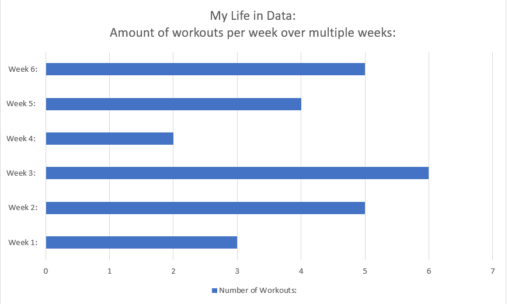
This is a data representation that relates to my life, showing by a graph how many times per week I have performed workouts over multiple weeks. The graph…

This shows the amount of games I own on Steam in their respective price-ranges. The data was taken from steamdb.info, which is a 3rd party site not affiliated…
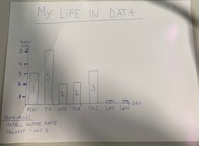
Grafen viser antall kopper kaffe drukket i uke 4 2024 X-aksen representerer dager Y-aksen angir enheten kopper kaffe. Datamaterialet er basert på egen erfaring av antall kopper kaffe…

The image is a representation of how many hours and minutes i slept every night in week 3 in 2024. The data was collected from my digital watch,…

The image shows how many games I played in 2023, as well as how many achievements I earned. It also shows the percentage of games I played with…
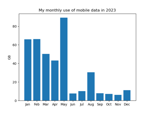
My monthly use of mobile data varies a lot – in November I only used 6.1 GB and in May I used 89.2 GB. During the spring semester…
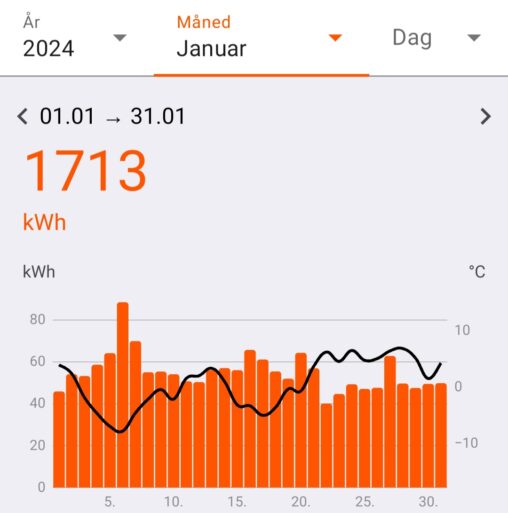
Visualisering av mitt strømforbruk (kWh) samt utendørstemperaturen (C) alle dager i januar 2024. Dataene er samlet inn av fjordkraft AS og gjort tilgjengelig gjennom fjordkraft sin app.

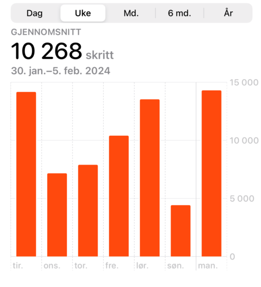
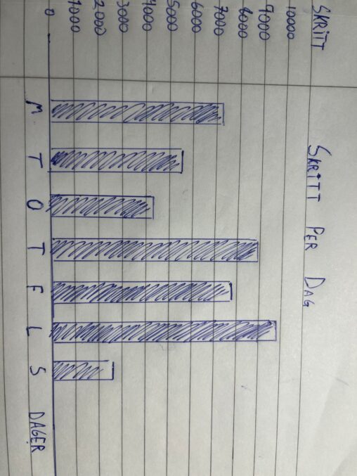
The data shows the average steps taken troughout a week. Each day is represented by a pole, with the days on the x-axis (Tirsday to Monday) and the…