
2077 Data visualizations Categorized "my life in data" (page 70 of 104)
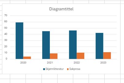
Diagrammet viser kor mange bøker eg har lese i perioden 2020 til 2023.Blå søyle viser talet på skjønnlitterære bøker og oransje søyle viser talet på sakprosabøker. Eg har…

How I spend my time when the kids are home vs. how i spend my time when they are vacationing with their grandparents
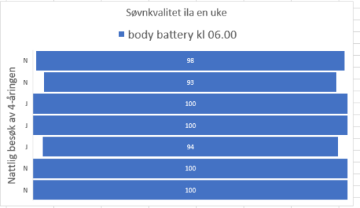
Body battery målt hver morgen kl 06.00 via Garminklokke, vises i % av 100. Sammenholdt med indikator (J/N) på om 4-åringen kom på nattlig besøk. Det viser seg…


Illustrations of 362 ferries. Number of ferries that I take in a year do to job. The Illustration are made by me, anyone can use it.
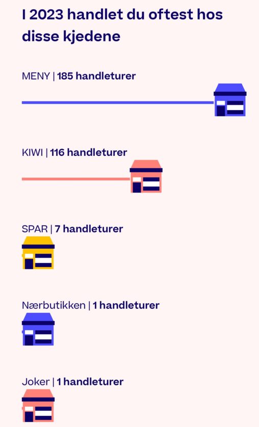
Dette bildet er hentet fra Trumf-appen og gir en illustrasjon over hvilke butikker jeg hyppigst handlet i løpet av 2023, basert på hvor jeg registrerte Trumf-poeng. Det gir…
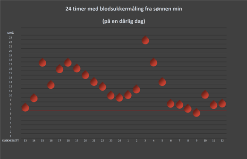
Visuell oversikt over et døgn med blodsukkermålinger med diabetes. Den røde streken markerer ønsket gjennomsnitt.
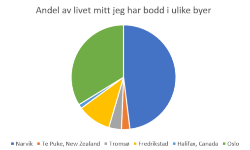
self-reporting on which cities I have lived in and for how many years I have lived in those citiest, the data are my own.

. A simple visualization of the last ten years of my music listening history. Made with and Adobe Photoshop.

Bibliotekets app BookBites gir oversikt over hvor mange minutter jeg har lest e-bøker og hørt på lydbøker. Skjermbilde av egen lesestatistikk fra tilfeldig valgte uker siste år.
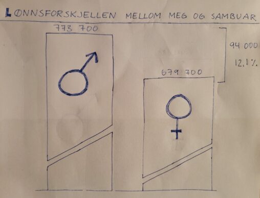
Difference between me and my boyfriends wage level, february 2024. Our own data.
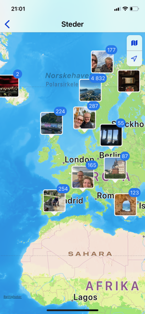
Viser hvor i verden jeg har vært når jeg har tatt bilder med min nåværende Iphone
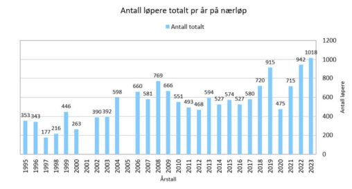
Utviklinga av totalt tal deltakarar på løp som Førde idrettslag Orientering har arrangert i perioden 1995 – 2023. Vi ser utviklinga frå 395 startande i 1995 til 1018…

Oversikt over antall timer, antall km, antall personlige rekorder og antall aktiviteter i 2023