2097 Data visualizations Categorized "my life in data" (page 6 of 105)
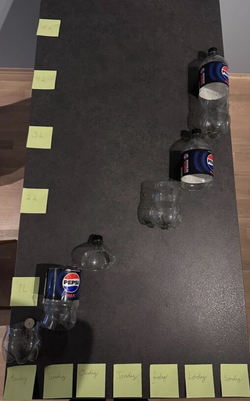
This is an visualisation of Pepsi Max consumption for a week in february 2026. The x-axis shows time (in days), while the y-axis shows consumption (in liters). The…
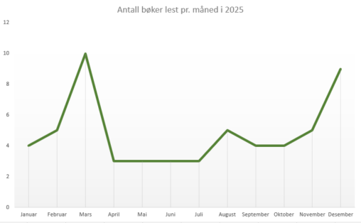
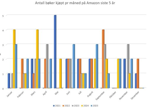
Diagrammet viser antall bøker jeg har lest per måned i 2025. Data er hentet fra min personlige profil hos Goodreads.
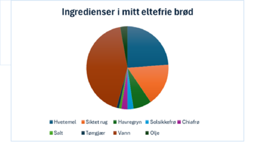
Visualisering av mengdeforhold mellom ingrediensene i brødene jeg baker
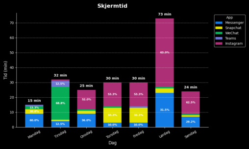
Diagrammet viser data over skjermtid på mobil for ulike apper i løpet av en uke. Tidene er hentet fra mobilen for de respektive dagene og registrert i et…
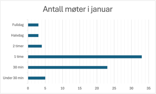
Oversikt over alle møter på jobb i janaur 2026. Data er hentet fra min personlige kalender i Outlook.
Ingredienser til 2 brød
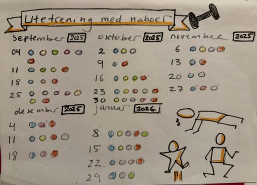
The drawing visualizes the dates for training outdoors with my neighbors in the period September 2025 to January 2026. I started with my Strava app to see when…
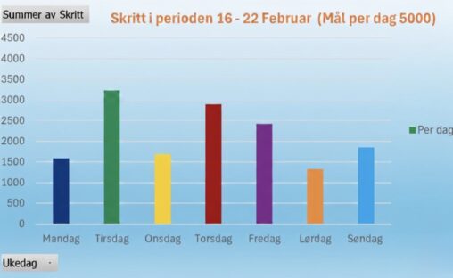
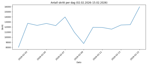
Data er lagret i Excel med søyler som viser oppnådde skritt per ukedag sist uke –
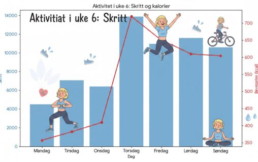
Aktivitetsdiagram som viser hvor aktiv jeg har vært i uke 6. Aktiviteten er målt i skritt og aktive kcal. Laget som diagram i Excel for deretter å benytte…
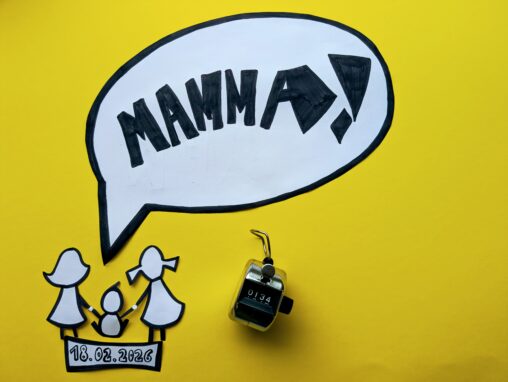
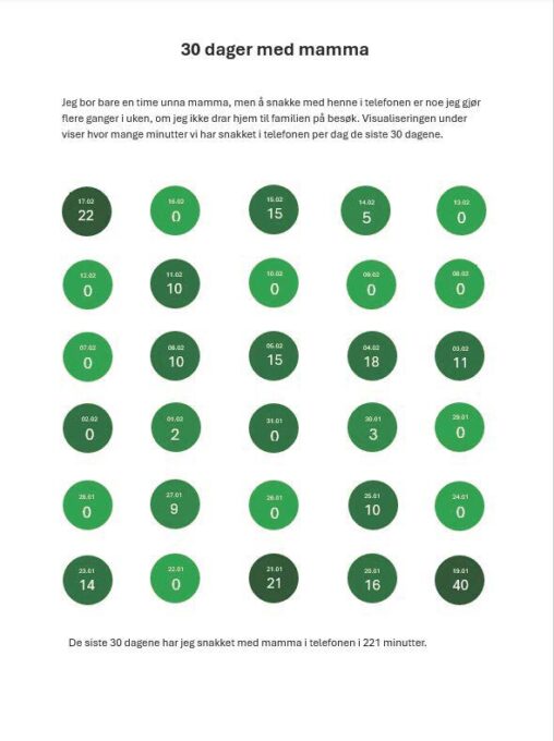
The visualisation represent the total number of times I was called ” Mamma” by one of my three children on a perfectly normal Wednesday, the 18th of February…
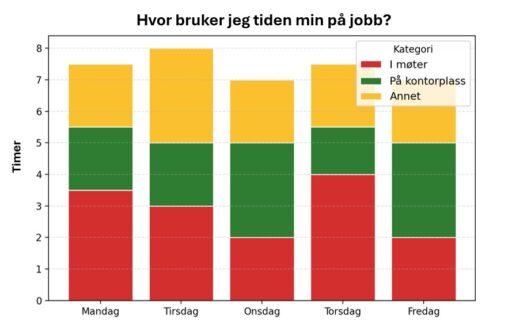
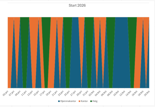
Figuren viser et stablet stolpediagram som illustrerer fordeling av hvordan jeg brukte arbeidstiden min i løpet av én valgt arbeidsuke (uke 7) i 2026. Den horisontale aksen viser…
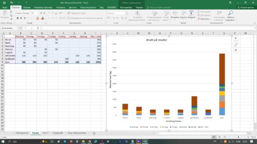
Mengden tid (i minutter) brukt på studier i løpet av uken og daglig, med en liste over emner som er studert. Kan si at det er min personlige…
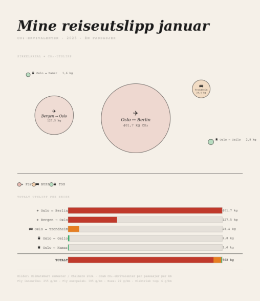
This visualization shows my personal CO₂ emissions from five trips taken in January 2025. Each journey is represented by a proportional circle (where the area corresponds to the…
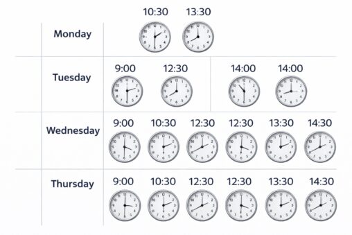
my weekly meeting scehdule. Monday 2 meetings 1030 13.30 Tuesday 3 meetings: 9:00, 12.30, 14.00 Wednesday 4 meeting: 9.00, 10.30, 12.30, 13.30, 14.30 Thursday 4 meetings: 9,30, 10.30,…
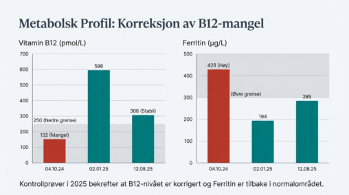
This visualization summarizes changes in two biomarkers across three laboratory timepoints (04.10.24, 02.01.25, 12.08.25). The left chart tracks Vitamin B12 (pmol/L), with a shaded band indicating the lower…