
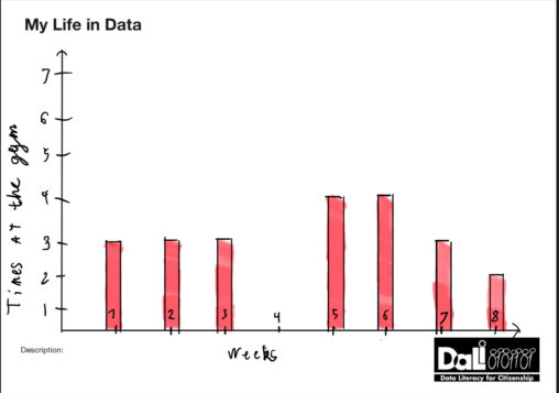
2077 Data visualizations Categorized "my life in data" (page 58 of 104)

Copy of diagram from the Norwegian Bank visualizing the EURO currency rates per day in 2024, with the currency rate from 11.1. to 12.3 listed on the Y…

This chart shows all artists on my Top Songs 2023 playlist on Spotify. It also shows the number of tracks each artists have on the playlist. The data…
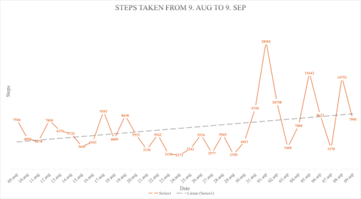
Due to an overwhelming need to improve personal fitness and mental health, I embarked on a journey of walking and hiking. This is the past month of my…

En ørret fisket i Spåkevannet ble dissikert og undersøkt for parasitter. Fisken inneholdt cirka 60 fiskeandmakk kapsler av arten Dibothriocephalus ditremus på og rundt magesekken. Kapslene er 6-8…
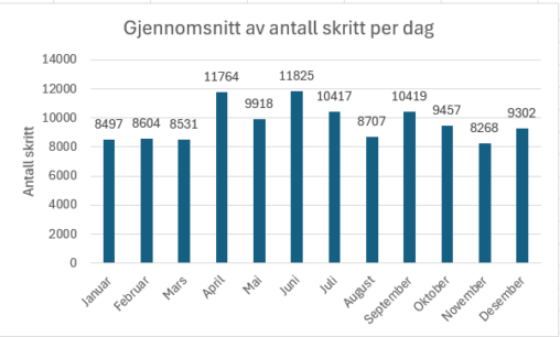
Dette stolpediagrammet viser et gjennomsnitt av antall skritt på en dag per måned i 2023.
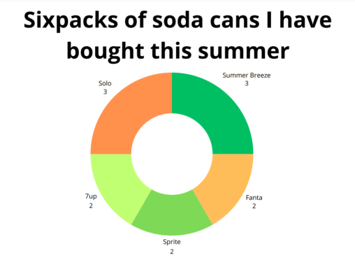
Here I show the different types of soda and the amount of sixpacks I bought this summer.

Oversikt over arbeidstimer, en kort uke i september. Laget ved hjelp av Microsoft Copilot.
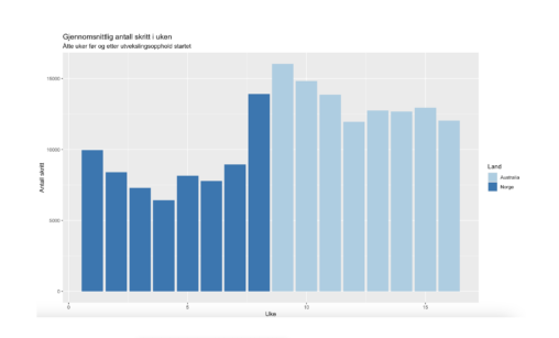
Fremstillingen viser gjennomsnittlig antall skritt hver uke de siste 16 ukene. Viser uke på x-aksen og antall skritt på y-aksen. Fremstillingen er laget i R.
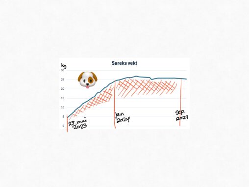
Our field golden retriever puppy grew so fast. We collected data on her weight during the first years. Public Domain.

Observasjoner fra 3 kamera på egen hytte i fjellet. Bevegelsessensor trigger opptak som viser type objekt som er observert innenfor eiendom. Observasjoner august 2024. Visualisering viser hyppighet i…

Kilometer løpt av meg i ukene 31 til og med uke 36, 2024. Y-aksen viser kilometer, og X-aksen viser ukene.
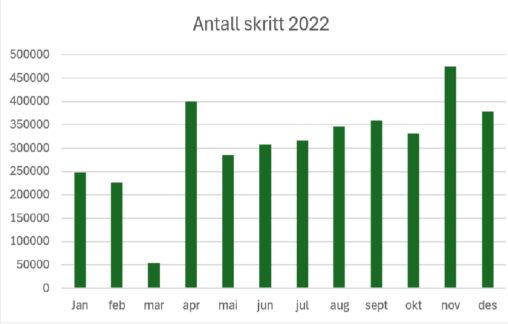
Fremstillingen viser totalt antall skritt jeg gikk hver måned 2022. Y-akse viser antall skritt, X- akse viser hvilken måned. Visualisering laget i Excel.
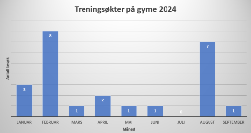
A bar chart visualization of how many times a week if been to the gym for the last two months. The Y-axis represents how many times I’ve been…
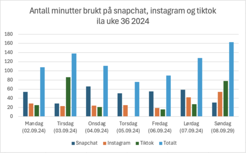
En fremstilling i form av et stolpediagram av hvor mye skjermtid jeg har på Snapchat, Instagram og TikTok i løpet av uke 36 2024. Diagrammet viser skjermtid i…
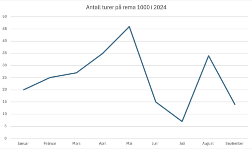
I dette diagrammet ser vi antall turer jeg har hat på rema 1000 så langt i 2024. Vannrett ser vi månedene i året og loddrett ser vi antal…
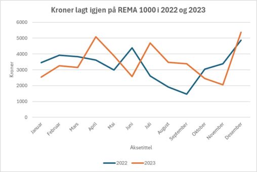
Oversikt over hvor mye penger jeg har lagt igjen på REMA 1000 i hhv 2022 og 2023
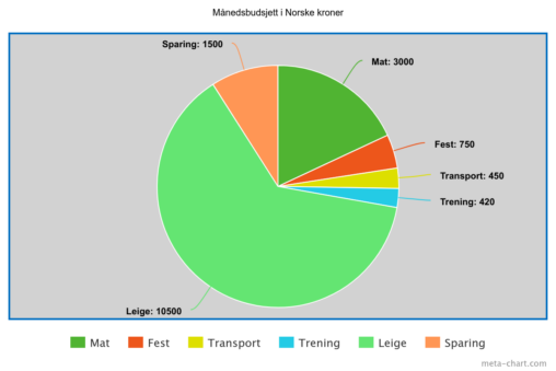
Hvordan budsjettet mitt er satt opp for hver måned, som student i Bergen.
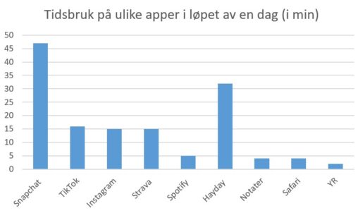
Jeg har fremstilt et søylediagram som viser hvor mange minutter jeg har vært på ulike apper iløpet av dagen idag (10.09.2024). Jeg har tatt med 9 apper; snapchat,…

En visuell fremstilling i form av et stolpediagram av hvor mye skjermtid jeg har brukt på Youtube, Snapchat og Instagram i løpet av uke 36, 2024. Diagrammet viser…