
2089 Data visualizations Categorized "my life in data" (page 28 of 105)
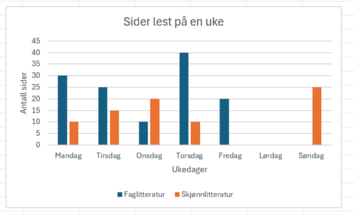
Antall sider som jeg har lest på en uke, fordelt på faglitteratur og skjønnlitteratur og vist per dag. Faglitteratur = blå og Skjønnlitteratur = oransje
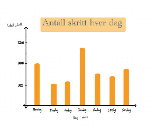
Grafen viser hvor mye jeg gikk hver dag i en uke, med ukedagene i X-aksen og antall skritt i Y-aksen.
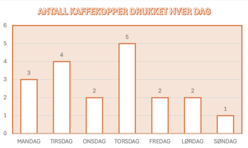
Grafen viser en oversikt over hvor mange kaffekopper jeg konsumerer hver dag. Y-aksen representerer antall kopper, mens x-aksen er de forskjellige dagene i uken.
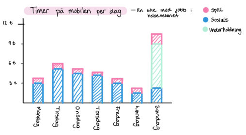
Skjermtid per dag i en uke med jobb i helsevesenet. Rosa – spill, Grønn – underholdning, Blå – Sosialt.
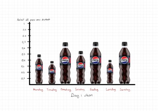
Hvor mye Pepsi max som er drukket, målt i dl, fra Mandag til Søndag. Dataene er mine egne.
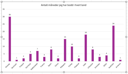
Jeg er eieren. Dataene handler om reisene mine i forskjellige land.
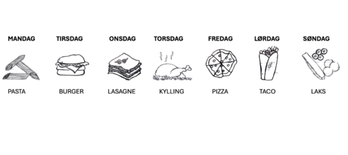
En tabell som går fra mandag til søndag med illustrasjoner og beskrivelser av matretter for hele uken.
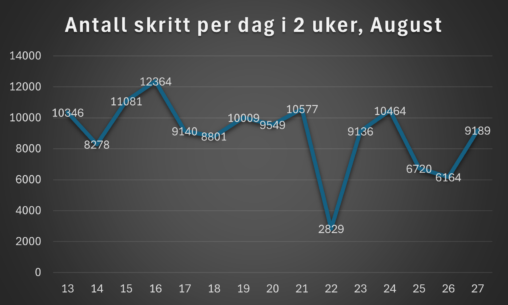
Linje diagrammet viser til antall skritt jeg har gått i en to ukers periode i august. Y-aksen illustrer antall skritt imens x-aksen viser til datoene i august (13…
Kilden til disse dataene er mine egne personlige dokumenter. derfor er de min eiendom og er ikke beskyttet av opphavsrett.
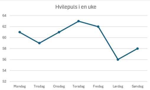
I have used Excel to represent my data. The data is my average resting heart rate in a week, measured from my smart-watch. The horisontal axis represent the…
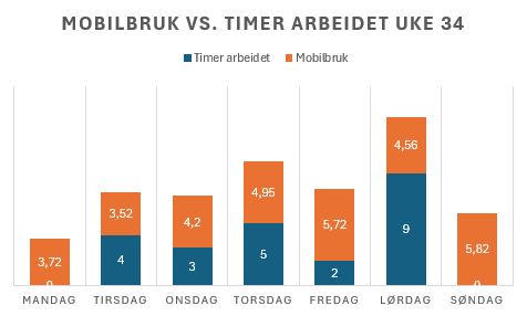
Søylediagram som viser antall timer arbeidet og brukt på mobilen i uke 34 per dag. Dataene er hentet fra min egen kalender og skjermtidstatistikken på min Samsung-mobil. Det…
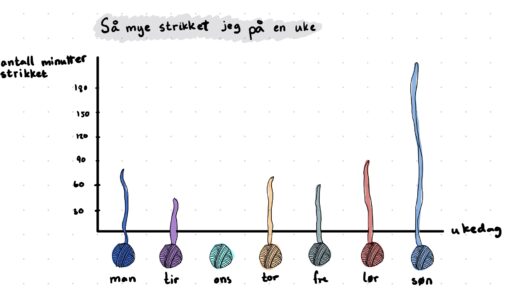
Dette søylediagrammet viser hvor mange minutter jeg har strikket i løpet av en uke der søylene er byttet med utdradde garnnøster
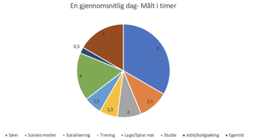
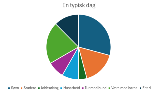
Viser hvordan en vanlig dag i mitt liv ser ut. Tallene representerer timer og viser til et helt døgn.
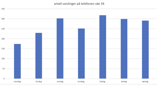
viser antall ganger mobilen min fikk en varsling hver dag i løpet av en uke. Uke 34 blir brukt for datainnhentingen og ble funnet på min Iphone sin…
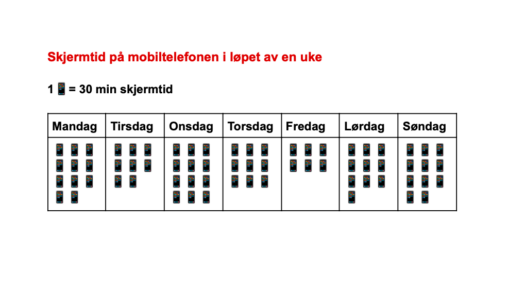
I denne oppgaven har jeg valgt å lage en visualisering av hvor mye skjermtid jeg har på mobiltelefonen i løpet av en uke. For å gjennomføre oppgaven har…
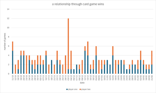
This graph shows how many times did two players win in a card game during a relationship between these competitive people. The graph shows total number of games…
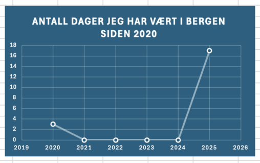
Denne visualiseringen viser hvor mange dager jeg har oppholdt meg i Bergen. Grafen viser en økning i 2025, fordi jeg nettopp flyttet hit pga studier.
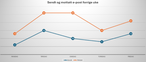
This graph shows the number of e-mail I have sent and received each days over the last work week. I counted them manually in my mail program, and…