
2107 Data visualizations Categorized "my life in data" (page 25 of 106)

Denne dataen viser til 18 runder med golf og hvilken score per hull. Dataen er delt inn i 5 kategorier.
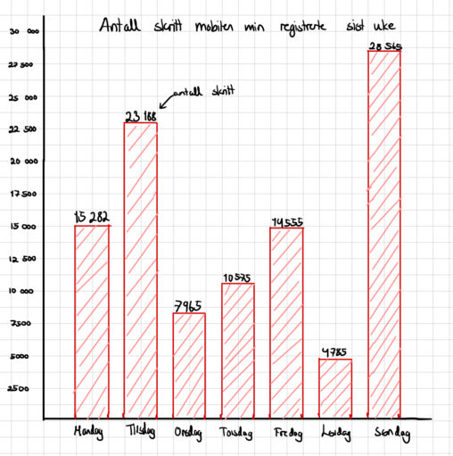
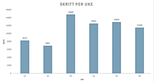
Bildet viser et stolpediagram over hvor mange skritt mobilen min registrerte hver dag, forrige uke. Med andre inkluderer ikke dette skritt jeg har gått uten mobilen og ikke…
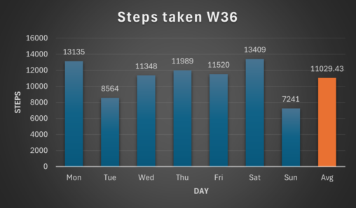
The graph shows how many steps i took each day during week 36. The y-axis shows the amount of steps(0-16000), and the x-axis shows the day correlated to…
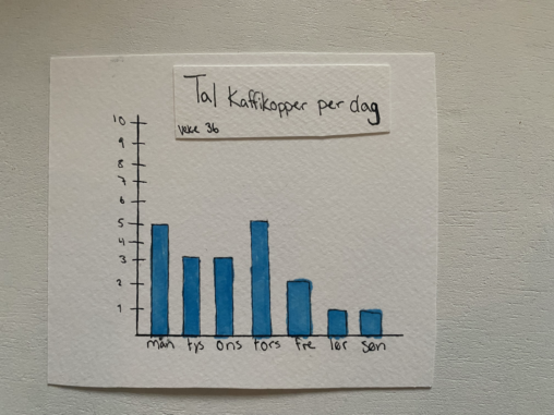
Dette er ei framstilling av kor mange kaffikopper eg drakk i veke 36. Eg har valt å teikne det i eit søylediagram. Diagrammet illustrerer godt skilnadene mellom dagar…
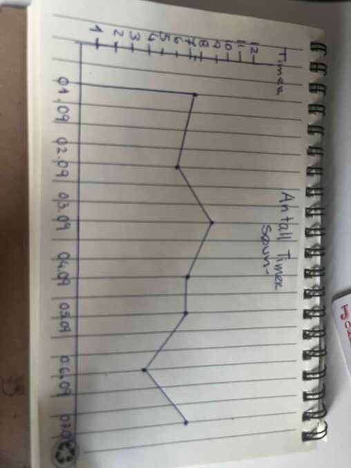
Grafen viser hvor mye jeg sov fra 1. til 7. september. Den første dagen sov jeg mest, rundt 10 timer. Etterpå sov jeg mindre, ned til cirka 5…
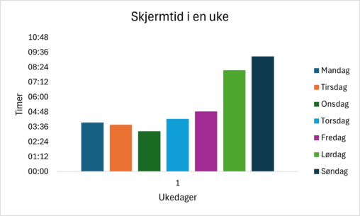
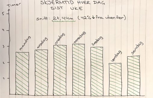
Denne visualiseringen viser hvor mange timer per dag jeg brukte på mobiltelefonen min i løpet av én uke.
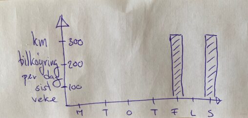
Driving per day last week (km) September 2025 link url=”http://www.themostamazingwebsiteontheinternet.com/” text=”bilkoyring”]
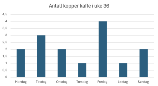
Stolpediagram over antall kopper med kaffe jeg drakk hver dag i uke 36. Antall kopper på y-aksen, og dagen på x-aksen.
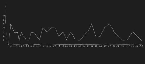
Håndtegnet visuell representasjon av antall treningsøkter jeg har fullført i 2025 hittil fra uke 1 til og med uke 37
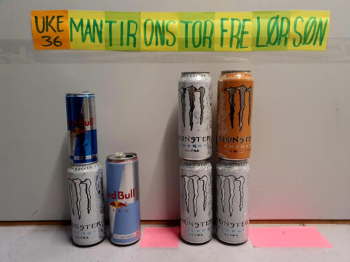
Oversikt over antall og type energidrikke jeg drakk i uke 36 de ulike ukedagene. Mandag drakk jeg 1 hvit Monster og en liten sukkerfri Red Bull, Tirsdag drakk…
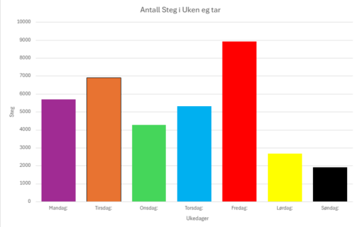
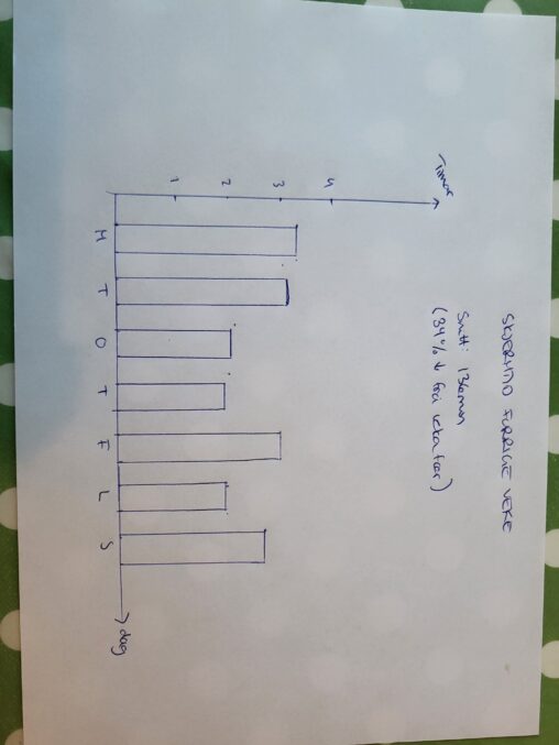
Visualisering av antall steg eg har tatt i uke 36. Tallene er hentet ved bruk av min smartklokke
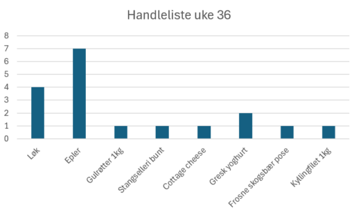
En handleliste for mat jeg skulle handle på rema1000 i uke 36, visualisert gjennom excel i et stolpediagram.
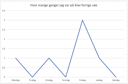
Figuren illustrerer antall ganger jeg var på Kiwi i nærområdet jeg bor forrige uke. Langs x aksen viser dager og y aksen viser antall besøk
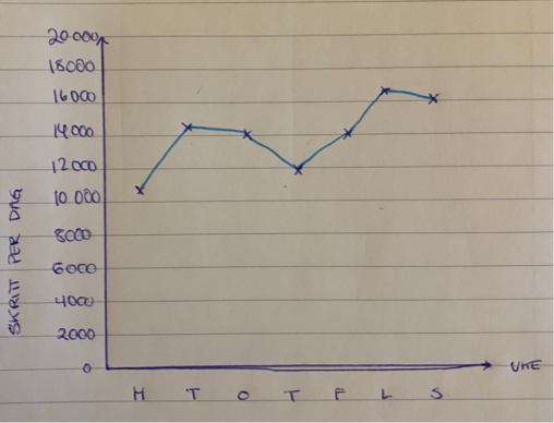
Figuren illustrerer antall daglige skritt jeg hadde i løpet av forrige uke. Dataen er hentet fra Helse-appen på iPhone.