
2107 Data visualizations Categorized "my life in data" (page 14 of 106)
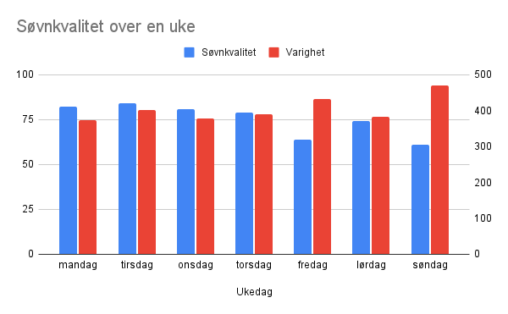
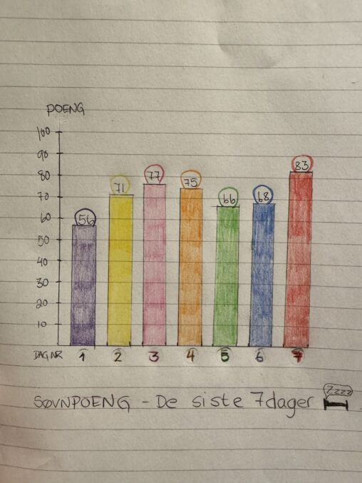
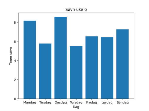
Søvnkavlitet på en skala fra 0 til 100 og søvnmengde i minutter for hver ukedag i en uke. Data fra Garmin forerunner klokke
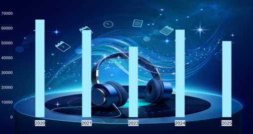
Musikk er en viktig del av min hverdag og grafen viser statistikk over antall minutter jeg har brukt til å lytte på musikk på Spotify de siste fem…
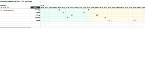
Etter at kontorbyggene ble sentralisert til ett område i 2015, har parkeringsutfordringene økt betydelig. Overgangen fra cellekontorer til åpne kontorlandskap har ført til at flere ansatte jobber på…
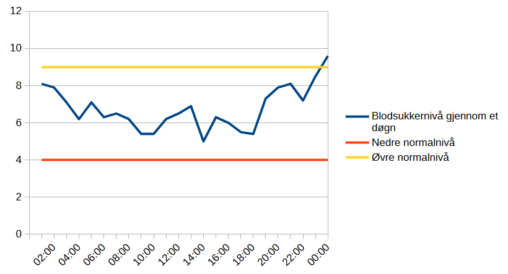
Denne visualiseringen viser mine blodsukkerverdier gjennom et døgn. Blodsukker er personlige helsedata som jeg bruker i hverdagen for å ta valg om mat, aktivitet og insulin. Dataene er…
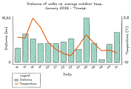
Distance of walks (km) plotted against average outdoor temperature ( degree C) in Tromsø for January 2026. Activity data was retrieved from my Garmin watch. Weather data was…
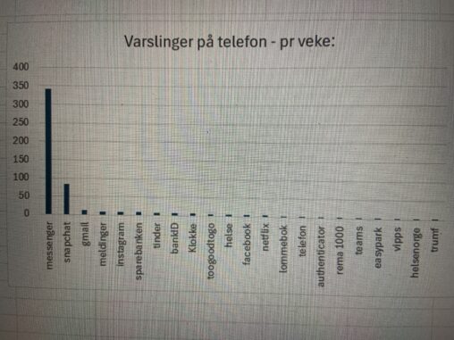
Dette beskriver en oversikt over apper og antall varslinger på telefonen over en uke.
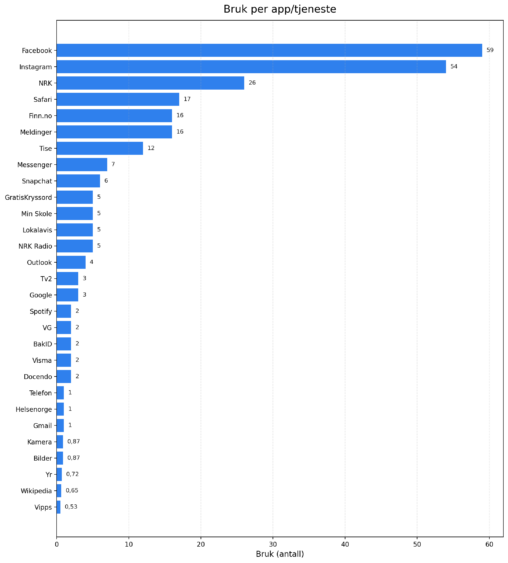
Med utgangspunkt i iPhones oversikt over skjermtid brukt på ulike apper, laget jeg en tabell i excel som viste tid brukt. Fikk så hjelp av CoPilot til å…
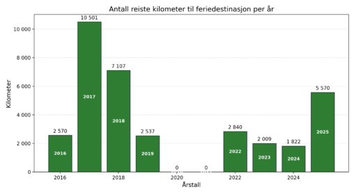
Diagrammet viser antall kilometer jeg reiste med fly til feriedestinasjon utenlands hvert enkelt år i perioden 2016-2025
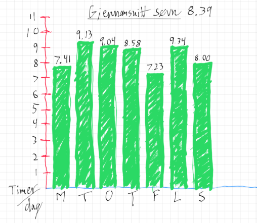
Picture shows my sleep last week. Where you see the sleep for each day an the average of that week.

A New Year’s intention to move more is translated into daily step data, embedded within an aerial view of a pedestrian crossing — where urban motion becomes the…
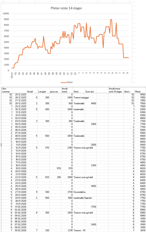
Graf som viser løpt distanse da jeg begynte å løpe igjen etter kneoperasjon for 6 måneder siden. Planen min har vært å øke løpedistansen, men ikke for fort….
A visualisation of experienced/selfreported energy levels through an average day. Energy levels are self-reported estimates. All estimates reported at time of low energy. Read as fictional. Visualisation created…
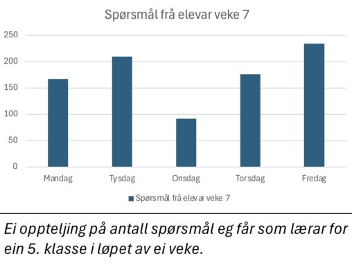
The image represents the types and frequency of questions I receive during a typical school week as a teacher in February 2026. The data visualised are based on…
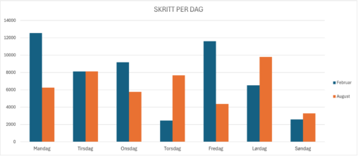
Table illustrating number of steps taken per day, the blue columns representing a week in February and the orange columns representing a week in August. I am the…
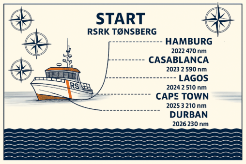
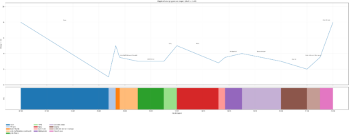
Hvilken havneby hadde jeg kommet til hvert år om jeg hadde seilet sørover etter at jeg startet som frivillig i RS i 2022 og frem til i dag?…
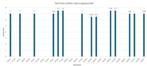
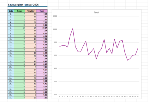
Denne visualiseringen viser antall timer eg har jobbet per dag i ein periode frå 16 .januar til 13 .mars i 2026. Kvar søyle representer antall timer jobbet den…
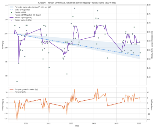
Jeg har manuelt logget mine treningsøkter med knebøy fra juni 2020 til januar 2026. Jeg har brukt dataene til å analysere om jeg har hatt effekt av treningen….