
2107 Data visualizations Categorized "my life in data" (page 1 of 106)
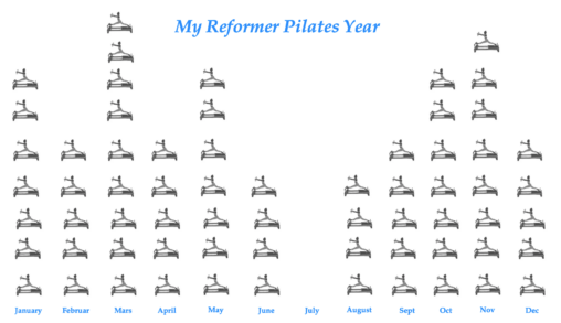
average amount of Reformer Pilates classes attended each month of year. Owner: Lora Shpak
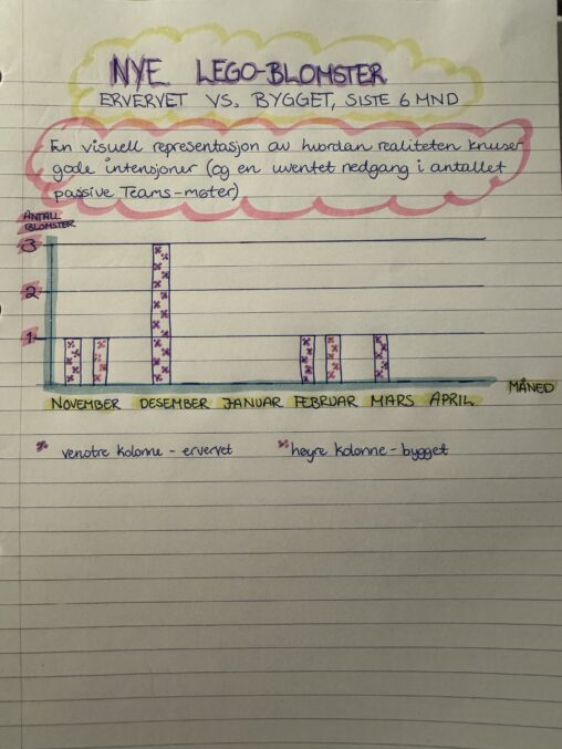
Antall nye LEGO-blomster ervervet vs. bygget siste 6 mnd – en visuell representasjon av hvordan realiteten knuser gode intensjoner. Representert ved antall blomster ervervet opp til tallet 3,…
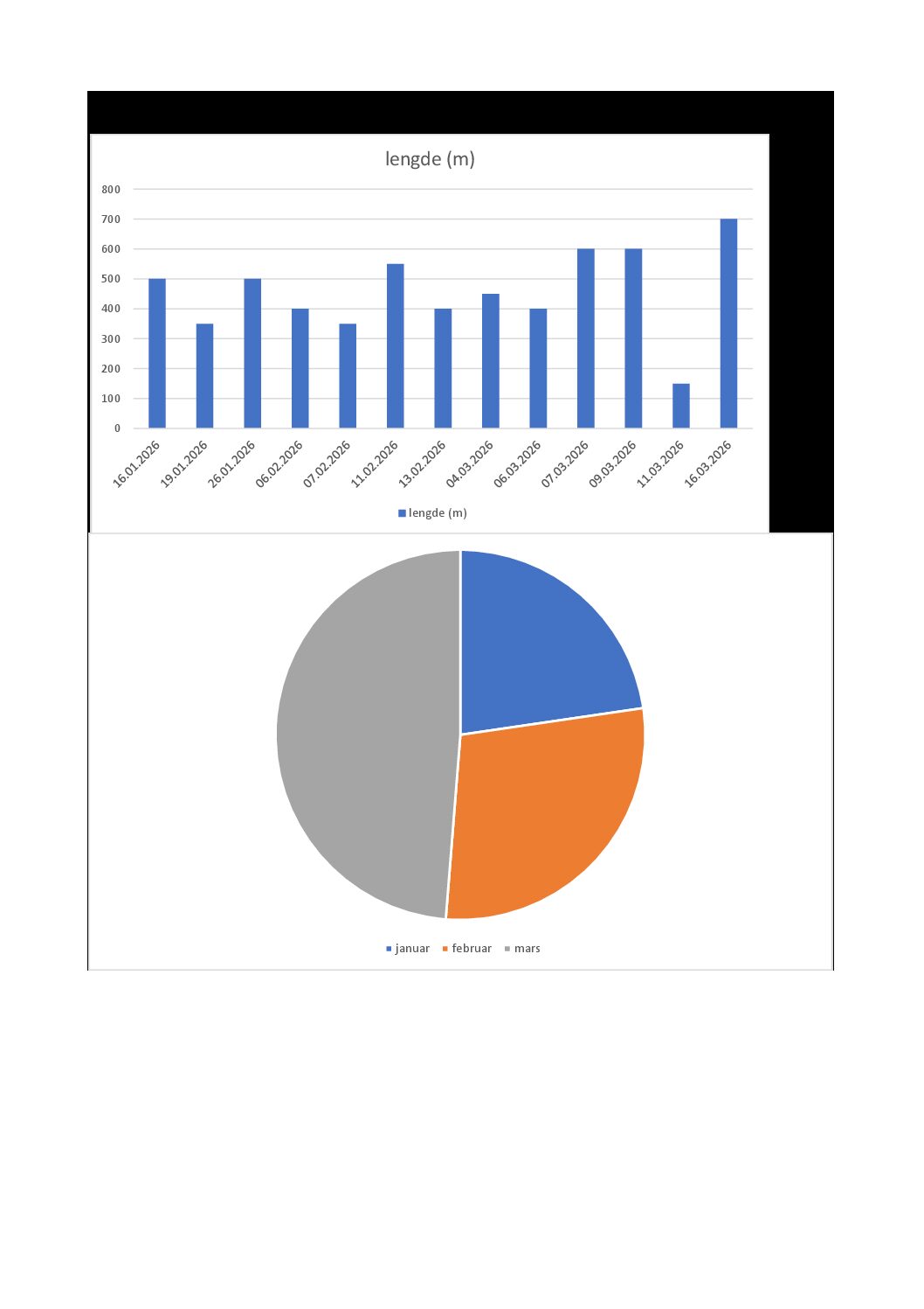
Data innholdet registrert svømeøkter i svømlangt kampanier 2026. Registrering var manualt på svomlangt.no. Data viser hvor langt hadde jeg svomt og hvor er det fordelt på de 3…
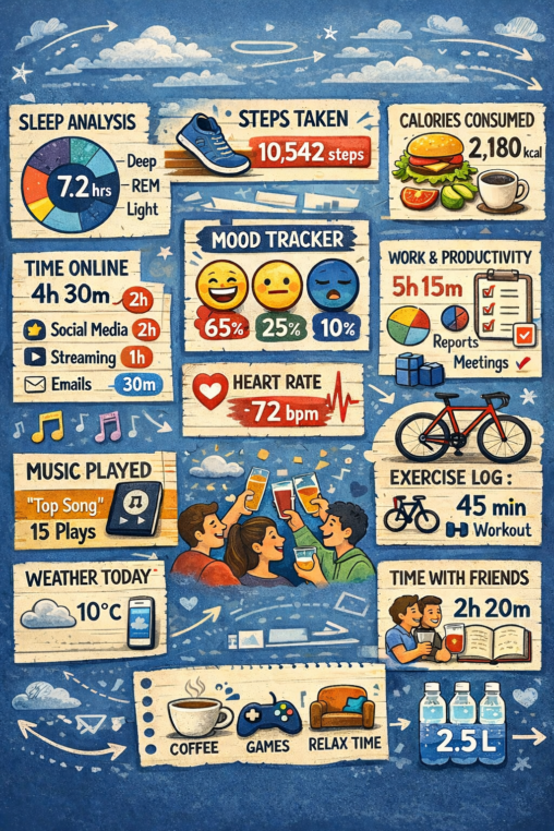
Dette er en skjerm fra en app på smarttelefonen min som viser daglig aktivitetsdata som søvn, bevegelse, humør og produktivitet.
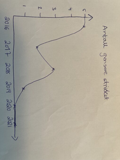
Dette er en oversikt over antall gensere strikket fra jeg ble mor og utover. Det viser tydelig ett fall i interesse og knappere tid etterhvert som det ble…
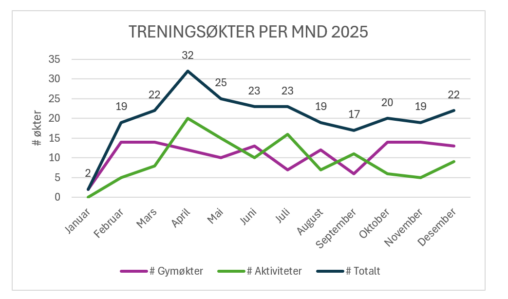
Antall treningsøkter per måned i 2025, fordelt i antall gymøkter og antall andre økter/aktiviteter (fotballtrening, fotballkamp, rulleski, ski, svømming, løping, fjelltur, osv)
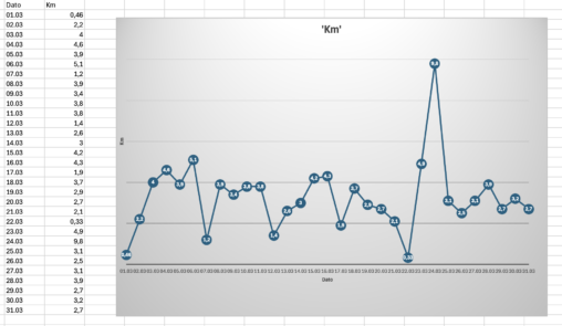
Dette viser antall km beveglse per dag i mars måned. Dataene er hentet fra min mobil og det den har tracket av bevegelse, så har jeg manuelt lagt…

Denne visualiseringen viser hvordan jeg brukte arbeidstimene mine i løpet av en uke som trainee i sjømatindustrien. Jeg loggførte tiden brukt på forskjellige oppgaver som sosiale medier, prosjektkoordinering,…
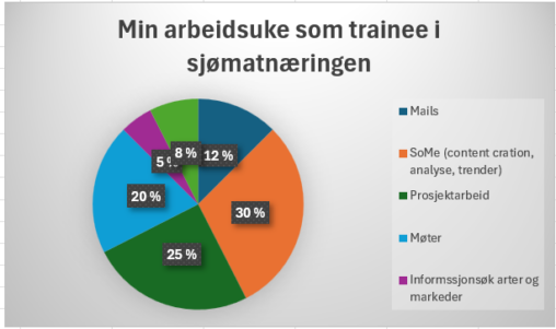
Antall timer jeg brukte på forskjellige oppgaver som Trainee i sjømatnæringen.
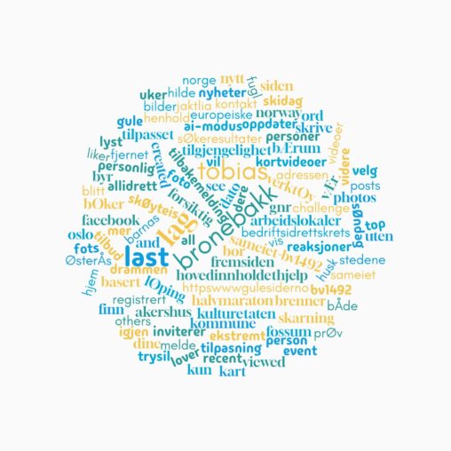
Denne visualiseringen viser ordene som dukker opp når man søker etter navnet mitt på internett. Ordskyen representerer hvordan identiteten min blir konstruert gjennom data på nettet. Den illustrerer…

Dette gjelder visualisering av antall middager meg og min samboer har laget hver så langt i Q1, 2026
This visualization represents the historical price performance of the Cardano ESG Transition Equity Europe fund (ticker: AVEA, ISIN: NL0010579074), listed on Euronext Amsterdam and managed by Cardano Asset…
The visualization illustrates how everyday activities generate data about our lives. Even simple routines like work, exercise or walking the dog can be quantified and represented as data.
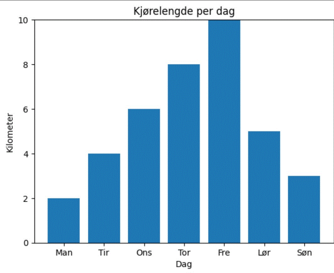
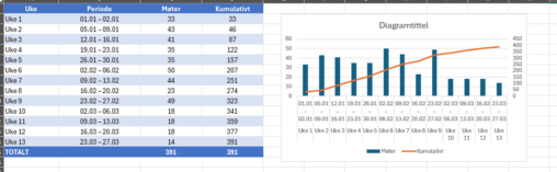
Antall kilometer kjørt gjennom uke 10, fra mandag 2.–søndag 8. mars 2026. Verktøy: Microsoft Excel, egen data.
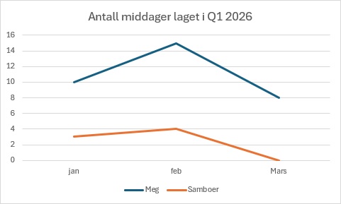
The visualization displays the amount of times me and my partner have made dinner in our household in the months of january, february and march.
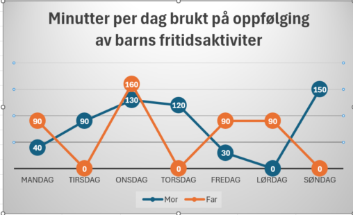
Minutes per day, follow up childrens daily activities
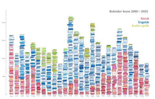
Tal på boksider eg har lese kvart år frå 2000 til 2025 i søylediagram. Tala er henta frå boklista mi. Fargane representerer kva språk sidene var skrivne på.
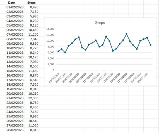
Denne datavisualiseringen viser antall skritt jeg gikk hver dag i løpet av februar 2026. Dataene er målt i antall skritt per dag og representerer daglig fysisk aktivitet over…