
171 Data visualizations Categorized "my country in data" (page 7 of 9)
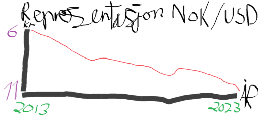
This is a graph representing the exchange range of the valutas NOK/USD from 2013-2023
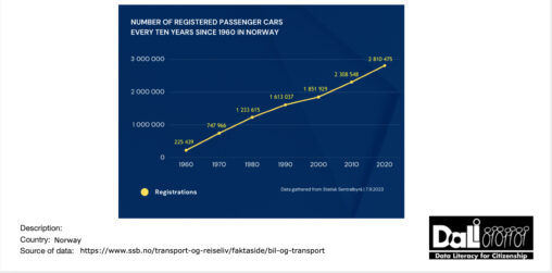
Data visualization of the number of registered passenger cars every ten years since 1960 in Norway. The data used is gathered from Statisk Sentralbyrå and the graph was…

A graph of the average number of rainy days between 2002-2007 in three norwegian cities in different parts of the country.
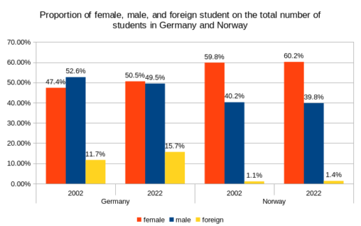
Percentages of female, male, and foreign students relative to the total student population. One fact that rather astonished me was that much more females than males were studying…

År Andel 2005 66,1 2006 66,7 2007 67 2008 66,2 2009 65,8 2010 65,3 2011 65,2 2012 64 2013 63,6 2014 62,9 2015 61,5 2016 60 2017 57,9…
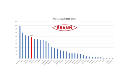
Maratontabell (1992 – 2023). Logo av min favorittklubb Brann – Fra 1992 til 2023 har de oppnådd 1181 poeng. Ligger på 5.plass i antall akkumulert poeng i perioden.
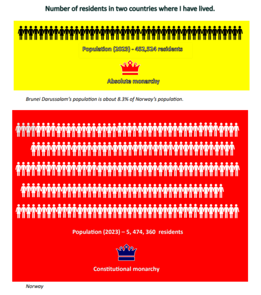
Brunei’s current(2023) number of population – 452,524 residents Norway’s current(2023) number of population – 5, 474, 360 residents

Number of nurses per 1000 inhabitants in 2019 in HU/FR/NO
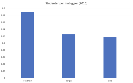
Grafen viser antall studenter per innbygger for, Oslo, Trondheim, og Bergen. Kilde: Statistisk sentralbyråd (2016)
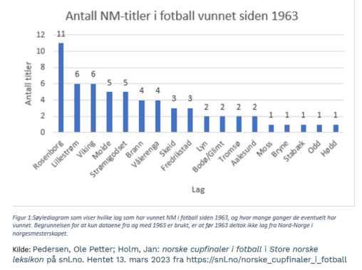
Søylediagram som viser hvilke lag som har vunnet NM i fotball siden 1963, og hvor mange ganger de eventuelt har vunnet. Begrunnelsen for at kun dataene fra og…

Verdiene viser antall døgn det har regnet, ifølge målestasjonene Yr.no bruker i de forskjellige byene. Opphavsrett © NRK og Meteorologisk institutt 2007–2023
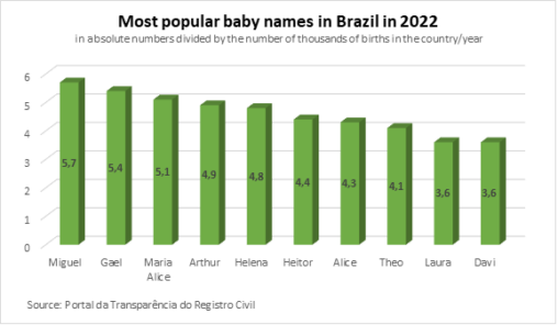
The image represents the most popular baby names in Brazil in 2022 in absolute numbers divided by by the number of thousands of births in the country/year. The…
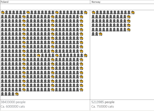
Amount of cats and people (in houndreds of thousands) in Poland vs in Norway in 2016.
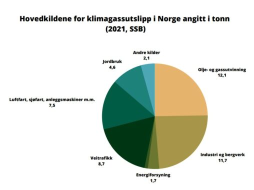
Hovedkildene for klimagassutslipp i Norsk luft i 2021. Hentet fra SSB.
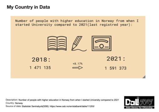
Illustration of people with/attending higher education in Norway in the year 2018 and the year 2021, including the rise in percent. The source and owner of the data…
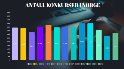
Her er antall konkurser i Norge fra år 2010 til 2022. Som vi kan se var det færre bedrifter som gikk konkurs under Covid-19, og flere årene før.
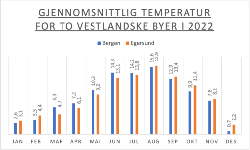
Diagrammet illustrerer gjennomsnittlig temperatur for hver måned i 2022 for de to norske vestlandske byene, Egersund og Bergen. Dataene er hentet fra YR som er en tjeneste Meteorologisk…
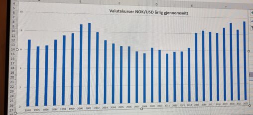
Søylediagram over gjennomsnittlig årlig valutakurs norske kroner mot US dollars perioden 1994 – 2022
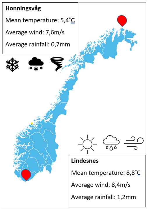
Weather at the southernmost- and northernmost point i Norway, by mean temperature, average wind speed and average rainfall of 2022. The data is collected by “Norsk klima service…