
1051 Data visualizations Categorized "my city in data" (page 8 of 53)
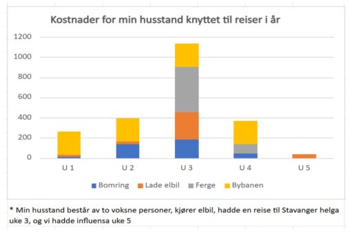
My family is represented by me and my wife, 2 persons. I have collected data from apps that shows my use of lectric power for charging my car,…
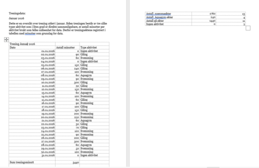
Dette er en oversikt over trening utført i januar. Siden treningen består av tre ulike typer aktivitet som i liten grad er direkte sammenlignbare, er antall minutter per…
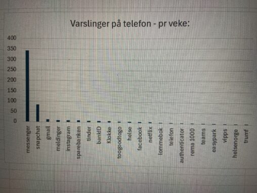
Dette beskriver en oversikt over apper og antall varslinger på telefonen over en uke.
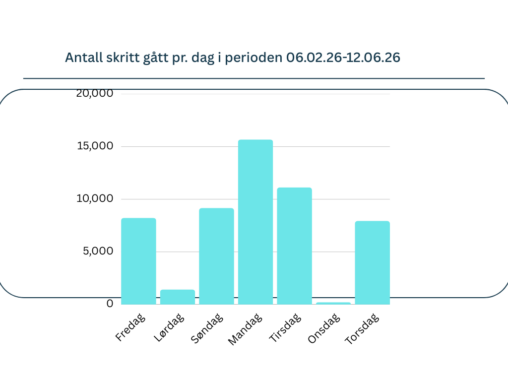
Bildet viser en visualisering av hvor mange skritt jeg gikk pr. dag i perioden 06.02.26-12.02.26. Antall skritt jeg brukte i visualiseringen fant jeg i Mosjons appen på iphonen…
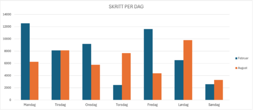
Table illustrating number of steps taken per day, the blue columns representing a week in February and the orange columns representing a week in August. I am the…
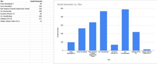
This shoes my “shoepark” and how long I have runned in every shoe in KM. The data is gathered from Strava
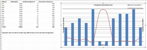
Oppsettet viser kostnad pr måned ved treningsenteret mitt, samt hvor mange timer pr måned jeg har trent.
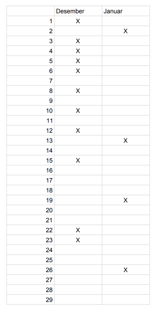
Overview of overtime worked in February and January. This shows how much more overtime was worked in one month compared to the other.
Jeg har samlet data fra min Aneo ladeopp og sat dem opp i excel. Disse data har jeg visualiseret via ChatGBT. https://chatgpt.com/s/t_698cb4d3d9908191a4b350dcf87d9476
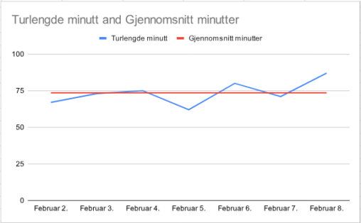
Gåtur med hund for en uke. Gjennomsnittstid og tid for dato. Data viser at det er ganske lik tid brukt på turer sammenlignet med gjennomsnitt. Små variasjoner over…
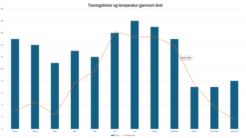
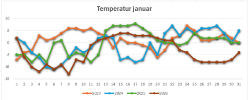
Treningstimer og gjennomsnittstemperatur per mnd. i 2023.
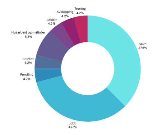
Figuren viser en grafisk representasjon av hvordan jeg disponerer tiden min på en gjennomsnittlig hverdag.
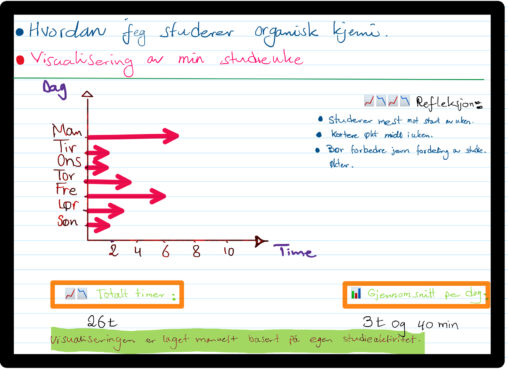
This data visualization shows how many hours I studied organic chemistry during one week. The data represents my personal study activity measured in hours per day from Monday…
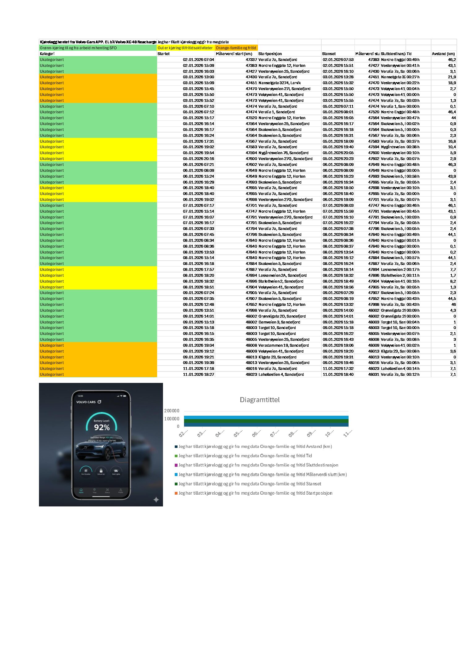


Jeg har tillatt kjørelogg i min Volvo app for mitt elektriske kjøretøy. Eksportert til excel og sortert og fargekodet jobb kjøring, fritidsaktiviteter (sport) og fritid.
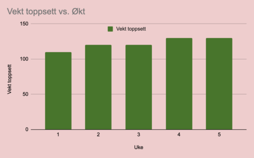
Dette gir et innblikk i hvor mye progresjon som foregår på det tyngste og viktigste i beinprogrammet, slik at man kan få en forventning om hva som kan…
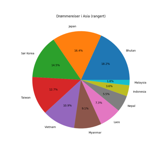
Personlig rangering over de 10 landene jeg kan tenke meg å besøke i Asia. Høyest ønske fikk verdien 10 og lavest ønske en verdi på 1. Verdiene ble…