
1051 Data visualizations Categorized "my city in data" (page 2 of 53)
Eg hadde eit mål om å selje 100 ting i 2024. For å gjere det meir motiverande laga eg eit illustrativt skjema som eg hang på veggen, der…
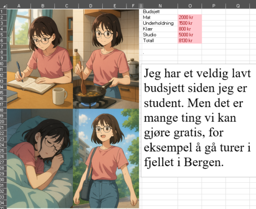
Den korte teksten er inspirert av studentlivet, både det økonomiske og hvordan vi kan være sosiale uten å bruke mye penger. “Jeg har et veldig lavt budsjett siden…
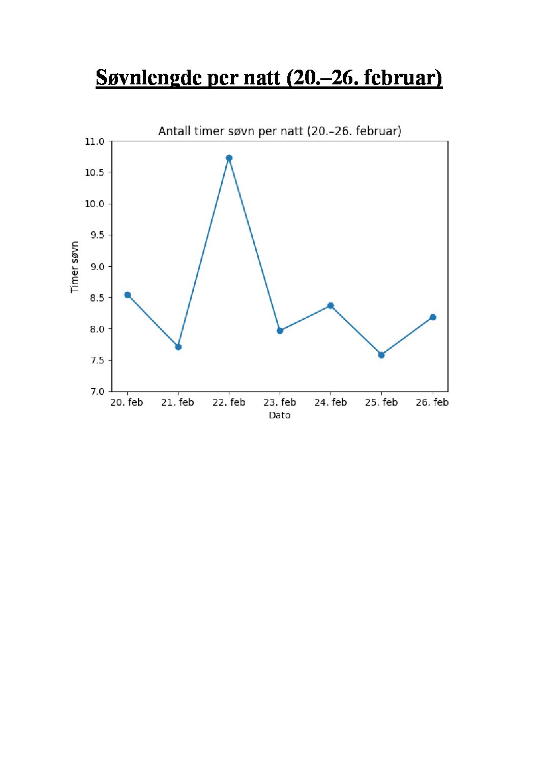
Visualiseringen viser en oversikt over egen søvnlengde i timer per natt i perioden 20-26 februar 2026.
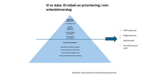
This visualization illustrates how sales data structures my professional practice as a sales manager in TESS. Inspired by the 80/20 principle, the iceberg metaphor represents how a small…

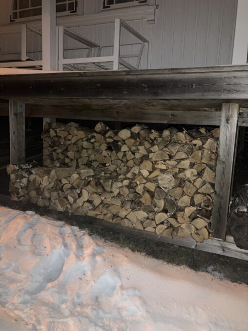
Wood left to heat up our house for the rest of the winter season 2026. Photo taken on February 10, 2026
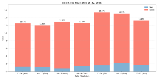
Detaljert beskrivelse: Denne visualiseringen viser hvor lenge sønnen min sov hver dag i perioden 16.–22. februar 2026, inkludert både middagshvil og nattsøvn. Søvntidene er oppgitt i timer og…
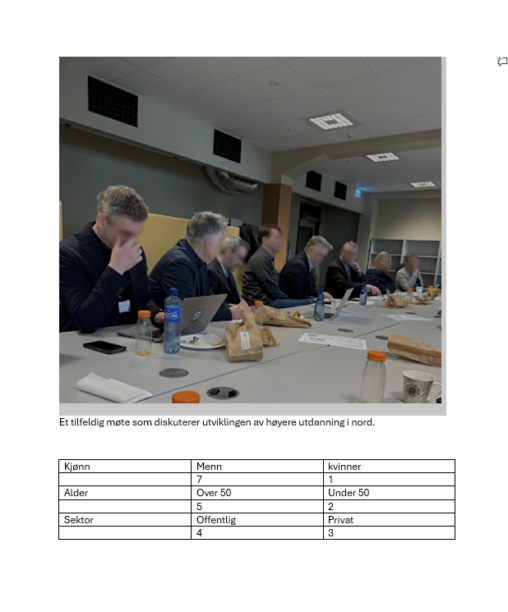
Enkel selvprodusert statistikk over gjester gjennom 30 år.
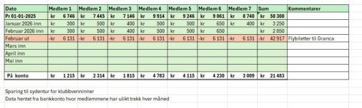
This represents an excerpt of the savings plan for a trip to for me and my friends. This overview is sent regularly to the members of the group…
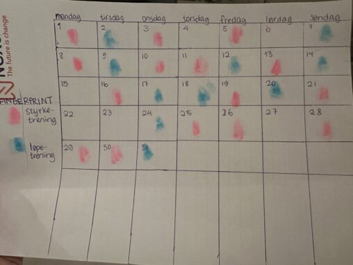
Denne visualiseringen representerer min treningsaktivitet i løpet av desember 2026. Dataene viser antall treningsøkter per uke, samt fordeling mellom ulike typer aktivitet (løping, styrketrening og hviledager) med fargelagte…
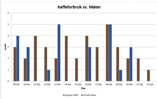
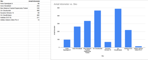
Antall kaffekopper pr. dag og antall møter pr. dag for å se om det drikkes mest kaffe på dager med mange møter, eventuelt motsatt. Antall kopper kaffe er…
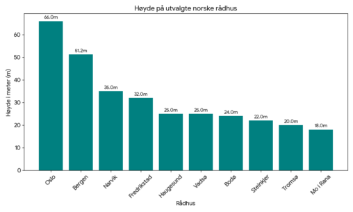
En oversikt over et utvalg norske rådhus, rangert etter høyde. Creative commons license.
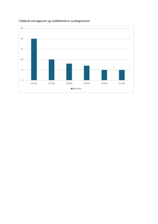
Visualiseringen viser hvor mye tid (i minutter) jeg har brukt på oppstart og stell av en surdeigsstarter over en peiode på seks dager i februar. Hver søyle representerer…
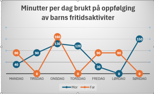
Figuren viser minutter brukt per forelder per dag på barns fritidsaktiviteter i løpet av en normaluke for en familie med 3 skolebarn. Både tid brukt på kjøring og…

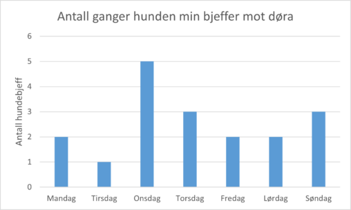
The data visualization shows how many times per day my dog barked at the door last week. I registered the data.
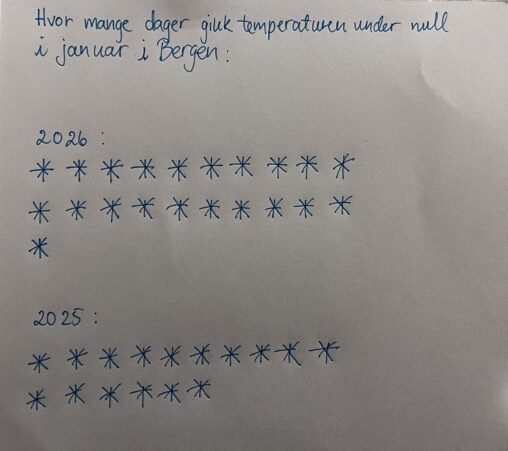
The visualization represent the number of days in the month of January in 2025 and 2026 that the temperature was below zero degrees Celsius in Bergen. Each day…