
1076 Data visualizations Categorized "my city in data" (page 1 of 54)
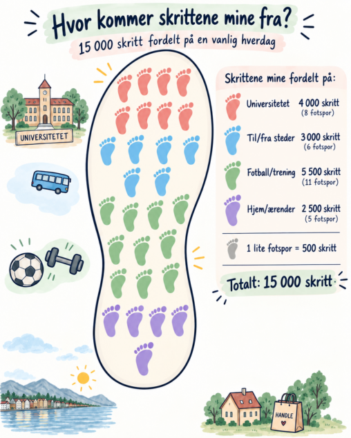
This visualization shows how 15,000 steps from a typical day in my life are distributed across different activities. University accounts for 4,000 steps, travelling between places for 3,000…
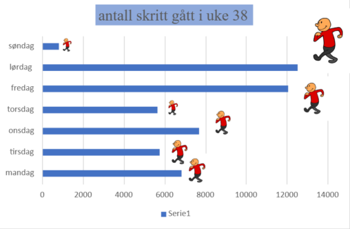
Dette er en visuell fremstilling av skrittene mine en hel uke. Søndagen viser indirekte hva jeg gjør på en søndag. altså slapper helt av 😀
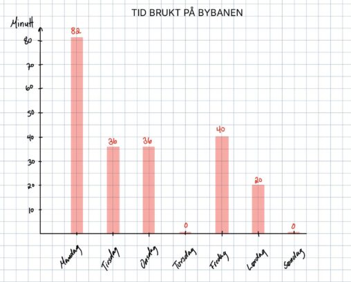
Stolpediagram som viser antall minutter jeg brukte på bybanen i uke 37. Ukedagene er presentert på x-aksen, og antall minutter på y-aksen. Informasjon om varighet på de ulike…
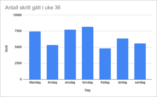
Stolpediagram som visualiserer hvor mange skritt jeg gikk i uke 36, mellom 31. august og 6. september. Laget med Google Sheets.


Denne visualiseringen viser hvordan jeg bruker tiden min i løpet av en vanlig uke. Dataene er målt i antall timer per uke og er delt inn i kategorier…

Diagrammet viser hvor mange minutter jeg brukte på fotball hver dag i uke 36. Tallene inkluderer tiden jeg brukte på å trene laget mitt, spille fotball selv og…

Kartet illustrerer et heatmap av bussholdeplassene i Bergen. Dette er lagd gjennom å omgjøre Vestland Fylkeskommune sine registrerte bussholdeplasser fra punkt til heatmap. Heatmappet viser områder som har…
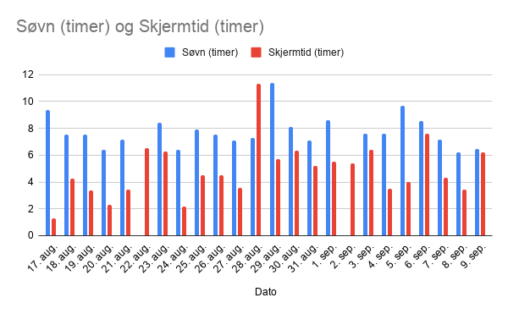
Jeg ville sammenligne data fra Garminklokken min og mobilen, for å se om det var noen sammenheng mellom søvn og skjermtid.
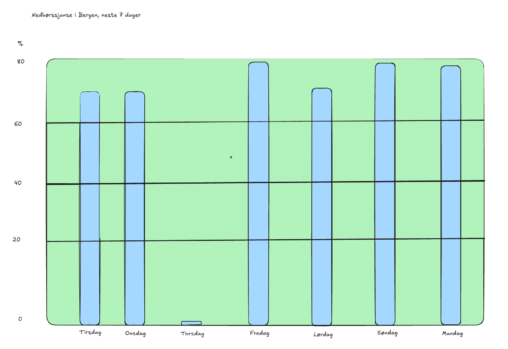
Nedbørssjanse i Bergen fra 08.09.2026 – 14-09-2026 08.09.2026 Opphavsrett © NRK og Meteorologisk institutt 2007–2026 Yr-sjef: Ingrid Støver Jensen Ansvarlig redaktør: Vibeke Fürst Haugen Meteorologisk ansvarlig: Roar Skålin
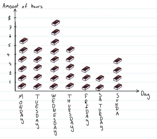
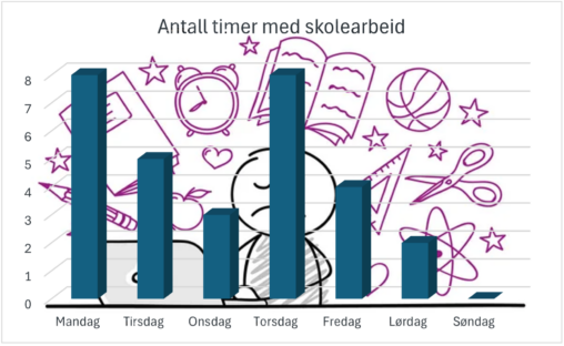
This data visualization describes how many hours I have used for schoolwork this past week. I have used books instead of “blocks” to make it more creative.
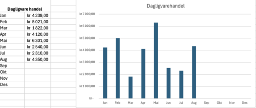
Dette er en grov visualisering av hvor mye penger som går til dagligvarer fra måned til måned.
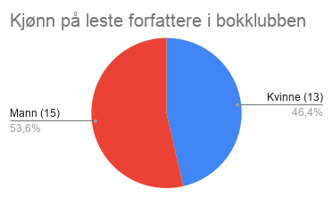
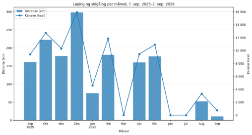
Antall kilometer løpt og gått på ski i forhold til hvor mange kalorier som er forbrent. Tall er hentet fra min egen Strava-bruker.
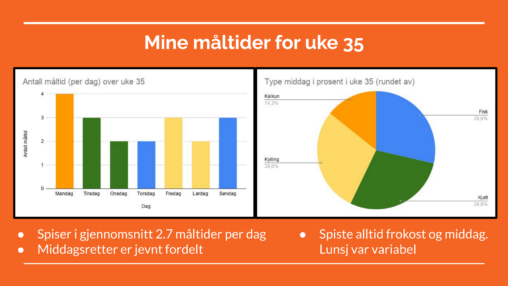
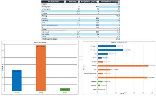
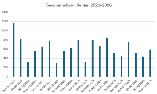
Denne visualiseringen viser sesongvis nedbørsmengde (i mm) i Bergen fra høsten 2021 til sommeren 2026, målt ved værstasjonen Bergen – Florida (SN50540). Hver søyle representerer total nedbør for…
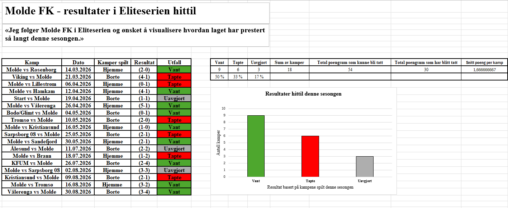
Denne datavisualiseringen viser Molde FKs resultater fra de første 18 kampene i Eliteserien 2026, i perioden 14. mars–30. august 2026. Resultatene er fremstilt som antall seire, tap og…