
1466 Data visualizations Categorized "30-64" (page 55 of 74)
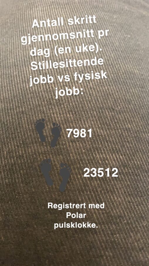
Eksempel på registrering av skritt på pulsklokke. Gj.snitt pr dag regnet ut fra en uke. Begge har samme pulsklokke. Stillesittende jobb vs fysisk jobb. Bildet viser den svært…
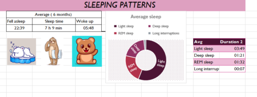
A six months collected data about sleeping time, including the quality of sleeping time
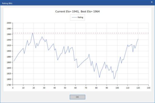
The fluctuations of my online rating in blitz chess on the server Playchess.com for the last three months, Nov 25th 2023 to Feb 26th 2024, Public domain, no…


Artist log, colors January 2024 Most used colors in January 2024. Data from the artist log of EWian. The picture shows frequency of colors for January 2024, with…
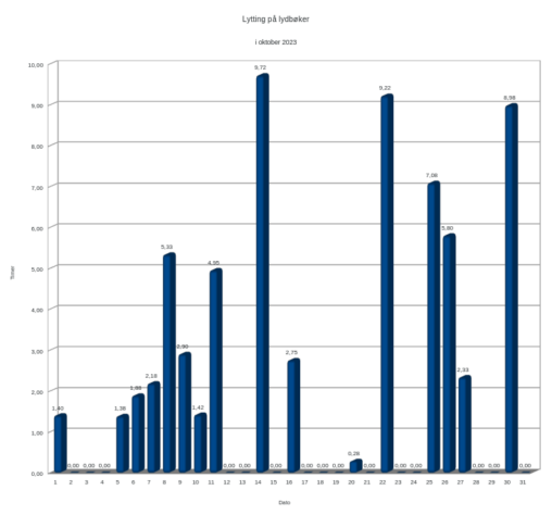
Each column represents a number of hours pr. day of october, I didn’t listen every day so some dates are empty.
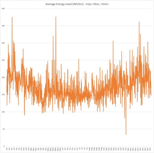
Trip data for my car was collected from app API and imported to Excel. Trips shorter than 5 minutes and/or 5 kilometers were removed. “Average energy used” [wh/km]…
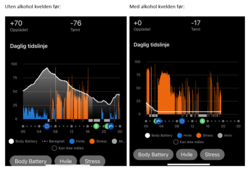
Data om søvn, aktivitet og stress registrert av treningsklokke. Viser forskjellen i beregnet Body Battery dersom man har drukket alkohol kvelden før i motsetning til om man ikke…
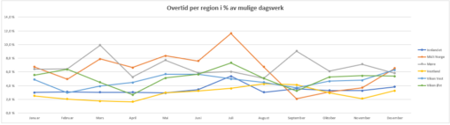
Overtid er en betydelig utfordring i helsesektoren grunnet utfordrende bemanningssituasjon. Vi overvåker derfor dette nøye, både av hensyn til arbeidsbelastning og økonomi. Data er hentet fra bemanningssystemet GAT…

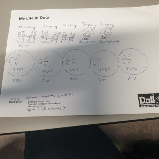
Skrittantallet er antall skritt jeg tar i løpet av en dag. Skrittellere og digitale aktivitetsmonitorer fastslår antall skritt. De teller antall skritt i alle aktiviteter som involverer skrittlignende…
Viser statistikk over salg av klær på Tise vs kjøp

Innsamlet data over antall skritt jeg har gått i januar og februar i 2021, 2022, 2023 og 2034. Egenlaget presentasjon og egne data, samlet inn via Garmin Connect.
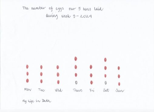
Antall egg lagt av våre høner pr. dag i løpet av uke 9-2024

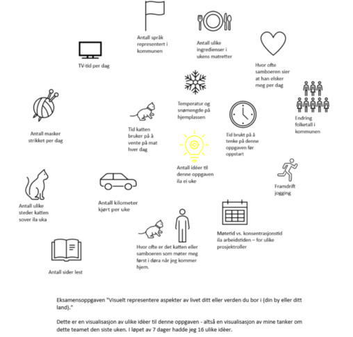
En visulisering av ulike idèer til eksamensoppgaven Vi er data, med bruk av symboler og kort tekst i en spiral fra start til valg av tema. Symboler er…
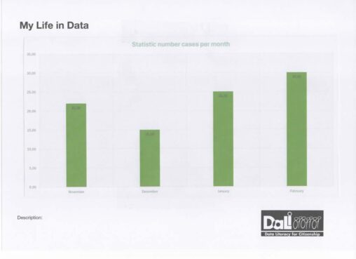
Data represents number of cases processed per month. I am the owner of the data.