
1477 Data visualizations Categorized "30-64" (page 5 of 74)
Data were collected from evaluation forms from 22 course participants after a 2‑day course in Berlin.
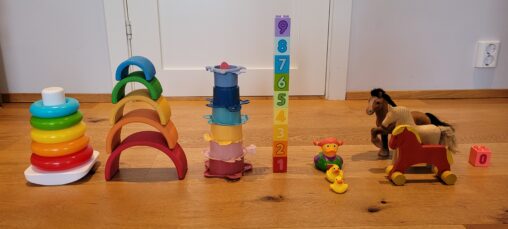
Number of times my daughter has woken me up during the night the seven last nights represented through her toys.
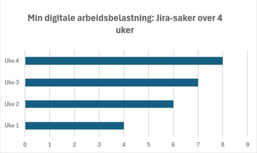
Jeg valgte å visualisere antall Jira-saker per uke fordi dette representerer min digitale arbeidsbelastning. Økningen fra uke 1 til uke 3 viser en tydelig intensivering av arbeidsmengde, før…
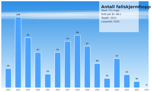
Figuren viser hvor mange fallskjermhopp jeg har hatt siden starten i 2011. Jeg eier disse dataene og jeg har brukt Microsoft Copilot til å lage figuren.
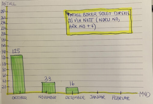
This data visualization presents the number of units sold of a self-published poetry collection per month during the fourth quarter (Q4) of 2025. The time period covered is…
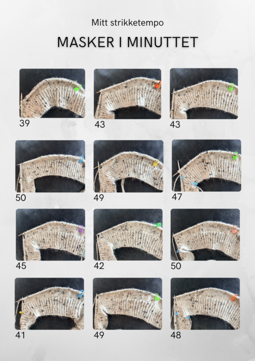
Jeg har satt nedtelling på et minutt, strikket og så telt hvor mange masker jeg har strikket i minuttet. Gjentok 12 ganger for å få riktigere data for…
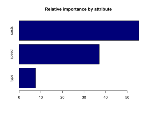
the data is supplied by the professor from course MBM 433 at NHH. the data contains the custormers age, gender, region, ID, and how customer choose the product…
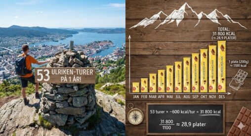
Figuren viser antall turer gått på Ulriken i 2025, målt i sjokoladeplater.
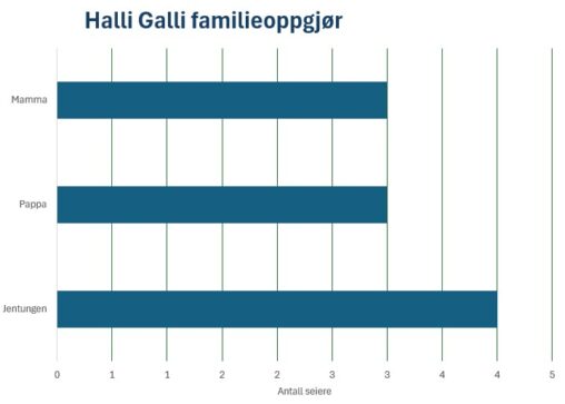
I helgen hadde vi familieoppgjør i spillet Halli Galli. Det er et spill hvor det er om å gjøre å reagere raskest. Vi voksne må øve litt mer…
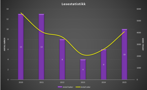
Diagram som viser hvor mange bøker jeg har lest per år over de siste 5 år, samt en representasjon over hvor mange sider dette tilsvarer per år.
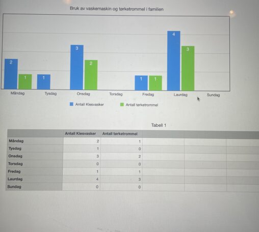
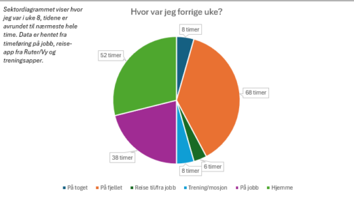
Dette viser kor ofte me bruker vaskemaskin og tørketrommel i veke 8.
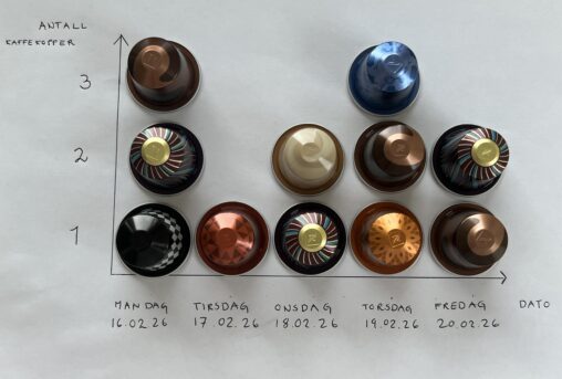
Visualiseringen viser antall kaffekopper konsumert i løpet av en arbeidsuke. Data ble samlet inn fra og med mandag 16.02.26 til og med fredag 20.02.26. Hver Nespressokapsel illustrerer én…
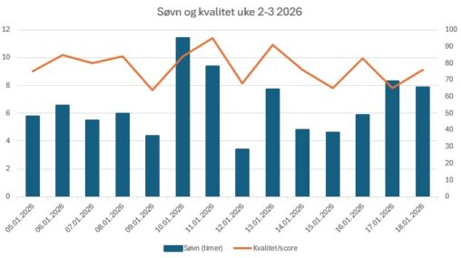
Har hentet ut data fra Apple Watch på søvnmengde per dag, og helse appen gir en rating på søvnscore basert på tre kategorier; varighet – sengetid og avbrudd….

I’ve collected data from my Garmin-watch and made a vizualisation of the hours I was awake from 16-22 of February 2026
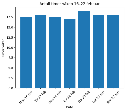
I have vizualied how many hours I was awake from 16-22 february 2026. I used data from my Garmin watch
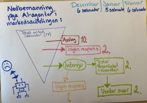
Beskrivelse av visualiseringen Visualiseringen viser min jobbsøkerprosess fra desember 2025 til februar 2026. Bakgrunnen er nedbemanning på grunn av AI-automatisering. Bildet følger 17 prosesser (enheter) fra kilder som…
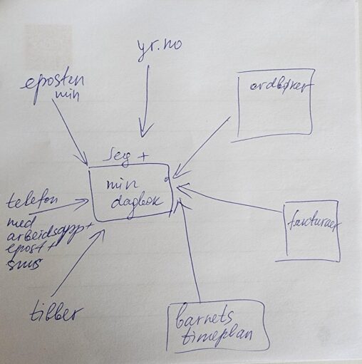
Min dagbok er i sentrum av mitt liv. Alt i mitt liv knyttet til data oppført enten i dagbok eller i telefon. Eller både og.
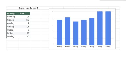
The data are my sleeping hours for week 8. I have gathered the data from my watch.
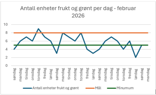
Grafen viser antall enheter frukt og grønt konsumert per dag i februar 2026. Målet er 8 enheter, minimum 5 enheter.