
1466 Data visualizations Categorized "30-64" (page 24 of 74)

A drawn image of a man in the air with a volleyball smash pose which he is about to smash the ball over the volleyball net. There is…

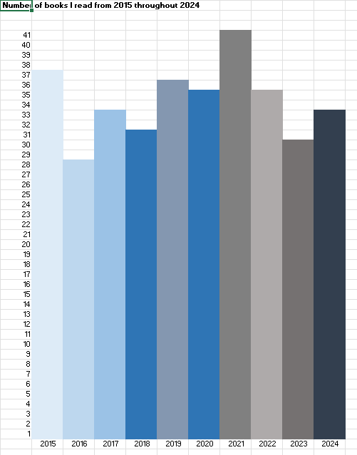
I register every book I read, and have done so since 2015. The table shows the number of books for the past ten years, with an increase during…
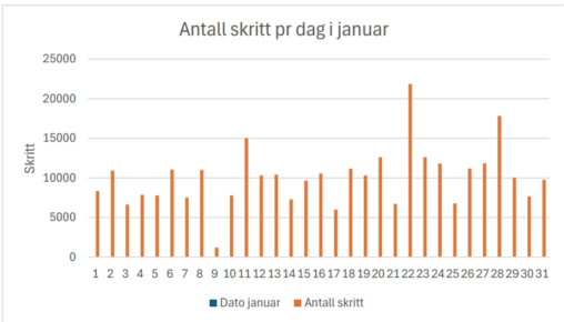
Antall skritt gått hver dag i januar 2025. Registrert med Garminklokke
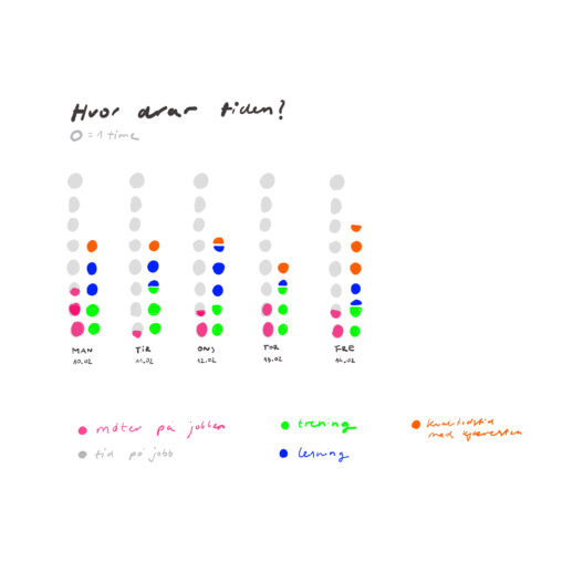
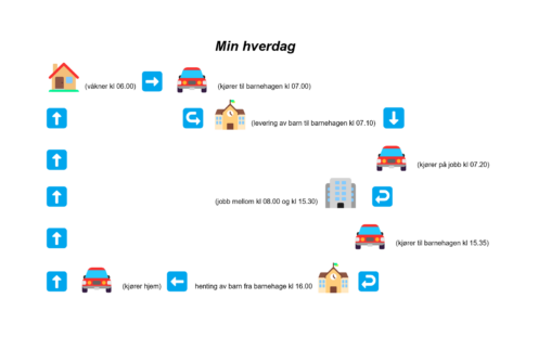
Disse dataene representerer tidsfordelingen i livet mitt mellom 10. og 14. februar. Data visualisering benyttes prikker å vise timer i løpet av dagen (en prikk=en time) og hvilke…
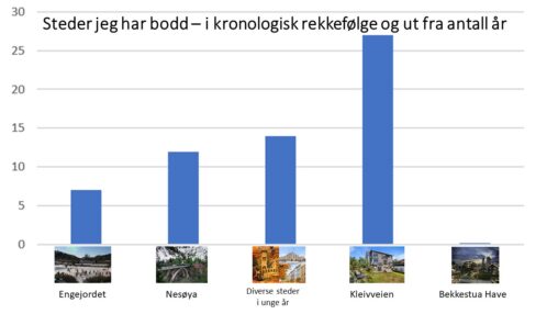
Visualiseringen viser ulike steder jeg har bodd i relasjon til hvor lenge jeg har bodd hvert sted. Jeg har med bilder av steder hentet fra internett, som f.eks,…
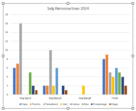
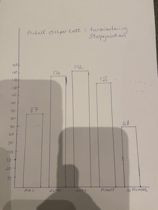
Deltaking på rørosmarknaden 2024 og statistikk over vareslag og salg
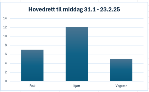
Jeg har registrert hva jeg har spist til middag over en tre-ukers periode. Jeg ønsker en oversikt over hvor mye fisk og kjøtt jeg spiser.
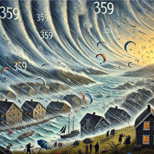
Hentet statistikk fra yr.no og generert bilde, kunne selvsagt visualisert det med ikoner, men syntes det ble gøy med det bildet.
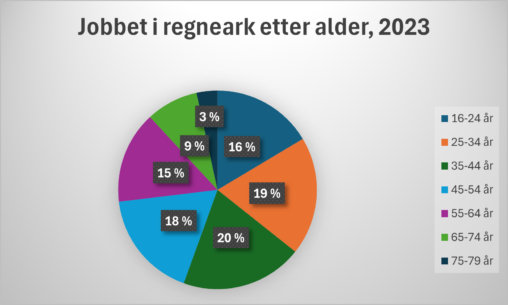
Offisiell norsk statistikk om bruk av regnearkprogram etter alder for både kvinner og menn i 2023 (Statistikken gjelder for de siste tre måneder, på intervjutidspunktet)
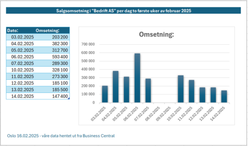
Omsetning per dag de første ukene av februar 2025 i vår bedrift. Data hentet fra vårt ERP-system, Microsoft Dynamics 365 Business Central
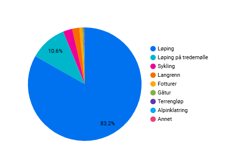
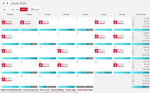
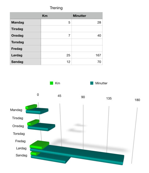
Statistikk for hvilke aktiviteter representert i segmenter. Eksport fra Garmin og benyttet variabler som dato, type og distanse.
The habit tracker is intended to track which dates during the month of March 2025 the user completes selected tasks to form desired daily habits. It tracks ‘walk…
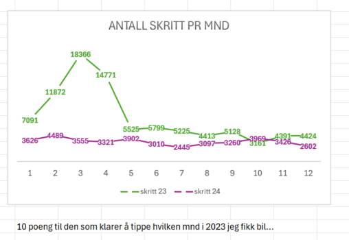
gjennomsnittlig Antall skritt pr dag pr mnd etter at jeg gikk til det steget å kjøpe meg bil. Bilen ble kjøpt i mai 2023. Helse appen på min…
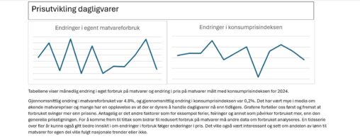
Konsumprisindeksen er hentet fra SSB sitt webgrensesnitt. Informasjon om eget forbruk er hentet fra egen bank app. Figuren viser prosentvis endring i forbruk og pris fra måned til…