
1466 Data visualizations Categorized "30-64" (page 22 of 74)
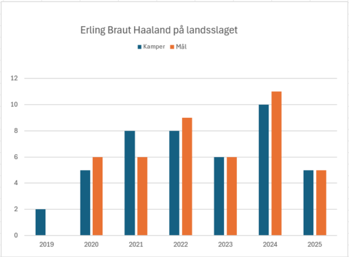
Grafen viser antall kamper og mål Haaland har scoret på landsslaget siden han debuterte på landsslaget i 2019.
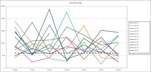
Daglig skrittmåling for hver uke fra uke 26 til uke 36, sammenlignet med personlig daglig skriftmål på 6000 skritt.
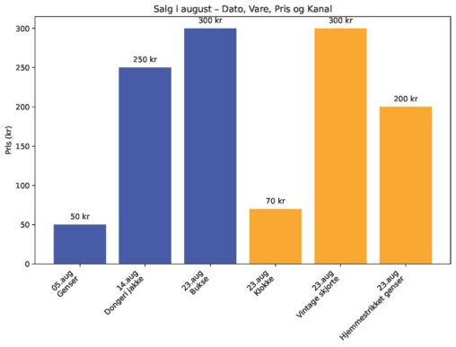
Oversikt over salg av ting fra Finn.no og Loppemarked for august måned (oppdatert)
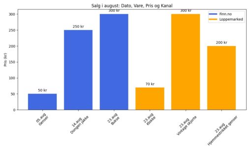
Oversikt over salg av egne ting fra Finn.no og Loppemarked for august måned.
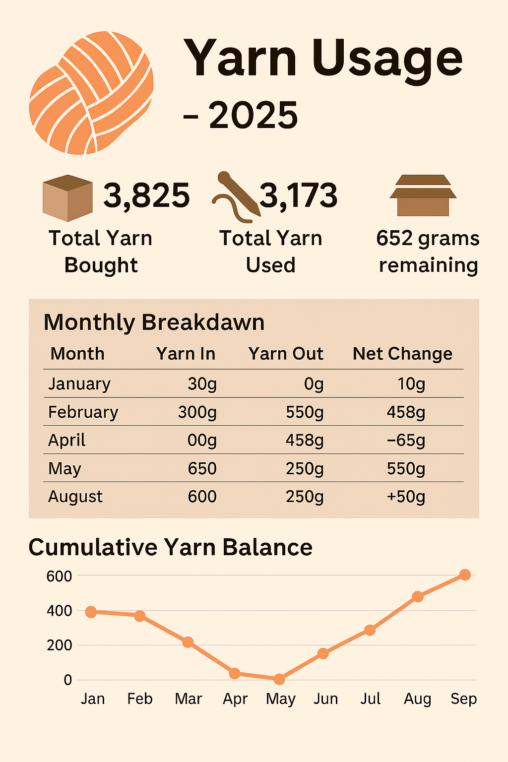
A visual representation of my yarn pantry, including purchases of yarn in grams and grams used up in finished knitted items.
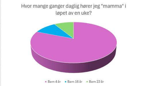
Dette kakediagrammet viser hvor stor andel av “mamma-ropene” som kommer fra hvert av mine tre barn i løpet av en gjennomsnittsdag. Jeg har telt i en uke, og…
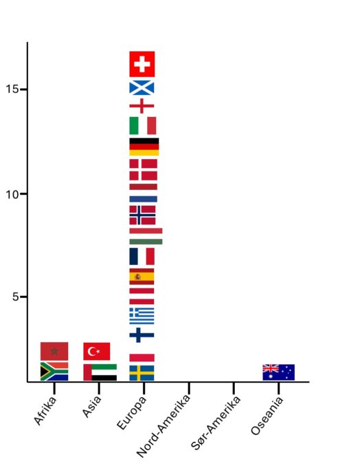
Land jeg har besøk i løpet av livet mitt, sortert etter verdensdel. Landene er representert ved flagget sitt. Antall land på y-aksen. Dataene tilhører meg selv. Bilder av…
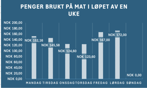
Her har jeg lagt inn mitt ukentlige forbruk på mat som student i en vanlig uke.
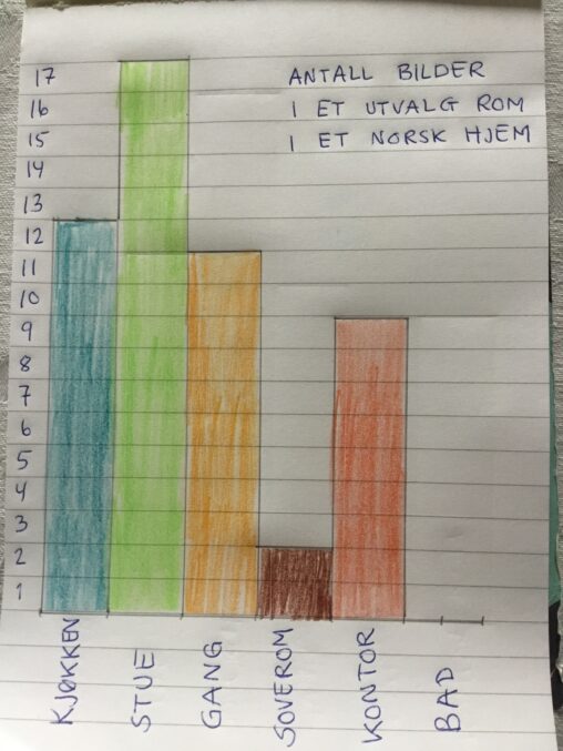
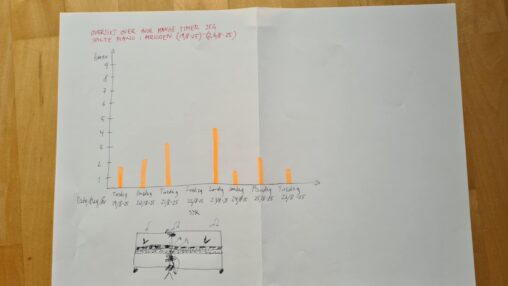
Her har jeg talt antall bilder på veggene, fordelt på rom, og laget et håndtegnet søylediagram.
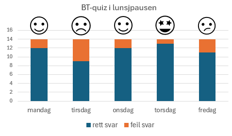
Antall rette svar i BT-quizen Hvor mange rette svar på 14 spørsmål fikk vi i lunsjpausen i løpet av en uke. Vi er i snitt 7 kollegaer i…
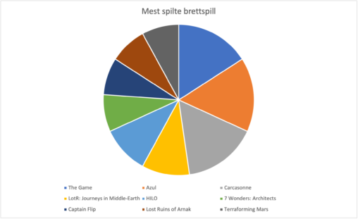
De ti mest spilte brettspillene siden jeg fikk øyne opp for brettspill representert med et sektordiagram der alle spillene har hvert sin sektor og farge. Data hentet fra…
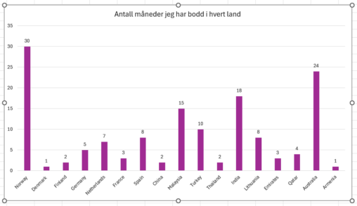
Jeg er eieren. Dataene handler om reisene mine i forskjellige land.
Kilden til disse dataene er mine egne personlige dokumenter. derfor er de min eiendom og er ikke beskyttet av opphavsrett.
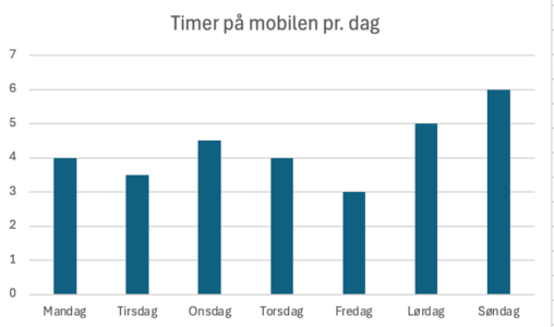
Jeg lagde en oversikt over min skjermtid på mobilen i løpet av en tilfeldig uke. Dataen fant jeg på mobilen min, men la dette inn i Excel for…
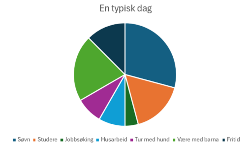
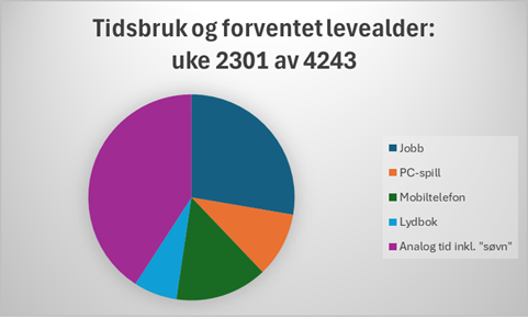
Kakediagram som viser omtrentlig tidsbruk i uke 2301 av en gjennomsnittlig forventet levealder på rundt 4243 uker. Kategorien “Jobb” hentet fra timeliste, “Lydbok” fra gjennomsnitt fra siste måned…
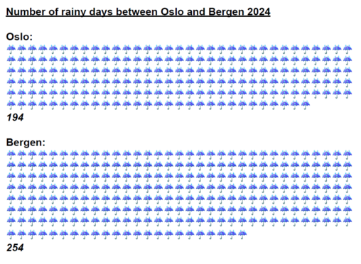
Representation: Rainy days Comparison: Oslo & Bergen Period: 2024 Source: Norsk klimaservicesenter